I want to chart the performance of multiple fix versions and show the performance of the current fix version against previous fix versions.
I am tracking the open issues by time and want to overlay them.
Is this even possible? I investigated the Lag function, but the lagging time for each fix version is different.
See attached as an example.
Can anyone from EazyBI support provide any guidance?
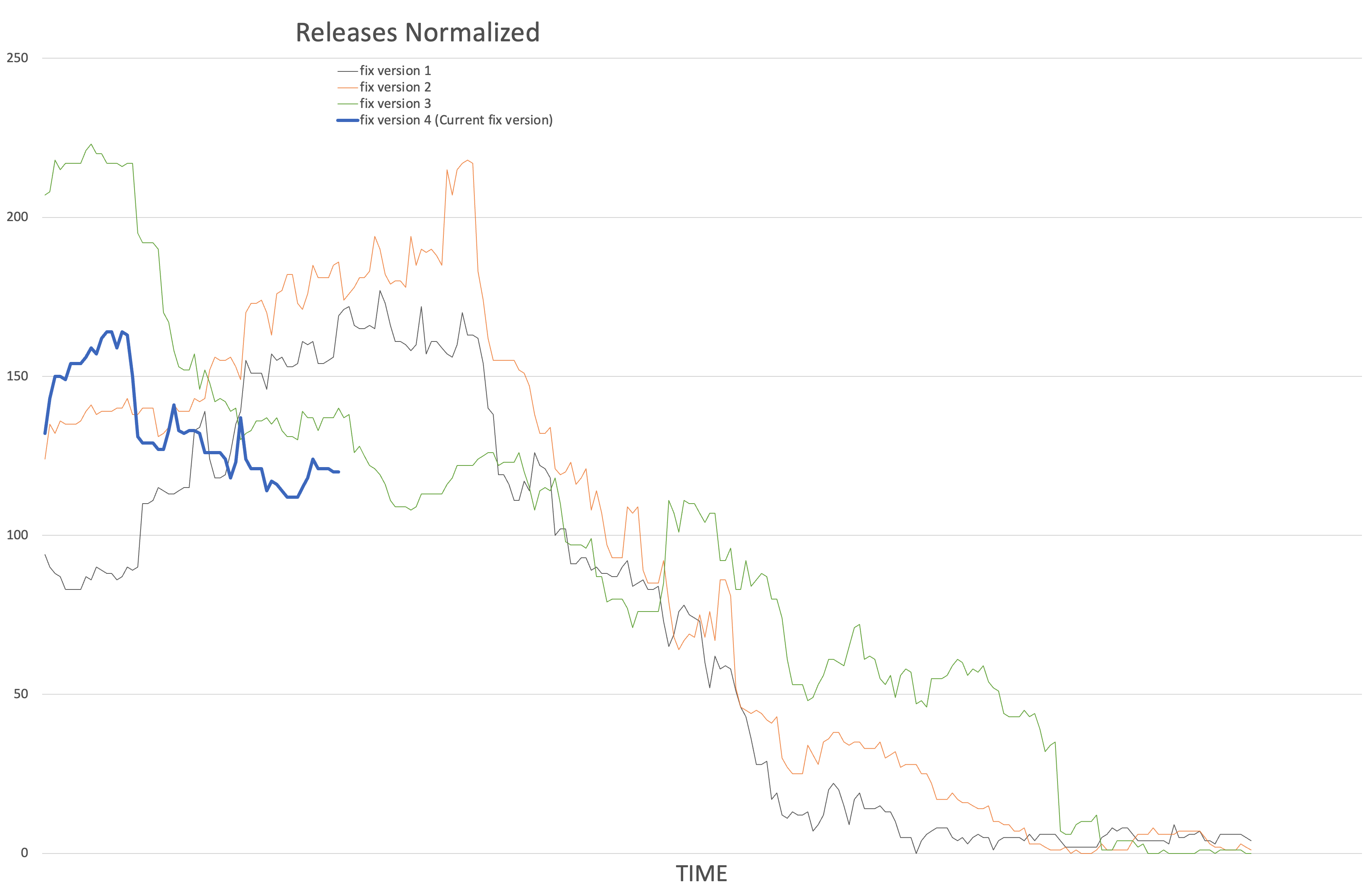
Thanks for this request. This inspired us to create a demo report Open issues in version comparison by release date for this.
The demo report uses Fix version dimension calculated member to show several latest versions. The current calculated member will pick versions with release date 1 year ago and planned in next 3 months. The timeline is based on the latest of the selected versions.
Any other version will show values on a timeline X days before the release date and timeline is only a visual guide for them. You can see on mouse over days before release. I used a vertical line to show the release date that is used as a dynamic guide for all releases.
I would suggest exporting the report and importing it into your account. Select the needed Project you would like to use as a comparison. If needed change the formula for the Latest fix versions to change the set of release used in the report. You can add any other dimensions as filters keeping the report structure as it is.
Daina / support@eazybi.com
OMG this is awesome. Thanks so much.