I’ve created a table with few columns so that for each column the report calculates the column’s average.
I want to highlight (thought by color) cells that contains values that are bellow the column’s average.
Is there a way to do that? I couldn’t find a solution.
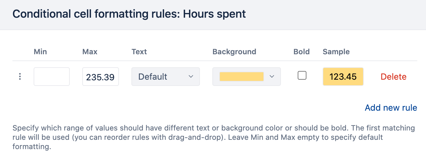
Currently, you can use very basic comparisons. For example, you can calculate the average and apply this calculated value manually as an exact value for cell formatting.
I used Add calculated>Statistical>Average to calculate an average of the column. Then I used this exact value in the formatting:
Here is good news, though. We are planning updates in cell formatting in one of the nearest versions. It will include the scenario for dynamic updates based on some calculations. I will update this community post when it will be released.
With version 6.2. we redesigned cell formatting with many configuration options. You can use MDX calculation in the cell formatting either addressing another measure or using the formula there directly.