Hello - I have a request to enhance eazyBI for JIRA’s Gauge chart.
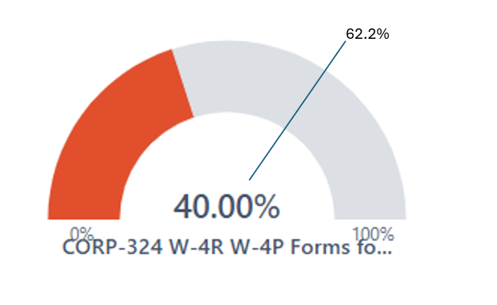
Here’s the idea… I’m using the gauge as a progress bar showing the % completion of work assigned to a team from our quarterly planning event. I’d like to factor into the chart the calendar progress. In the example below, the team is 40% complete with their work, however the calendar is now 62.2% through the quarter. Likewise, because the team’s progress is lagging the calendar, the progress bar is red. My main question is - I need a way to make a 2nd mark on the graph to illustrate progress of the calendar. (I know the color coding can be done based on the progress vs the calendar).
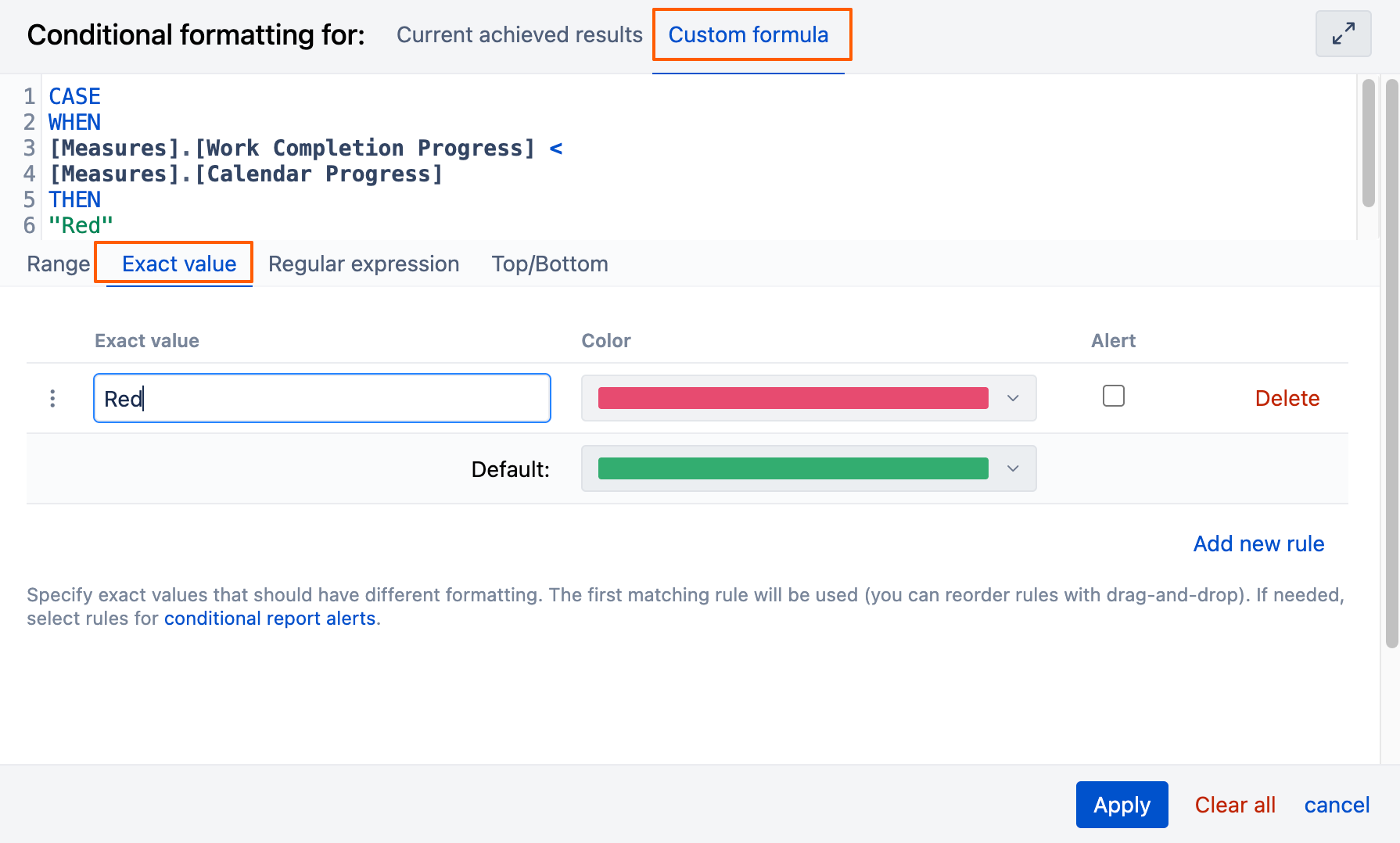
Thanks for posting your suggestion for the Gauge chart. Currently, it is not possible to add a dynamic mark showing the progression of the year in the Gauge chart, but we have noted your idea in our backlog for future development ideas.
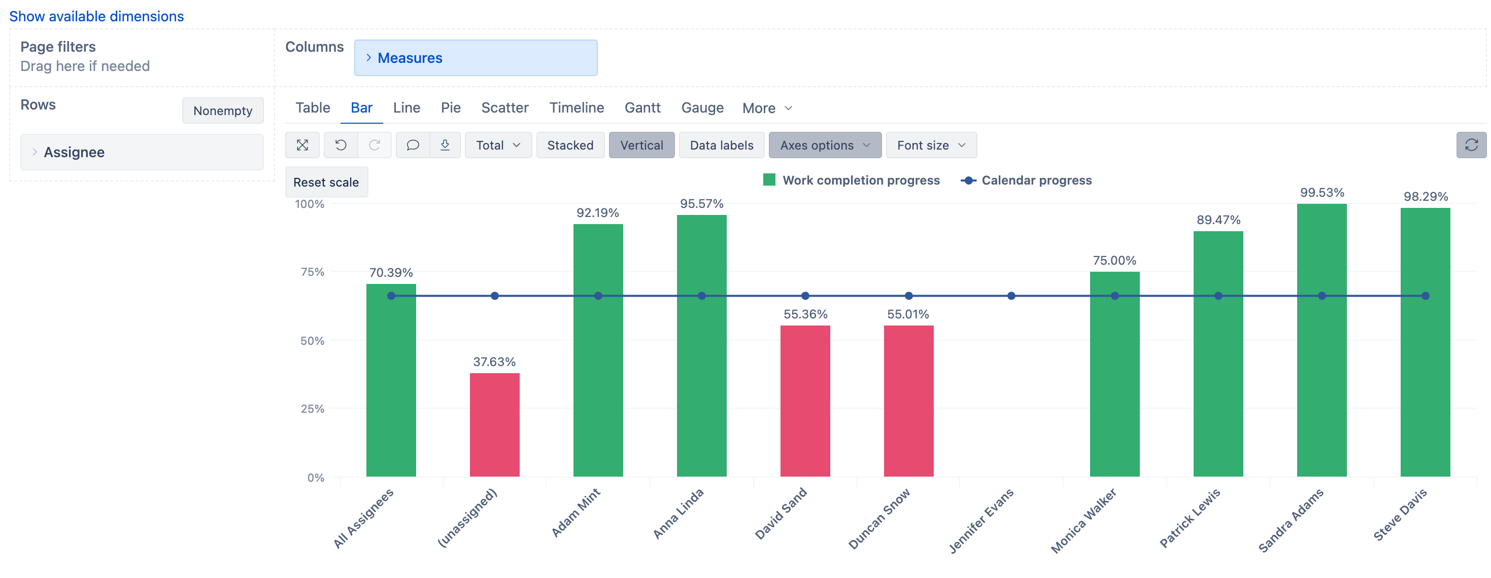
As a workaround, I can suggest using the Bar chart: