Hi Sebastian,
You may have a timeline of created issue amount represented by labels.
- Set “Time” dimension as rows and select hierarchy level Month.
- Set “Label” dimension and measure “Issues created” as columns.
- Select Bar chart view. And customize it to represent data as you like.
You may set to represent data vertically, stacked and show data labels for each bar (number of issues).
Your report may look like in the picture below:
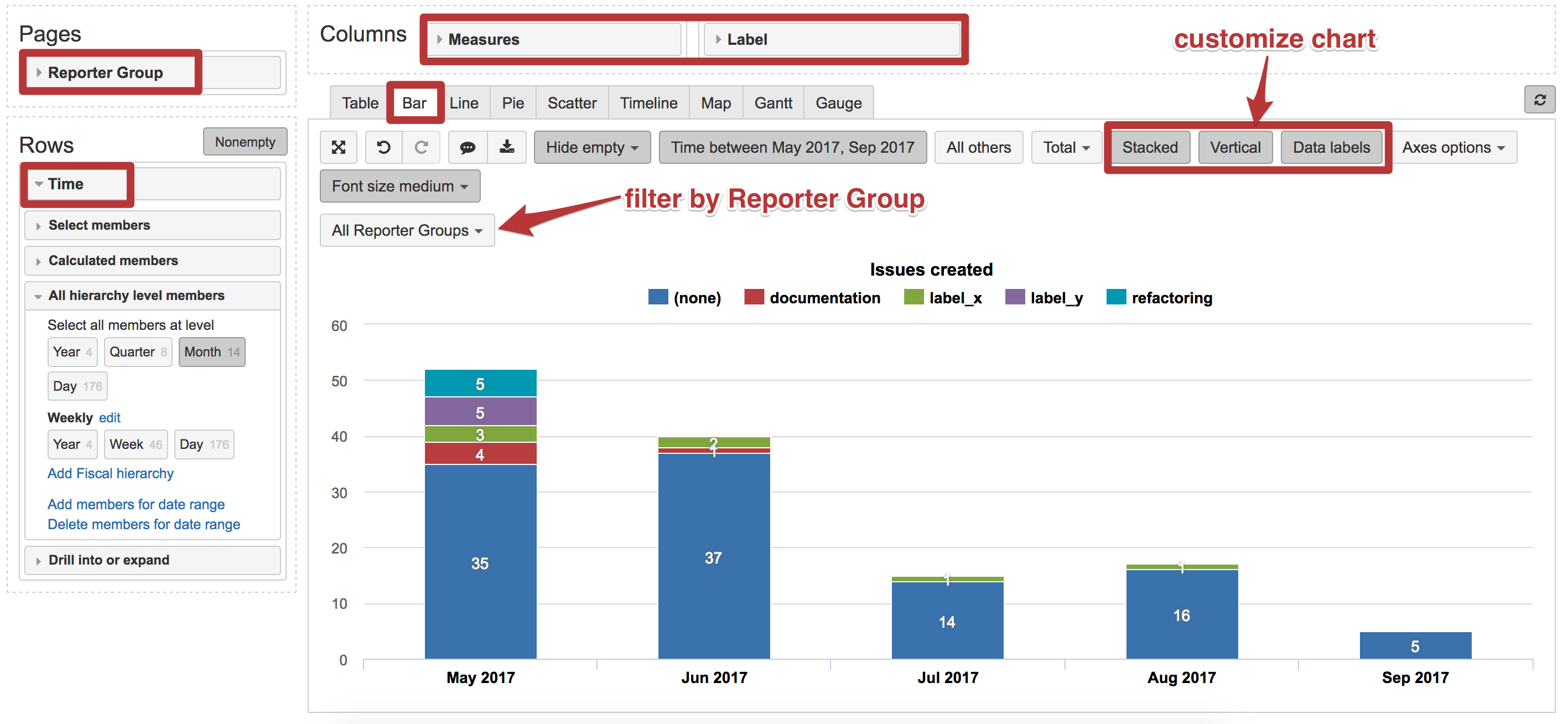
I do not know how you are representing customer information into your eazyBI account (custom field with customer name, groups of particular users or some other indication). However, you may analyze data by issue reporter or other dimensions.
For example, you may set “Reporter Group” dimension as pages and use it as a filter to get the report for each of reporter groups.
Best,
Zane Baranovska / support@eazybi.com