Hi
I Have a Report with a graph that is working fine.
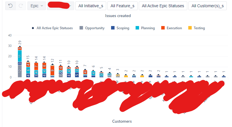
It has customers of epics in the rows and All Statuses of Epic on the columns
see PIC 1
the measure is Issue Created
I save the report in expended why (like PIC 1) so there is a column for each status and one for the All members
when I use this report in jira dashboard (as a single report gadget) it also looks fine as well.
However
when I add this report to an eazy bi dashboard
it always start collapsed like PIC 2
and this is actually a graph (see PIC4) so it is presented as in PIC 3 only totals
and I have to switch to table mode, expend manually and return to graph mode
and I have some reports like this
how can I make it start expended in the dashboard?
So I get PIC 4 on the start.
10x
Avi
PIC1
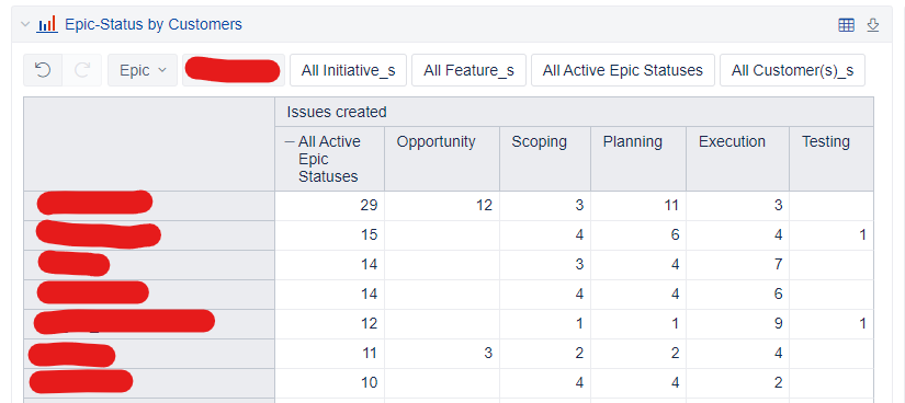
PIC2
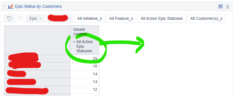
PIC3
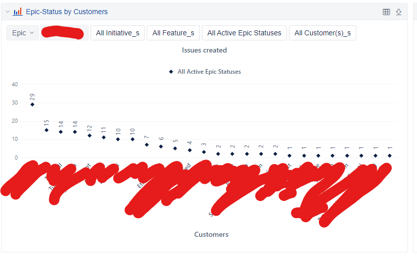
PIC 4