I am trying to plot two cumulative custom numeric fields (imported as Integers) over time with a selectable date ranges (currently Last 90 days and Last 180 days, but I may want to add more later).
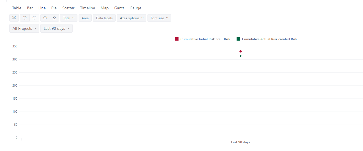
This works when only one calculated Time member (Last 90 days) is added. However, when adding the Last 180 days option as the second, the line chart changes to show just the first summed day values for the current filter (i.e. row) as single points and the plotted line(s) disappear. I can’t find a way to change how the lines are being plotted once the second filter option is added.
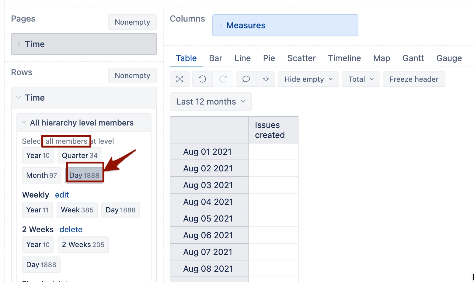
To reset this I have to remove the Last 180 day calculated member filter option and re-add the two original measured fields from which the two cumulative columns are derived. This forces the expansion of the Last 90 day calculated Time member to all days. The two cumulative columns then re-compute their values. I then remove the two original measured fields and the dual line chart works again.
There must be an easier way to create dynamic date sets (in days) as filter options?
After 180 Days is added