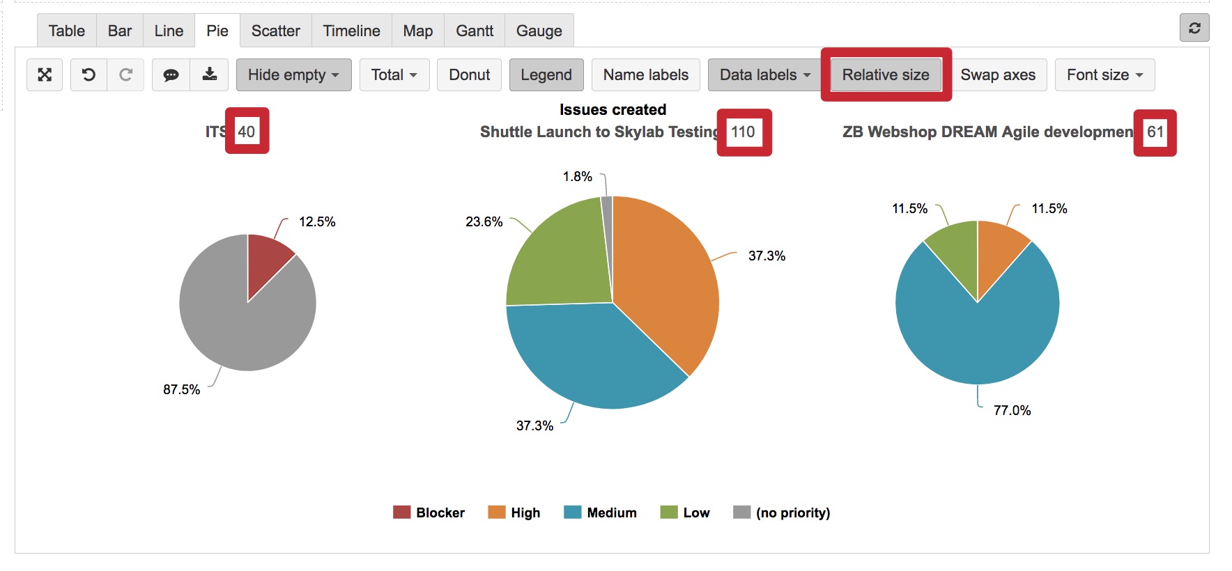
We’ve had a request, from our report users, to have pie charts where the size of the pie indicates how many records it represents, that way the pie charts could be side-by-side and show both the percentage for the different slices and the relative size of all the records represented in a particular pie.
In a Pie chart, you can set a Relative size to represent the data volume differences between pies (see picture below).
Thank you! That is what I was looking for.
Can you share more details? I do not see “Relative size” in my pie chart. Somewhat similar, I am looking for a way to highlight one segment from among several. It’s an arbitrary grouping, so there is nothing I can use in the existing data to group it.
I need just some way to single out one entry by hand from among the batch. And then have the pie chart show that grouping.
Ideas?
Right now I did it laboriously by hand to change the color of each slice of the pie chart so at least the color makes that one slice jump out visually. But that’s not a scalable solution…
Hi @lpattontr,
The option Relative size is available when you have more than one pie in the chart and it changes the size of whole pies compared to other pies. Option to change the size of one slice is not supported.
If you would like to highlight only one slice you may change the color of slices or use option (see picture below).
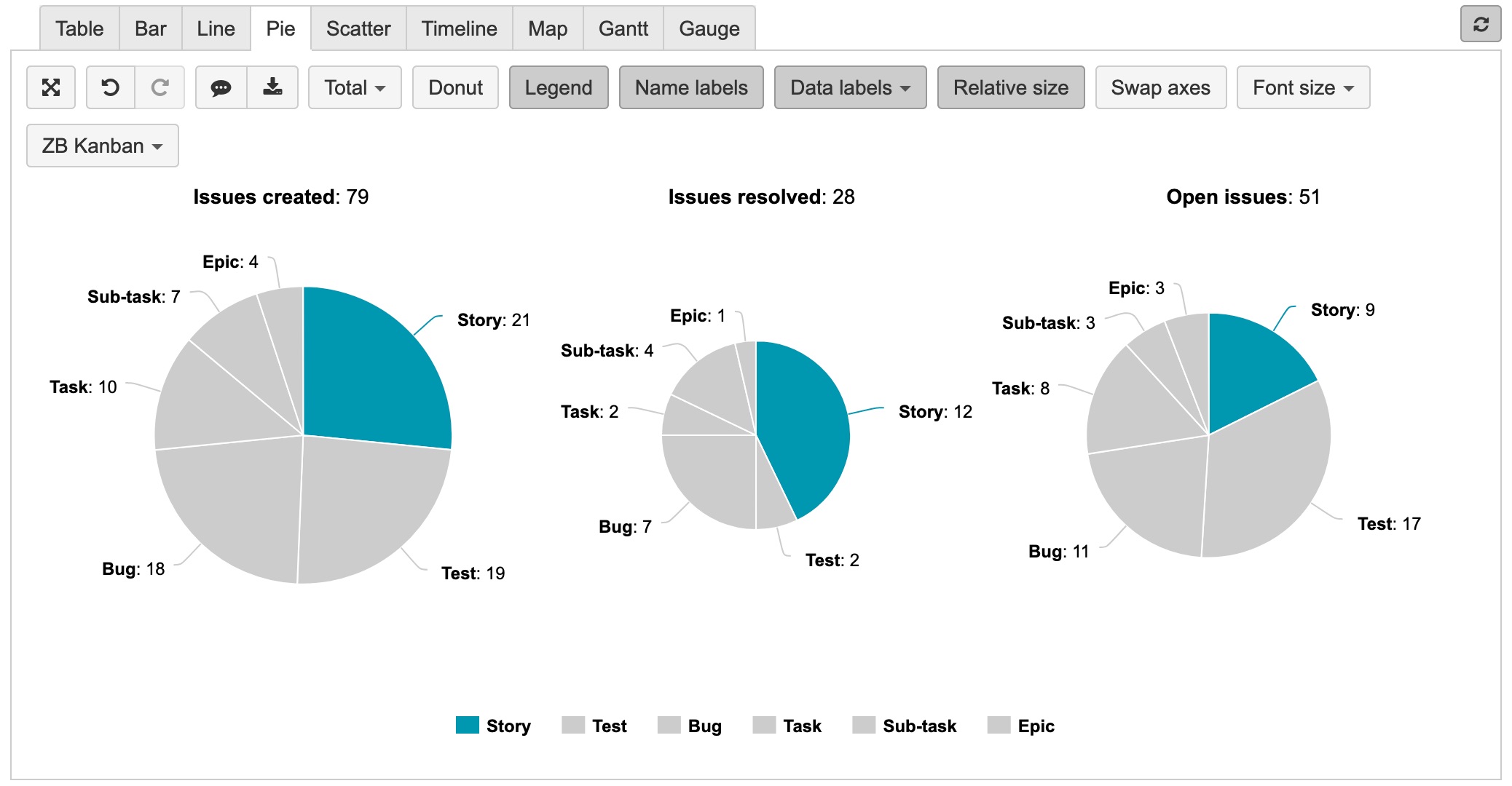
Probably you could use another data representation to focus user attention to that one value. For example, calculate the value as a separate measure and represent it on Gauge, for gauge limit you may select measure representing total value. (Gauge chart in the picture below represents the same data as Pie chart in the picture above)
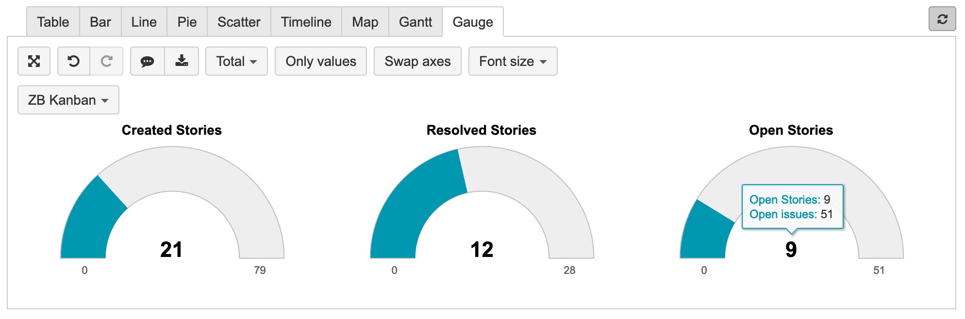
More on gauge charts and chart customization you can read in the documentation:
https://docs.eazybi.com/eazybijira/analyze-and-visualize/create-charts#Createcharts-Gaugechart
Best,
Zane / support@eazyBI.com
Thanks for clarifying the “relative size” button.