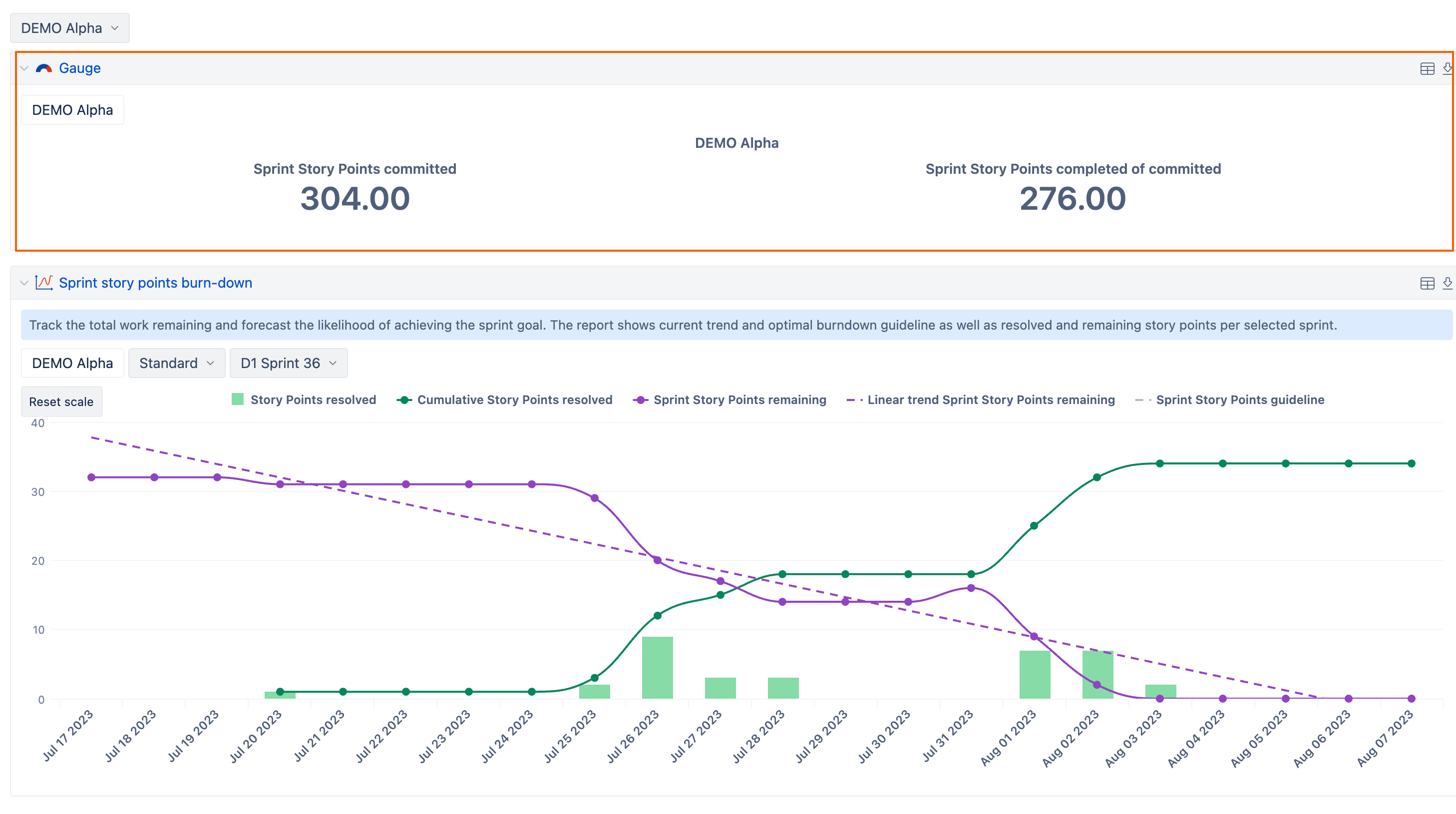
We often create dashboards utilizing many instances of a single chart. For example we have a dashboard showing sprint burndown for each of several teams. We create the dashboard with a single chart and use a page filter to select each team. These dashboards are generally sent via pdf email subscription.
It is currently not as easy as it should be to see which chart is for which team. You have to look at the page filter settings and there may be more than one present depending a particular report. Having filters visible on a dashboard makes sense in some cases, but not in others and I see an enhancement request already exists to be able to hide them.
This feature request is for the ability to add dynamic data to chart descriptions so that instead of trying to read a specific page filter, I can have a chart description that reads something like:
Sprint burndown for [Project].CurrentMember.Name