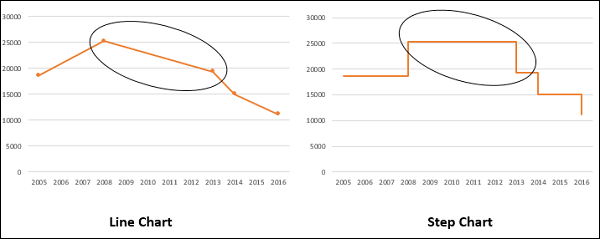
The current line graphs seem to indicate we gradually increase/decrease between data points, instead of demonstrating sudden events after a period of inactivity (ex: creation and resolution of Jira tickets). Events like these are better shown on a step line graph or step chart.