I’ve created a Bar chart which shows the total estimated remaining hours left for each member of the team. What I would like to have is a dynamic marker line which appears on the chart and updates each day to show the estimated hours they should have left in order to complete the work in the sprint. The line basically just needs to be number of working days left in the sprint multiplied by working hours in the day (currently set as 8), so would move left 8 hours every day.
Is this possible? Thanks in advance!
Have you heard back on this, I to am would like this feature, as I am tracking projected hours for employees. I would like a static line at 40 hours.
1 Like
Not heard anything back yet sadly, I was hoping it wouldn’t be a particularly hard thing to add!
Still really need this feature - any ideas?
Hi.
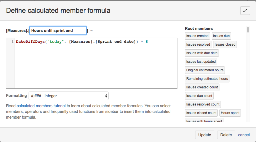
You can use a function DateDiffDays().
This function returns how many days there are between two dates. It will probably work like this:
DateDiffDays(“today”, [Measures].[Sprint end date]) * 8
You might also have to select a different formatting for the calculated member if it just shows “mmm dd yyyy”.
I hope that helps!
Gvido Neilands, flex.bi
1 Like
Thanks Gvido - I’d worked out the formula, but I don’t get how I actually display this as a line. I added it as a new calculated measure but nothing happens.
Hi,
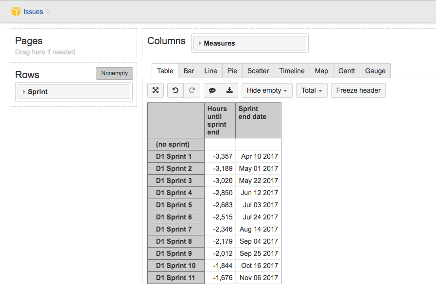
Please see some screenshots how I have set it up as an example. Please note that the values are negative because in my test data the sprint end dates are in the past.
Gvido Neilands, flex.bi
Cool, that’s pretty good, however it adds a horizontal bar to every row, which is a bit overkill as the bar is obviously the same for every row. What I’d really like is a single vertical bar would would easily show which horizontal bars are over. Does that sound doable?
Thanks so much for your input so far, it’s really appreciated.
@MarcBurrageCA
Please send a screenshot of your current report setup.