I want to modify the Created vs resolved issues over time report to have each bar for issues created and issues resolved provide the breakdown of the selected issue types. A percentage of each issue type would be even better.
Welcome to the eazyBI community!
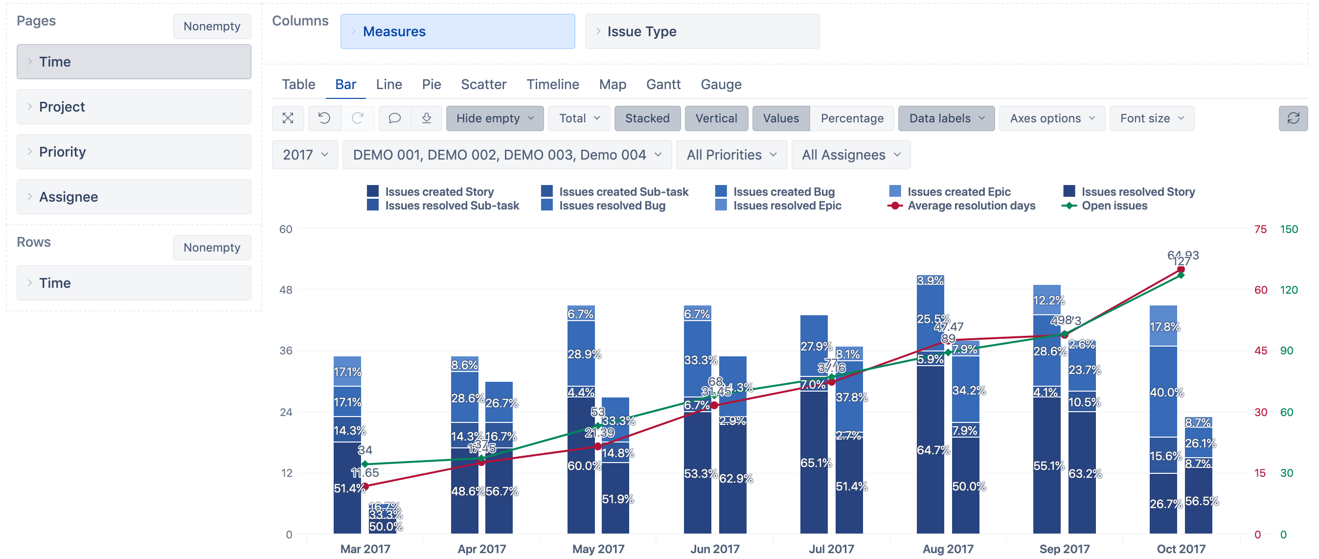
You may modify the existing “Created vs resolved issues over time” report:
- drill into the “Issue type” dimension from measures “Issues created” and “Issues resolved” : Create reports - eazyBI
- then display the report as a Bar chart where “Issues created” and “Resolved issues” would be vertically stacked bars, and “Open issues” and “Average resolution days” - lines.
- changing to Bar chart view, you would need again to set up separate axes for “Open issues” and “Average resolution days” measures
- Select Data labels > Percentage so you would see percentage for each issue type
- customize colors so they would match issue types for both measures
Though, this report could look too busy.
I suggest creating an additional report based on the same “Created vs resolved issues over time” (with [New] from the report). Remove “Average resolution time” and “Open issues” measures and move the “Issue type” dimension in columns. Then customize the chart (vertically stacked, percentage labels, align colors).
Then use the original report side by side with the newly created in the eazyBI dashboard
There are two training videos on how to customize charts and mix different chart types together: Training videos - eazyBI for Jira (episode 4 and 5).
Best,
Ilze, support@eazybi.com