Hey there,
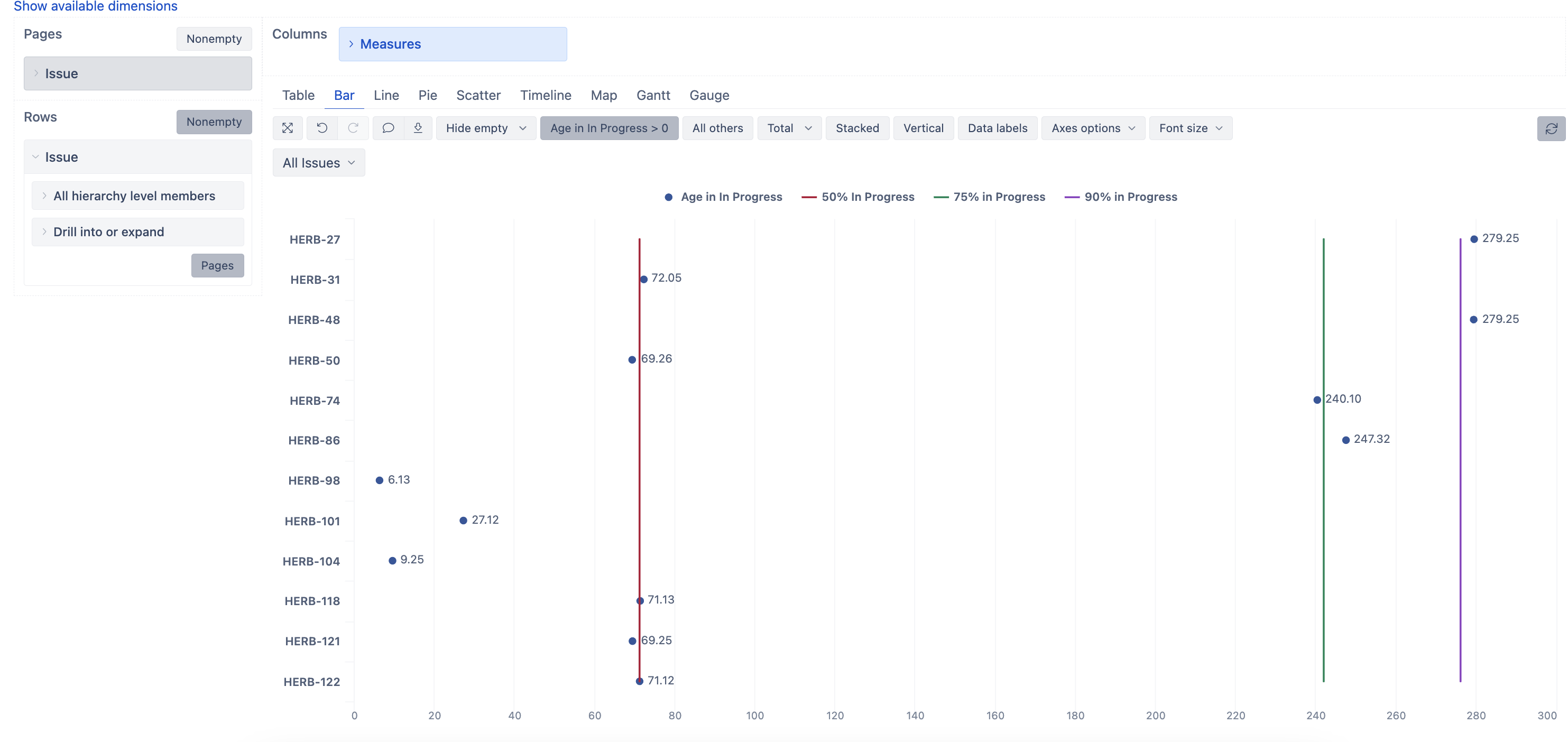
I would like to create a chart like shown in the screenshot which should help my development team to easily understand, if issues, which they currently have in progress, start to run out of the average cycle time of past items.
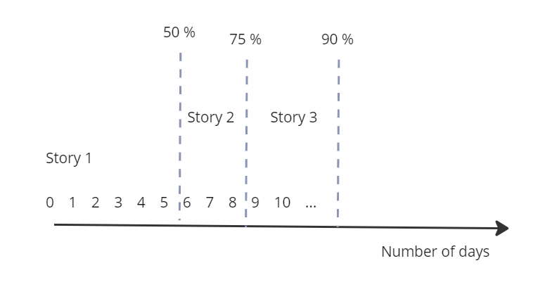
I’ve tried to draw the idea like this.
- On one axes, the number of days in a transition status “In progress” is shown. (As in our process two transition status potentially relfect the “in progress” status - active time, inactive time), it would be good if that could be flexible enough to add the transition status you need
- In the chart all items are shown which are currently in that status including the number of days they are in the status
- As vertical lines, I would like to visualize percentiles of how long past items took (e.g. 50 % of items took 6 days, 75 % of items took 8 days,…).
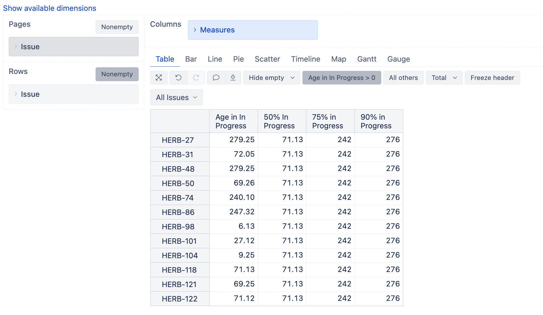
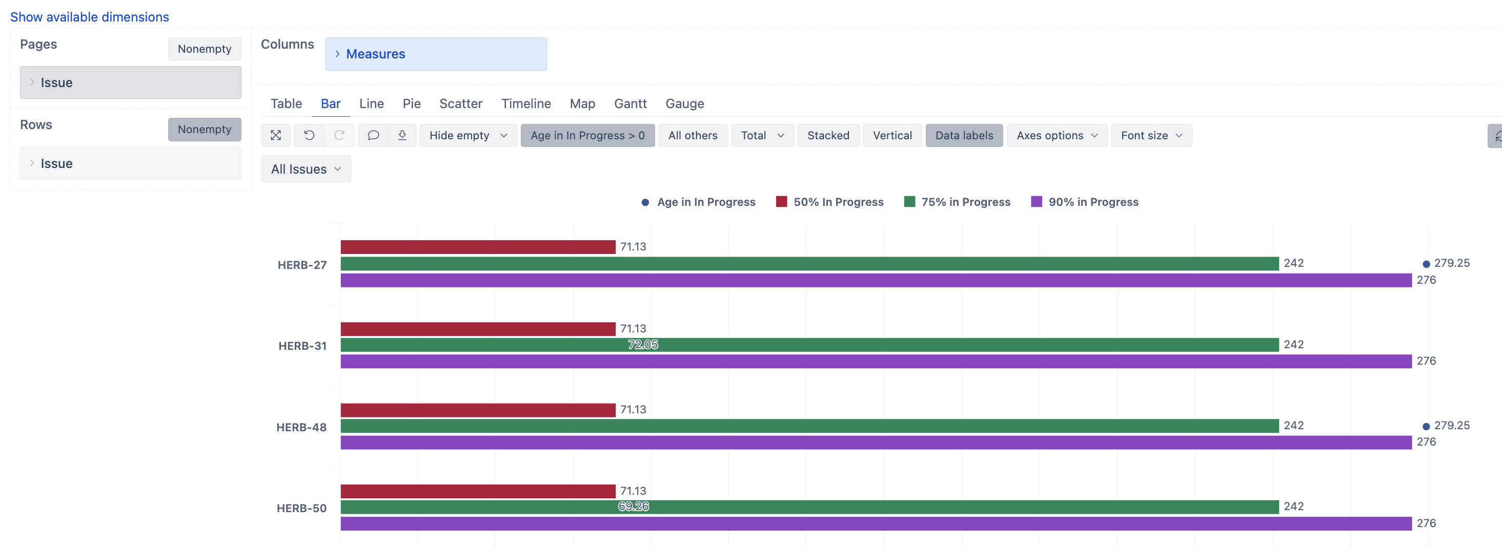
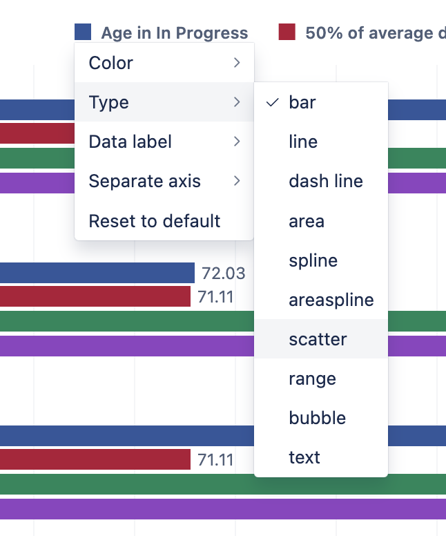
My skills of setting up such a report a very limited. ![]()
I would be happy to get some support on this issue.
Best regards
Daniel