I am trying to create a graph with a running total of tickets over time.
So for example if the following showed 5 weeks of ticket creation:
- w1 - 5
- w2 - 2
- w3 - 1
- w4 -1
- w5 - 3
Then the bar chart would show:
- w1 - 5
- w2 - 7
- w3 - 8
- w4 - 9
- w5 - 12
I am trying to create a graph with a running total of tickets over time.
So for example if the following showed 5 weeks of ticket creation:
Then the bar chart would show:
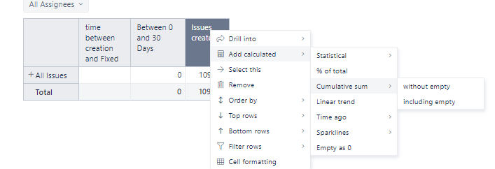
Hi @daruma,
I think you could use the included cumulative Sum.
In your table, click on the measure you want to have a cumulative sum for, select Add Calculated > Cumulative Sum and choose if you want including or excluding empties.
Once that is done, you can remove the original column if you don’t need it.
Have a good day,
Marilou