Hi,
I feel a bit daft for asking… But after extensive search online and here I just couldn’t find an answer.
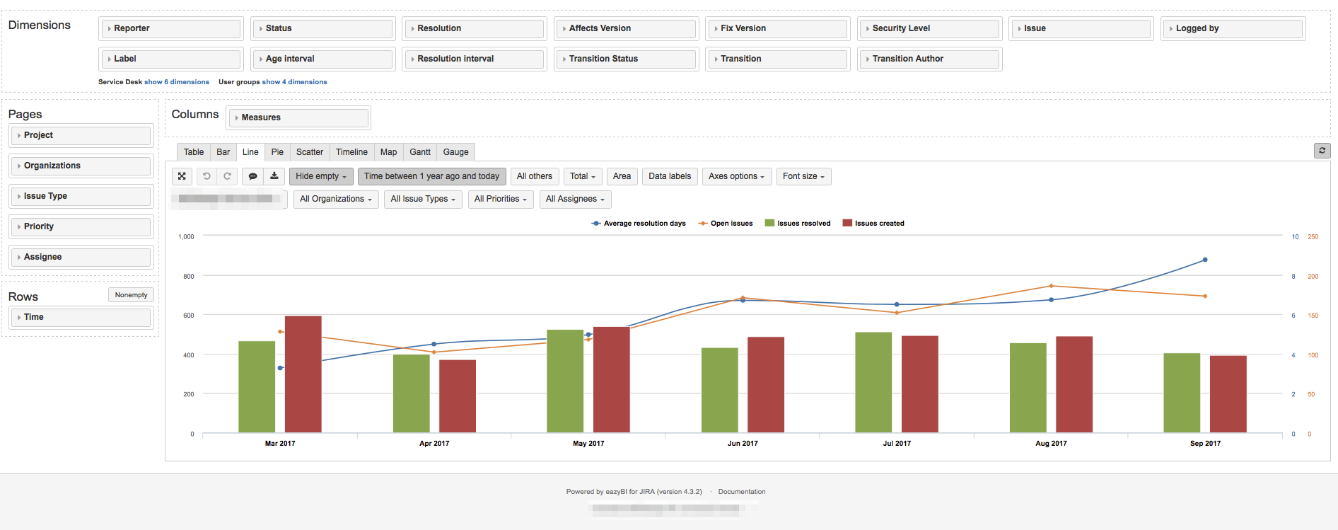
I use EazyBI in conjunction to Jira Servicedesk. And one of the preloaded reports is:
Created vs Resolved. A nice and clear graph. Useful in every way.
As vertical bars these amounts of opened and closed tickets are being represented.
There are two lines accompanying these bars…
These represent the amount of days it took to resolve the issue fully and the amount of open issues at that moment in time.
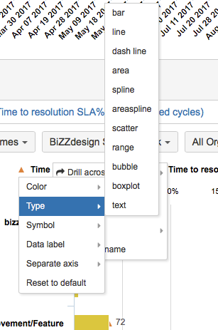
But these are shown as lines and not as bars…
And I feel daft about not being able to figure out … how they mix this…
How do you determine not everything is bars and where do I tell the later two to be lines …
Any push in the right direction will be awesomely helpful…
Grazie,
Armin