Hi Team,
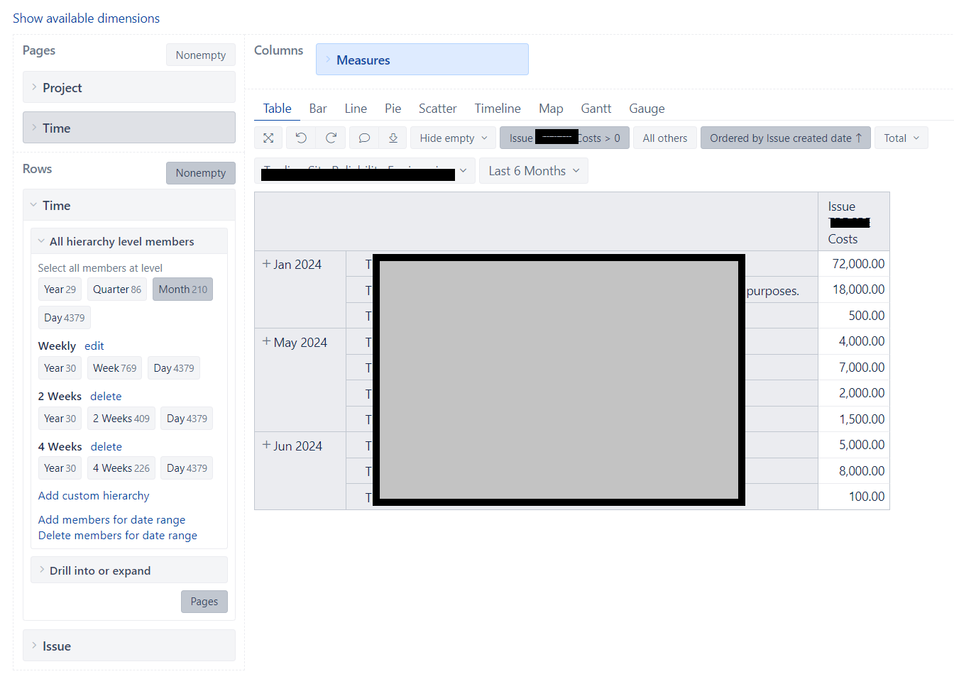
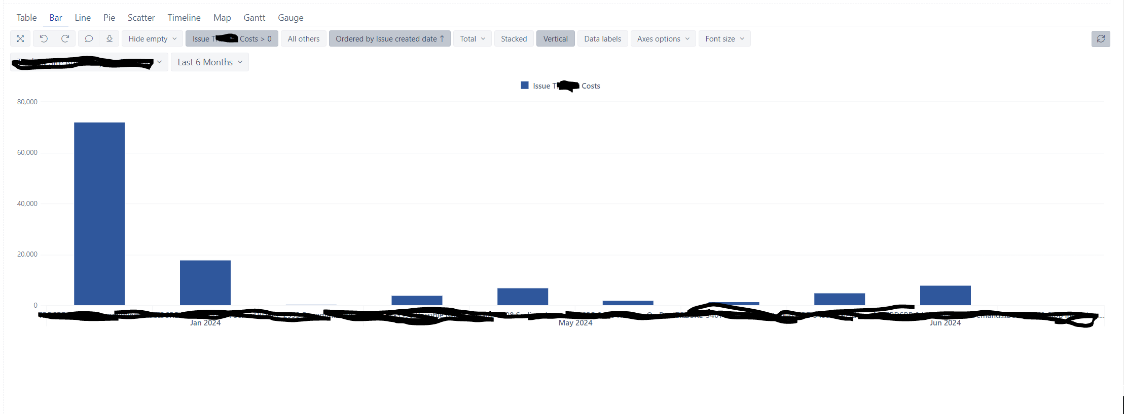
I’ve been struggling with this report for a while. I have a field T_cost where I hold numerical value. I need to create report (ideally simple bar chart) which shows what was the cost per month.
Please import the field “T-cost” as a measure in the eazyBI import options “Custom fields” tab - Jira custom fields. That way, eazyBI will create numeric measures tied by important dates of the issues in which the field “T-cost” is specified.
For example, the measure “T-cost created” will tie the “T-cost” value to the issue creation date, and with the Time dimension in the report, it will sum all issue values that were created in the particular period.
So, in your case, you can remove the Issue dimension from the report and replace the issue property “Issue T-cost” with “T-cost created”.