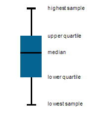
I would love to be able to create a box-and-whiskers plot, which shows the min, 25th percentile, median, 75th percentile, and max. Bonus points if I can visualize individual outliers. I see this as a variation on the scatter chart when one has a step-wise function (such as date or story points).
Example here:
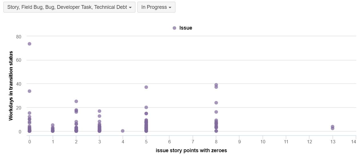
In particular, I would like to show the number of workdays in progress based on the assigned story point estimate. Right now, I can get a sense of it, but I’d love to be able to see this more precisely.
Hi @viviane,
In eazyBI, you may draw Boxplot charts when you have five required measurements:
- Min,
- 25th percentile (or first quartile),
- Median (or average),
- 75th percentile (or third quartile),
- Max.
Please see the documentation where is short video how to draw Boxplot chart:
https://docs.eazybi.com/eazybi/analyze-and-visualize/create-charts#Createcharts-Boxplotchart
Each of the five measurements should be defined as a new calculated measure in Measures using aggregate functions over the same set of issues (https://docs.eazybi.com/eazybijira/analyze-and-visualize/calculated-members#Calculatedmembers-Aggregates).
In the eazyBI demo account, you may check out example “Issue Resolution Time (Boxplot Chart)” one boxplot report and calculations to see approach how to build calculations for five measurements:
https://eazybi.com/accounts/1000/cubes/Issues/reports/91815-issue-resolution-time-boxplot-chart
Best,
Zane / support@eazyBI.com