Bubble chart - age vs comments vs partcipants

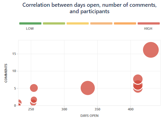
In Jira Dashboards you can make a very useful bubble chart out of the box showing incidents based on age, comments and participants. This chart is great for finding forgotten or high risk incidents that need some attention.

bubble-age-comments-participants

I’ve created a Comments measure based on the below post:

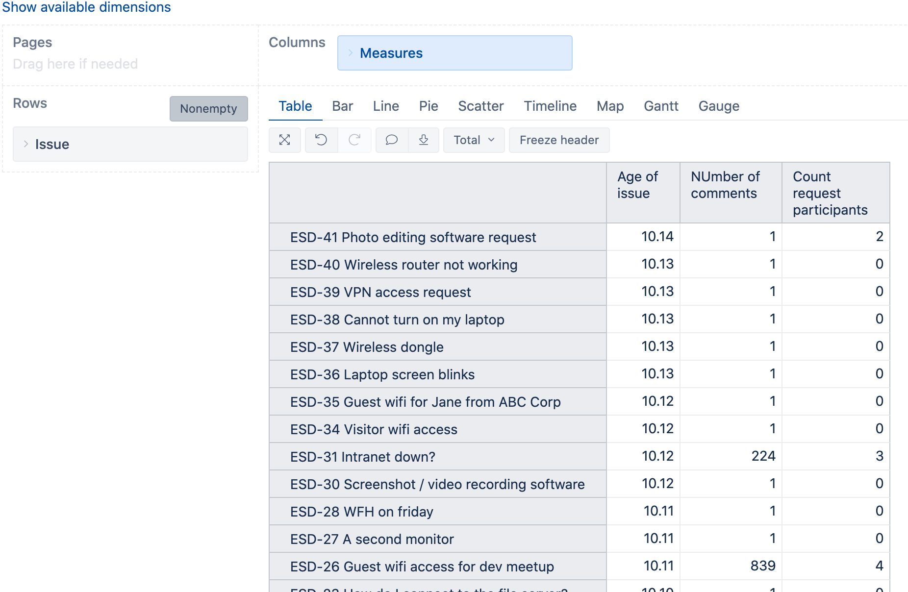
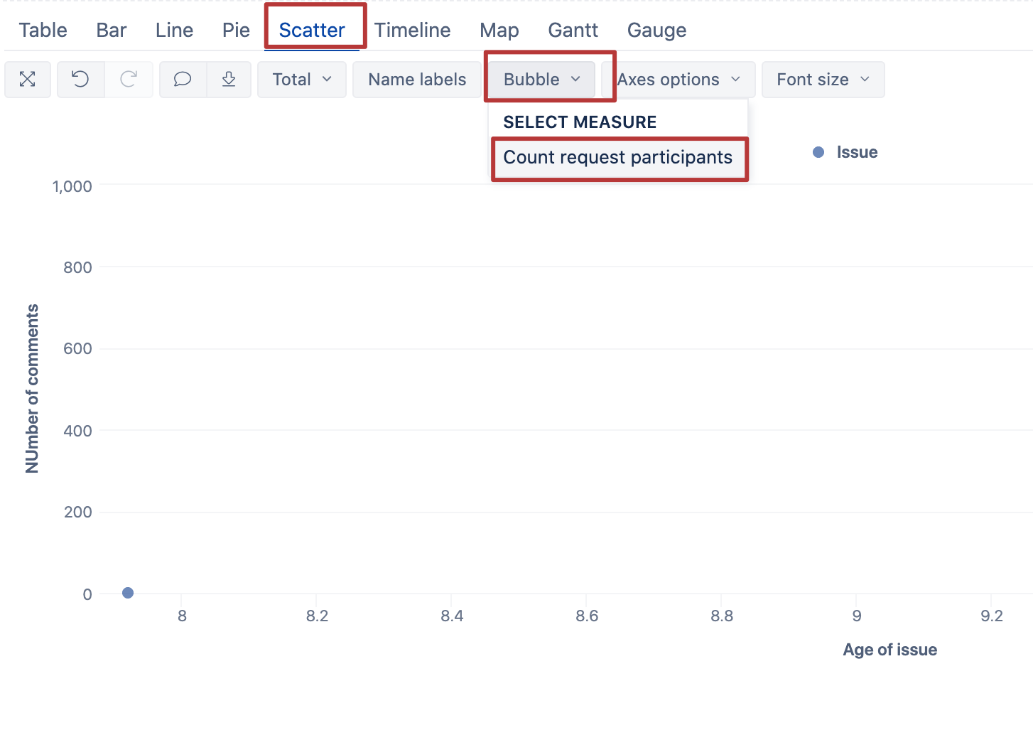
but I can’t work out how to recreate the Jira bubble chart with age, comments and participants.

Hi,

You can create a very similar report in eazyBI. For that, you need two more measures besides the comment count:

  1. Calculation of the age in days:

    DateDiffDays(
    [Measures].[Issue created date],
    Now()
    )

  2. Counting the number of request participants:

    Len([Issue].CurrentMember.Get(‘Request participants’))
    -(Len(Replace([Issue].CurrentMember.Get(‘Request participants’),
    “,”,"")))

The table view should look like this:

Then you can switch to the scatter chart with the bubble option:

Kindly,
Janis, eazyBI support