Hi team,
I have two custom date fields -
- Issue start time
- Issue end time
I need help regarding building a formula to find out the average of (Issue start time - Issue end time) on a monthly basis.
Whatever formula I try, the graphs get built only around the Issue Created/Resolved time.
Can you please help me with the formula or any documentation explaining such scenarios?
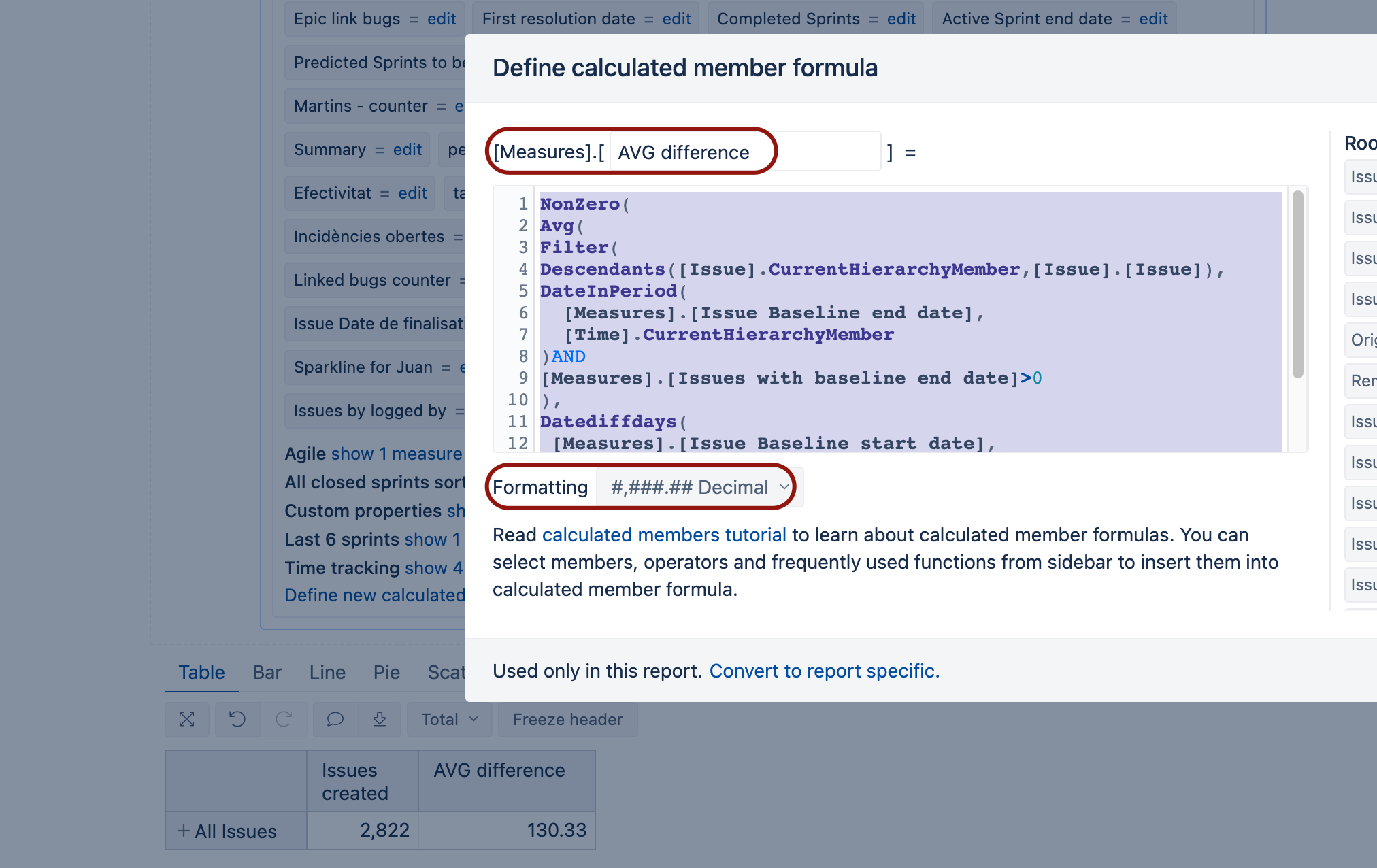
Hi @Supratik_Sarkar
First, make sure that you selected in the import options page and imported your both date fields as measures and properties in the eazyBI data cube.
https://docs.eazybi.com/eazybijira/data-import/jira-issues-import#JiraIssuesImport-JiraCustomFields
Then you could create a new calculated measure to calculate the average difference (issue start - issue end time) for issues that have an end date in the displayed period.
Try this formula for your calculated measure (and save it in decimal format)
NonZero(
Avg(
Filter(
Descendants([Issue].CurrentHierarchyMember,[Issue].[Issue]),
DateInPeriod(
  [Measures].[Issue end time],
  [Time].CurrentHierarchyMember
)AND
[Measures].[Issues with end time]>0
),
Datediffdays(
 [Measures].[Issue start time],
 [Measures].[Issue end time]
)
)
)
And don’t forget to enable “Nonempty” cross join for your report query.
https://docs.eazybi.com/eazybijira/analyze-and-visualize/create-reports#Createreports-Pagedimensions
Martins / eazyBI support