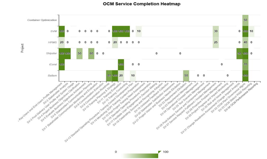
Rows = Individual OCM Epic issue types, labeled like OCM-101 Name, OCM-102 Name, etc.
Columns = Project Names
Cells = Metric value, such as progress (percentage of completion of each OCM Epic)
Color intensity = visualizes that metric for each epic-project combination
Each OCM Epic is associated with a specific project. I want to show each OCM Epic as its own row and see how it relates to different projects across the columns — all visualized using heatmap colors.
Could someone help me build this? Below is an example of the final result I’m aiming for:
My eazyBI is for Jira Server/Data Center, and it does not have a Heatmap chart, as it is the old version of eazyBI. Therefore I should use table with conditional formatting.**
An OCM Epic is an issue type that has a different key prefix for each project but shares the same summary/title. For example, we have BAL-400 Stakeholder Analysis for Project BAL and TMS-102 Stakeholder Analysis for Project TMS. The goal is to group all these similarly named epics under a single entry called ‘Stakeholder Analysis’ by creating a new calculated member in the Issue dimension, which will be used as a row in the report."
Any guidance or suggestions would be greatly appreciated!
Conditional formatting heatmap is the perfect solution for your reporting requirements. This functionality was introduced in eazyBI version 6.2, released in 2021.
We always recommend users to use the latest eazyBI version that includes new features and improvements: Changelog - eazyBI for Jira
Regarding grouping issues by a similar text in the issue summary, I suggest checking this community post about the JavaScript calculated custom field solution:
@gerda.grantina, thanks for sharing the link. I want to handle it using an MXD query.
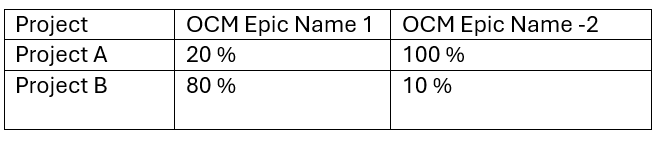
The OCM Epic Name represents the issue type. The percentage in each cell indicates the proportion of completed OCM tasks relative to the total number of OCM tasks (where OCM tasks refer to child issues within the OCM Epic). Below is the expected output: