I am stuck with what is the right approach to get to the ultimate goal of a “timeline” or Line report to show rolling averages of a difference between two custom datetime fields.
Admittedly, I am new to EasyBI. So when I created my first report, I wanted it to read like a spreadsheet. But now that I am converting it into a visual, I am having problems converting the data to match what the timeline is expecting.
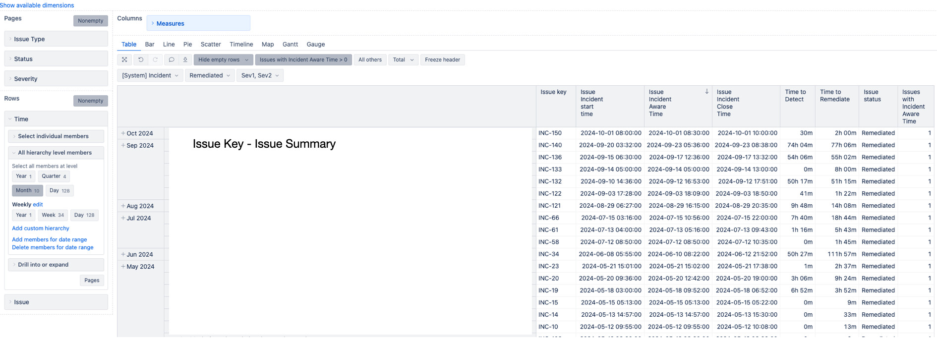
Here is a picture of my first report. I am using Time and Issue in my Rows to group the issue by month and calculate the custom fields/measure to get diffs (DateDiffMinutes) in "Time to Detect " and “Time to Remediate” Custom Measures.
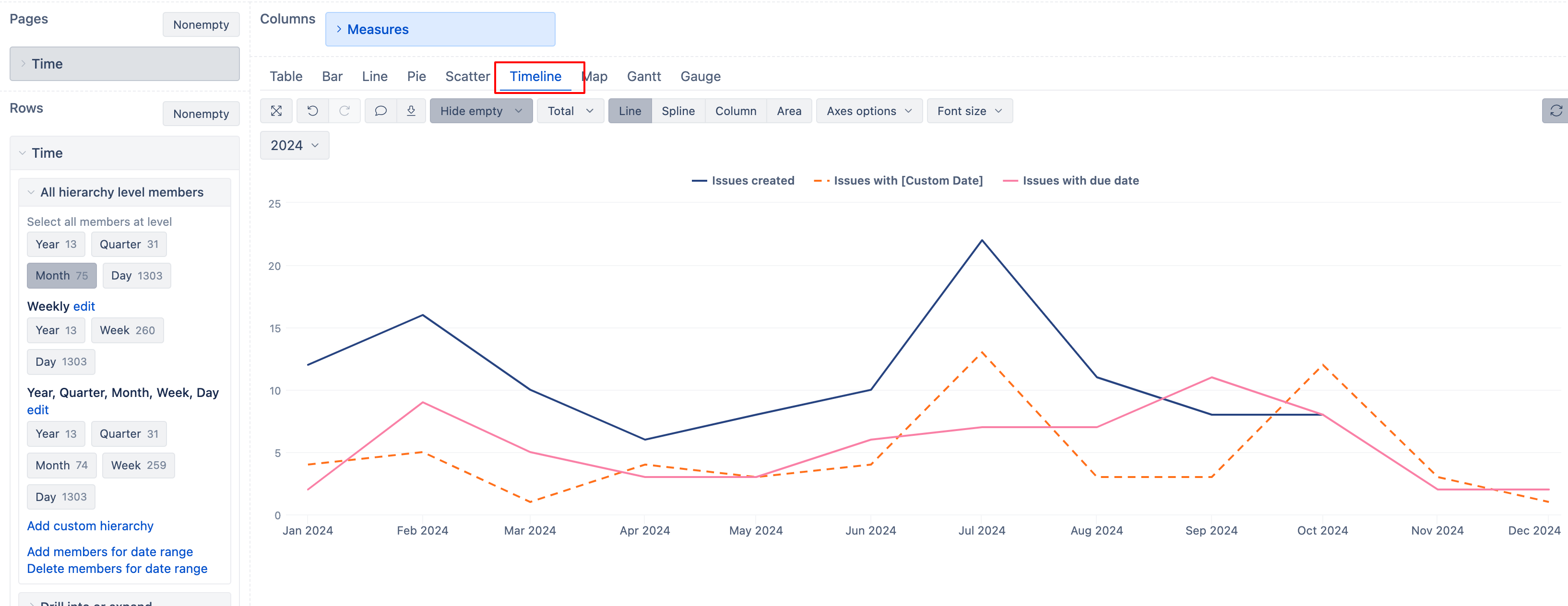
When I try to visualize this in the Timeline view, it shows each record on the X axis which is obviously not what I am going for.
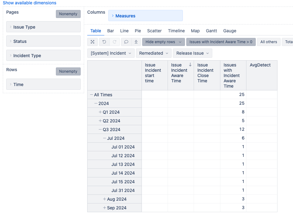
So I try removing the Issue dimension from Rows to get aggregates of just issues in a month. But when I do that, I lose all of the Measure details per item (see first comment below).
I been looking in the Community forums all day trying different approaches. But I still cannot get the issue details related to the custom DateTime measures.
We already discussed your use case internally, however, I’ll post the answer in case other eazyBI users might face a similar issue.
The main reason the Timeline chart isn’t working is because issue properties are used, instead of measures
To display how many issues belong to the selected Time period, you need a measure. You can learn more about main concepts and difference between properties and measures here - Main concepts
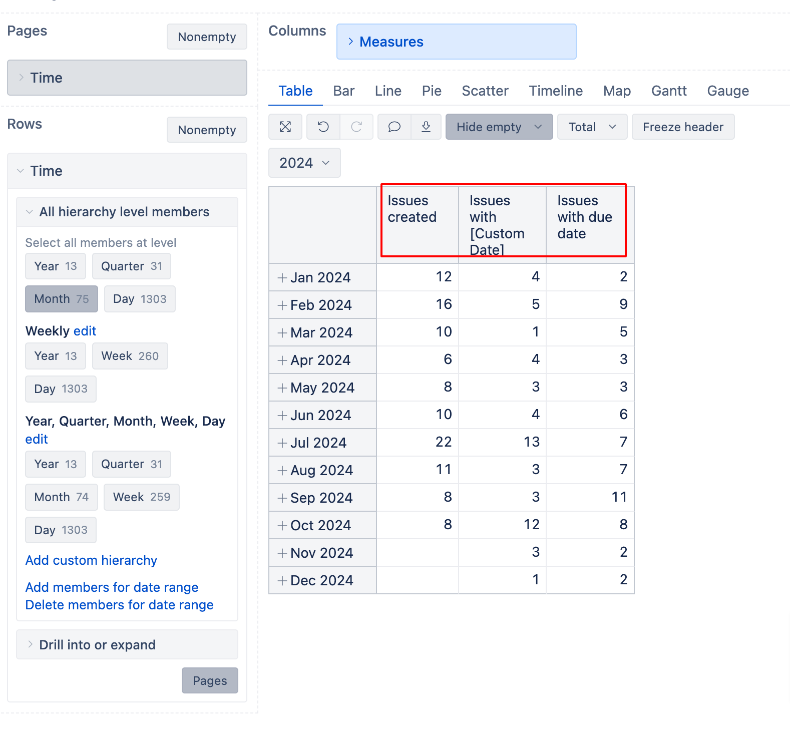
To display the date fields as measures, you should select the custom fields to be imported as measures. For example, you have a custom field “Incident Start Time”. You should make sure that this field is imported as a measure, and then select (from Measures dimension) a measure named “Issues with Incident Start Time”. This will return the count of issues that have the Incident Start TIme in a selected Time period.
Here in screenshot below, I have given an example of measures that answer 3 different questions. These all questions require a “measure” to answer the asked question.
For how many Issues the issue creation date is in the selected month?
How many have the Custom Date field in the selected month?
How many issues have the due date in the selected month?
I have similar issue. I have a custom date field “Splitting and analysis start” and I need to calculate a rolling average of time between Splitting and analysis start and resolution date on a monthly basis so that on the timeline I see the average date difference from issues that have a resolution date in the previous 12 months.
So for example the November 2024 number would be calculated from issues resolved in between December 2023 and November 2024, and the October 2024 number would be calculated from issues resolved between November 2023 and October 2024.
I have tried with the AI assistant but not getting results. Whatever I try, I only manage to get a timeline that includes only the average of the issues resolved during that month. So for example the November 2024 number includes only those issues that were resolved in November 2024, not the rolling 12 months average.