Hi, At the begging I’m sorry if that question was already somehow answered, maybe I’m not able to find the answer because I do not “look” for right question.. Please point me how/where and I will do my best to figure it out. But so far no luck.
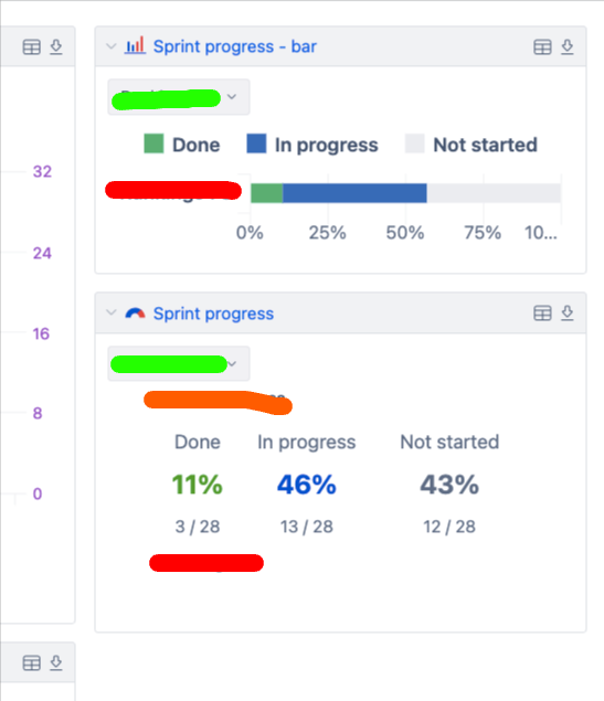
On the image, we have a “section” of a dashboard. What I would like to do:
- remove the “labels” colored in red
- make the green one driven by one selection, so it’s not separate per each report.
Hi @Slawek
Welcome to eazyBI Community, and thanks for posting your question!
Removing chart labels: Unfortunately, it’s not possible to completely remove the labels from charts as they are essential for data interpretation and chart readability. However, we have a ticket in our backlog regarding this and I have upvoted it on your behalf. If/when the feature is implemented - you will be notified about it here.
Have only one filter: You can achieve this by setting up a common page filter for your dashboard. Here’s how:
- Edit your dashboard
- In any report that has the dimension you want to make common (like Sprint or Time), click on the page dimension dropdown
- Select “Common page filter” at the bottom of the list
- This will move the filter to the top of the dashboard and apply to all reports that contain this dimension
See Create dashboards documentation regarding this
Let me know if you have any follow up questions regarding this!
Best regards!
Elita from support@eazybi.com