Hi, I (newbie) hope someone can tell me if what I’m trying is possible or not and if my approach was somewhat correct.
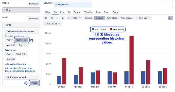
I wanna do two bars next to each other for 5 years in a row.
Such as:
[KPI 1] [KPI 2] [KPI 1] [KPI 2] [KPI 1] [KPI 2] [KPI 1] [KPI 2] [KPI 1] [KPI 2]
X- Axis: 2020 2021 2022 2023 2024
Under Measures in Columns
KPI 1: Calculated Measure: Aggregated Measures (Custom Numberfields) such as '20 Q4 created + '21 Q4 created + '22 Q4 created…
KPI 2: Calculated Measure: Calculated Measure (Total of X) + Calculated Measure (Total of Y)
X: Calculated Measure: Measure X for 2020 created + … + Measure X for 2024 created
Y: Calculated Measure: Measure Y for 2020 created + … + Measure Y for 2024 created
Under Rows in Status
Calculated Member “2020”:
IIF(
(
[Measure].Current Member IS X for 2020
OR [Measure].Current Member IS Y for 2020
OR [Measure].Current Member IS '20 Q4
),
[Measure].CurrentMember,
NULL
)
Calculated Member “2021”: Same as above, just with different year
Calculated Member “2022”: Same as above, just with different year
Calculated Member “2023”: Same as above, just with different year
Calculated Member “2024”: Same as above, just with different year
So I get the view I want this way, but I can’t use a Time Filter really and I wanted to do this with history not created since it doesn’t make a lot of sense this way.
Info:
In Jira the first KPI is entered by Users as a total and then split with a Listener to a ramp up over customfields which start with Q1 Year 1 up to Q4 year 5. X and Y have for each year one custom field respectively, were Useres enter the data.
My Goal:
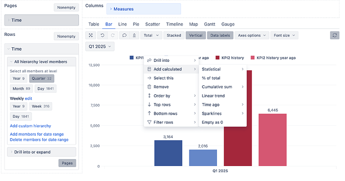
Useres wanted now a Bar chart where for each year KPI 1 had a bar and KPI 2 (X+Y) had also a Bar over five years. They also wanted a functioning Time filter (down to Quarters), which I not even sure how to implement.
If anybody can help me, I’d really appreciate it.
Have been trying a lot of different things for a couple weeks now.

