Hi, I
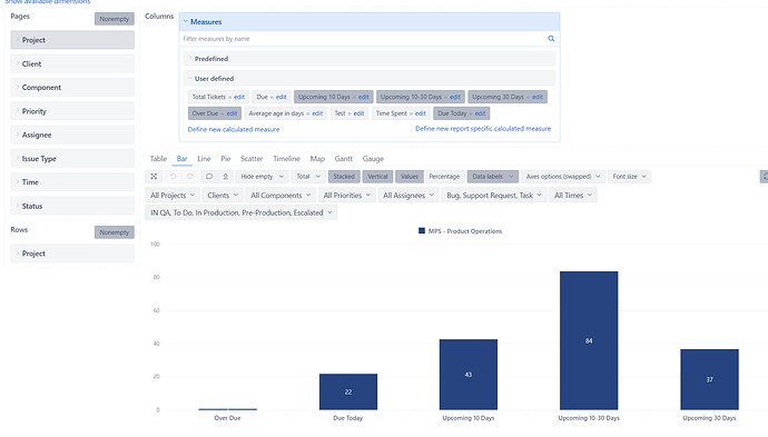
Im trying to perform conditional formatting for the Bar Graph mentioned here on basis of the measures mentioned here. For example, Red for Overdue, Amber for Due today etc. I tried using the Keywords to format, however it dint work. All the 5 bars in the graph are custom measures created. Is there a way I can achieve this.
Hello @anoopkrkumar,
Thanks for reaching out to us!
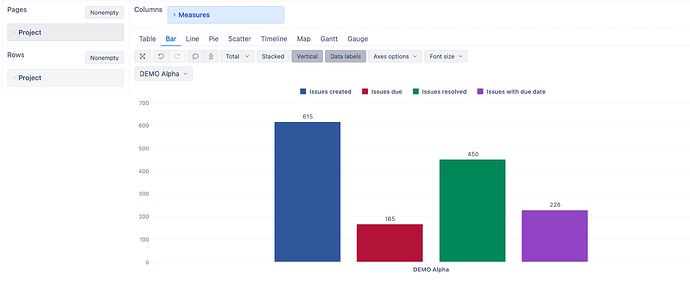
Conditional formatting is available for measures. Here is an example of it in our demo account sample report: Unresolved issues by priority with chart formatting - Issues - Jira Demo - eazyBI
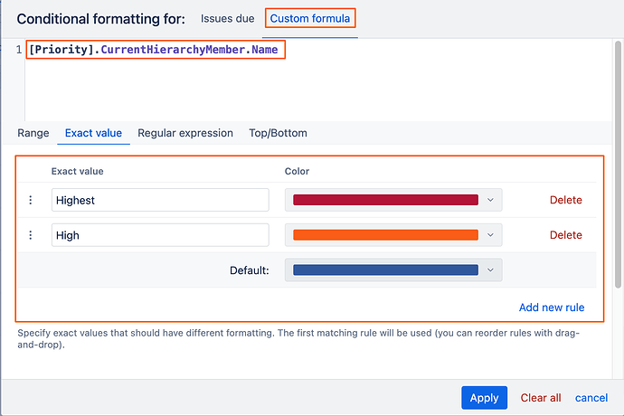
If you left-click on the icon in front of the measure “Issues due” → “Color” → “Conditional formatting”, you can see how a custom formula can be used to color code the different members of “Priotity” dimension.
In your case, however, you have swapped axes and this option would not be working in the same way. The workaround would be to swap the axes back, select the necessary project in the Page filter & then pick the colors for each measure as needed.
I hope this helps!
Best,
Marita // support@eazybi.com
Thanks @Marita_Burgio for the workaround. It seems that’s the only way I can achieve it.
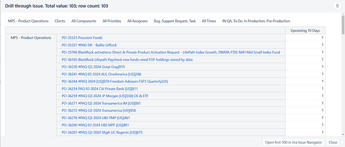
One more query I got. When i drill down to the underlying data say for example I click the bar Upcoming 10 days, it gives me the list of the tickets which are due in 10 days. However in the right side column I would like to see how many days are remaining with respect to the due date. Is there a ready measure available for it.
Hi @anoopkrkumar,
“Drill through” Issues will show you the list of the issues but this view is not customizable. I suggest using “Drill across” → “Issue” → “Issue”.
Then you can create a new calculated measure using DateDiffDays function:
DateDiffDays(
  [Measures].[Issue due date],
  Now())
You might need to adjust [Issue due date] measure with the one you are using in your report.
Best,
Marita // support@eazybi.com


