Hi everyone,
I want to have a stacked bar chart, which includes
- Issues created
- Issues resolved
- Open Issues
I would like to have the percentages and Data labels with Values and percentages shown.
Issues created should be always 100% and the rest, issues resolved and open Issues should have the part percentages.
e.g. I have 5 created Issues, 2 Resolved Issues and 3 Open Issues, which should show percentages like this:
100%, 40 % and 60% (created, resolved and open issues)
I would appreciate some help,
thanks! 
Hi, @Krisnomaly
Welcom to the eazyBI community!
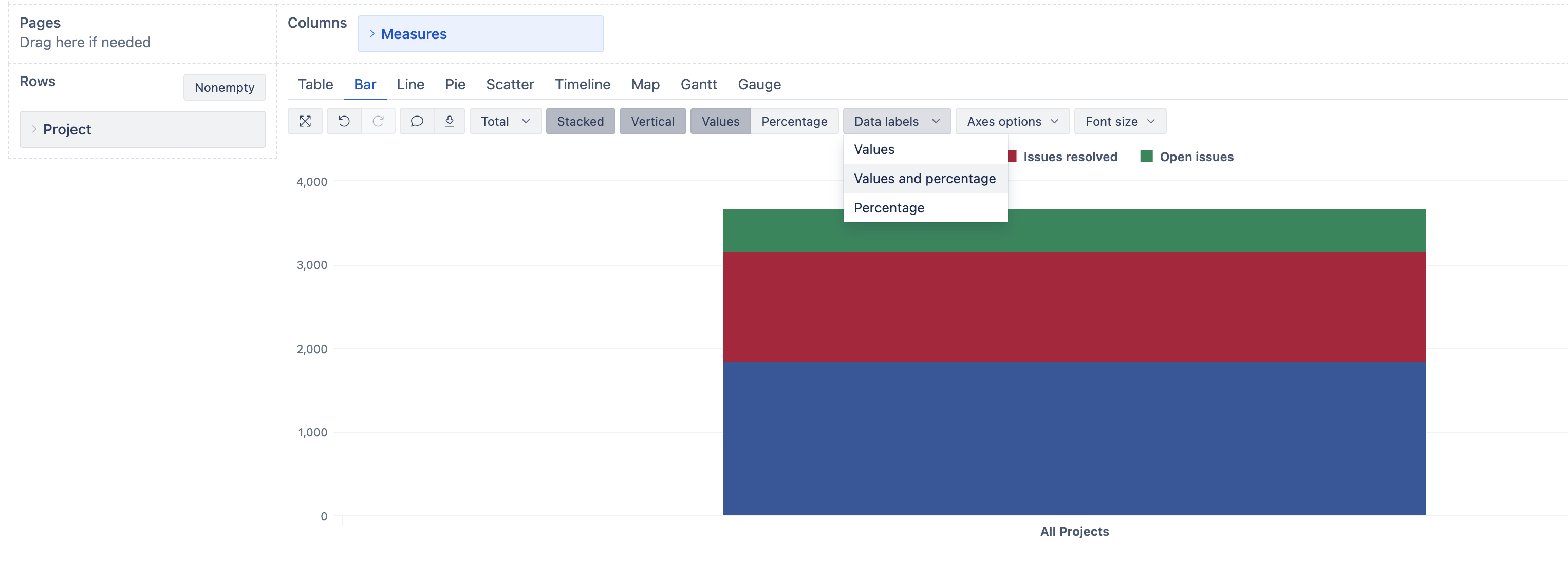
Please add the Project dimension to the rows.
Please select measures:
- Issues created
- Issues resolved
- Open Issues
Switch to the Bar view:
-
Select “Stacked”, “Vertical,” and “Data labels”, the report should look something like this:
-
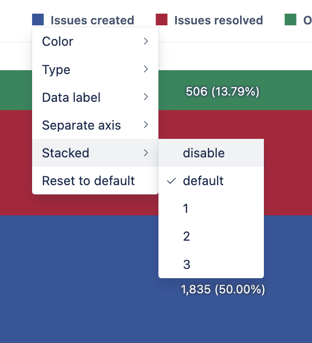
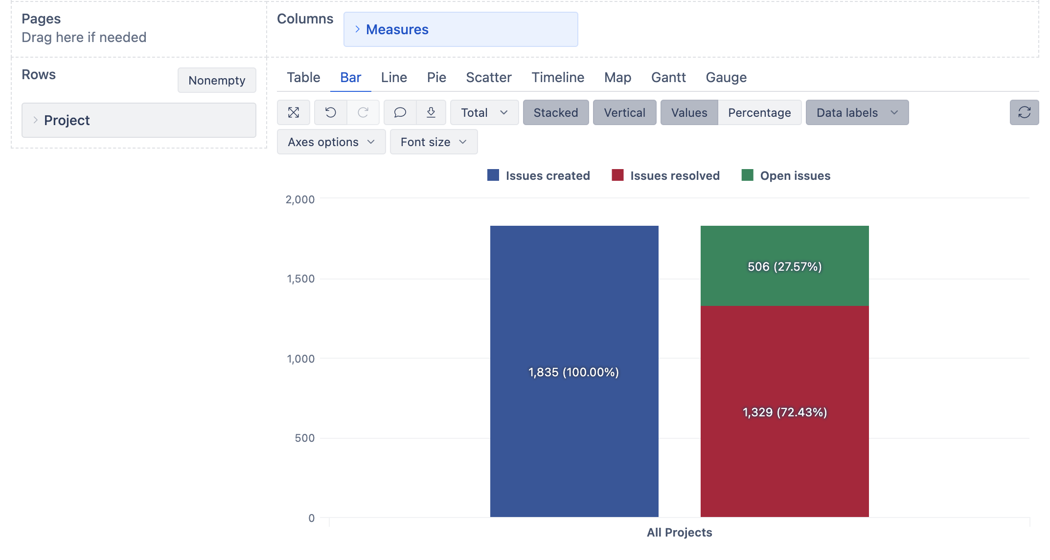
To remove “Issues created” from the stack, please go to the measure (in. my case, blue square before “Issues created” name) and select “Stackes → disable.”
The report now has the measure “Issues created” separately.
If you want to see the data through the Time, please remember that each measure connects differently with the Time dimension.
For example, Issues created by creation date and Open issues - from the beginning of the time until the end of the selected time period. Please read more about these measures under “Jira Core measures and dimensions” section: “Measures” in our documentation page: Jira Core measures and dimensions
Kindly,
Ilze
Thanks for sharing …informative
Hi, @ilze.mezite
thank you very much for your help.
This solution helped me a lot! Now I can work with this.
Kindly,
Kris