I have a custom field country with the name of countries that I would like to display in a map chart.
As far as I have seen, the chart works with two letter ISO code (US, ES, UK…), so I would like to know if there is any possibility to do the mapping between name and code when defining the cube.
This way, users can continue working with real names and chart can do the work behind the scenes.
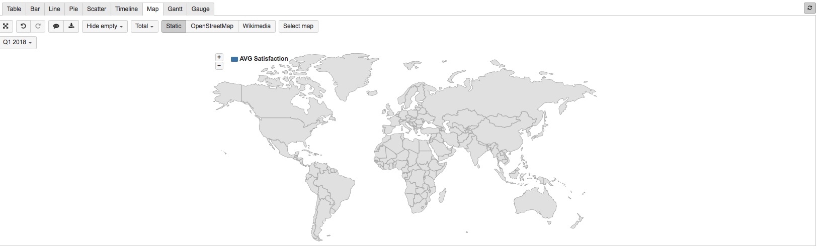
After solving my previous problem I started to look at the map in the tool.
I would love to see the average Satisfaction rate of the resolved issues bound by country of the customer.
But how to achieve this.
there is a MAP, but I cannot find anything that will teach me anything about how to make use of this.
Is there manual or training documentation where we can learn the deeper knowledge of the BI tool.
As I’m afraid it hold a lot more that I don’t get out of it
I’m going to study this, and try to get it to work…
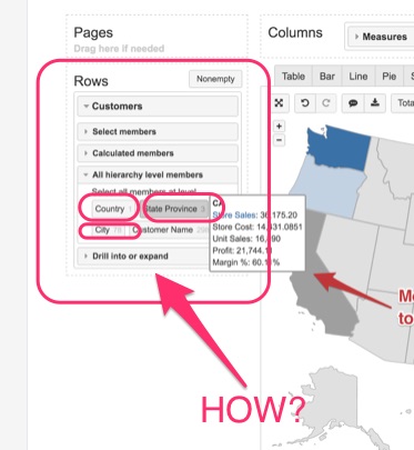
[EDIT: Well, that was fast to get stuck… how did you store the country information with the customer? That is the general question on Internet as well.
That would solve a lot of questions all around. Nobody I spoke to knows how to store this in the customer fields.]
eazyBI requires a dimension to do any calculations per country (using ISO codes) and represent it on a map.
If you do not have this custom field by default in JIra in a particular format you can create a new calculated custom field with JavaScript calculations for eazyBI. You can define a new value on one or several levels (Country>State>City). You can use any of custom field advanced settings for those calculated custom fields. For example, add settings for multi-level custom field. For calculated custom field, you should add a split_by parameter defining how eazyBI should identify each level.