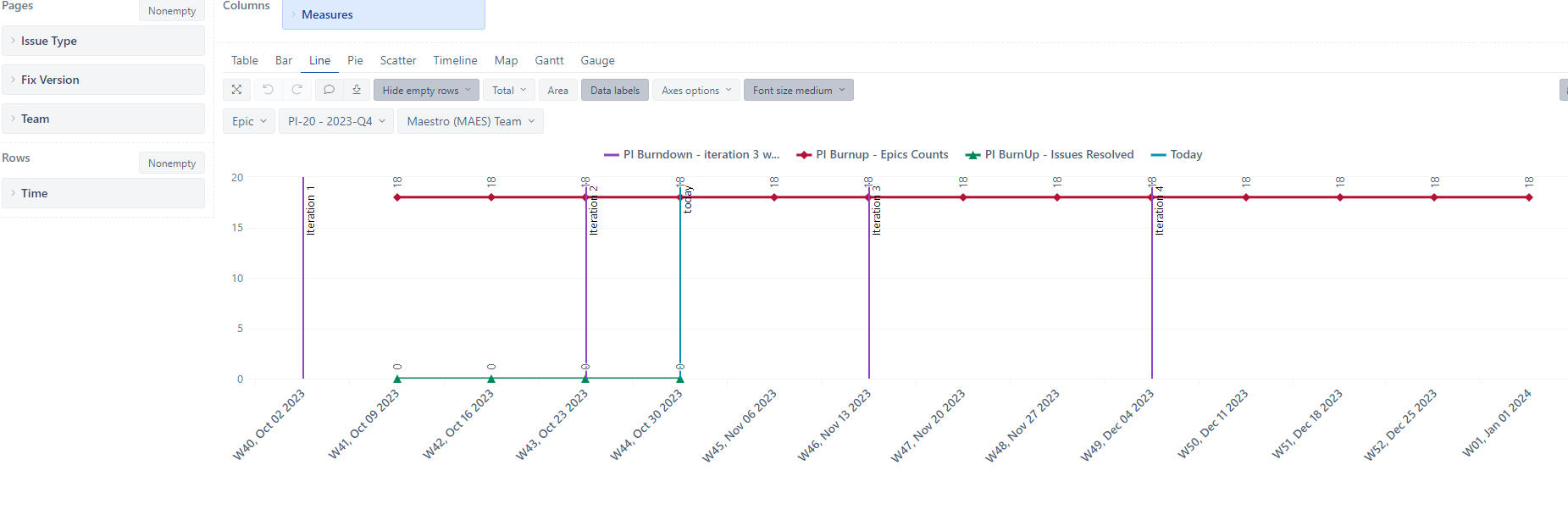
I’m trying to create a Burnup chart for epics in a release.
I want to display the following information in a line diagram:
- Iteration 1 (we use four iterations in our PI)
- Iteration 2
- Iteration 3
- Iteration 4
- Today
- Per week the number of Open Epics
- Ideal burn up Epic count
- PI burn up issues resolved
- Ideal burn up line
See attached image as example/ reference.
For some reason I am unable to let the red line start at iteration 1.
Code for this calculated member:
CASE WHEN
      DateBetween([Time].CurrentHierarchyMember.StartDate,[Measures].[PI Burndown - PI start date-burnup], [Measures].[PI Burndown - PI end date])
THEN
 CASE WHEN
      DateCompare([Time].CurrentHierarchyMember.StartDate, ("Today")) > 0
  THEN
    [Measures].[Issues history] - [Measures].[PI Scope Change Epic Count -burnup]
  ELSE
    [Measures].[Issues history]
  END
END
Code for : PI Scope Change Epic Count -burnup
Count (
  Filter(
    Descendants([Issue].CurrentHierarchyMember, [Issue].[Issue]),
      [Issue Type].[Issue Type].getMemberNameByKey([Issue].CurrentHierarchyMember.get('Issue type ID')) MATCHES "^Epic"
      AND
      [Measures].[PI Scope Changed Epics].Value > 1
     )
  )
Also, I know that at the start of iteration 1, there were 19 issues, not 18. For one epic the fix version was removed. This is a scope change and I want this visible in my line diagram. If one story is added, I want to see that as well. But I am unable to the count the number of epics in a certain week, or even iteration. How can I do that?