Hello EazyBI Folks,
I’m working with a project on which SLA’s were not correctly configured so retrieving the SLA breaches is not possible.
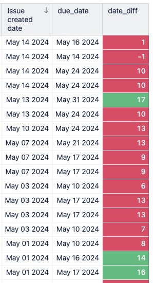
However, from historical tickets I’ve created a table which displays the difference between the due date and date the request was submitted.
The minimum time frame should be 14 days. Anything less that 14 days is a breach of our required lead time.
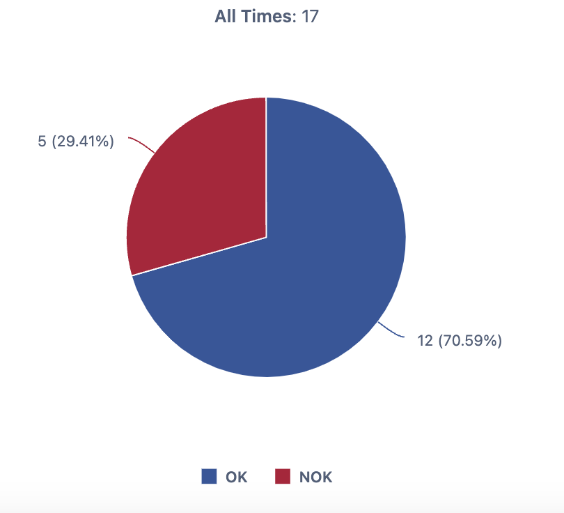
The table shown now displays the data I need, but I subsequently need to display the data in date_diff column as a chart to display how many issues are within or exceed the 14 day limit.
In excel I would use the COUNTIF “> 14”
function
How might I process this column data for ease of representation ?-
In Excel I’ve got this far, but would like to keep this all within EazyBI if possible