Hi all, as the title states, I’m attempting to create a gauge chart in Eazybi which will show the number of issues related to an epic in Jira, with the gauge itself indicating at which step the issues are in through the workflow (e.g. To do, In Progess, Done).
I attempted to create my own calculated measure - see below:
Aggregate({
[Status].[Ready for Dev].
[Dev in Progress].
[Dev Complete]
.[Ready for QA]
.[QA in Progress]
.[QA Complete]
.[Ready For UAT]
.[UAT in Progress]
.[UAT Complete]
})
However, when I select this measure to be used as what I can define in the “set limits” section, nothing shows up on my report.
I guess I have two questions - would this aggregate actually give me what I’m looking for within the gauge, so I can set my own colors by status? Secondly, is there a better way to do this?
Hi @tfitzgerald
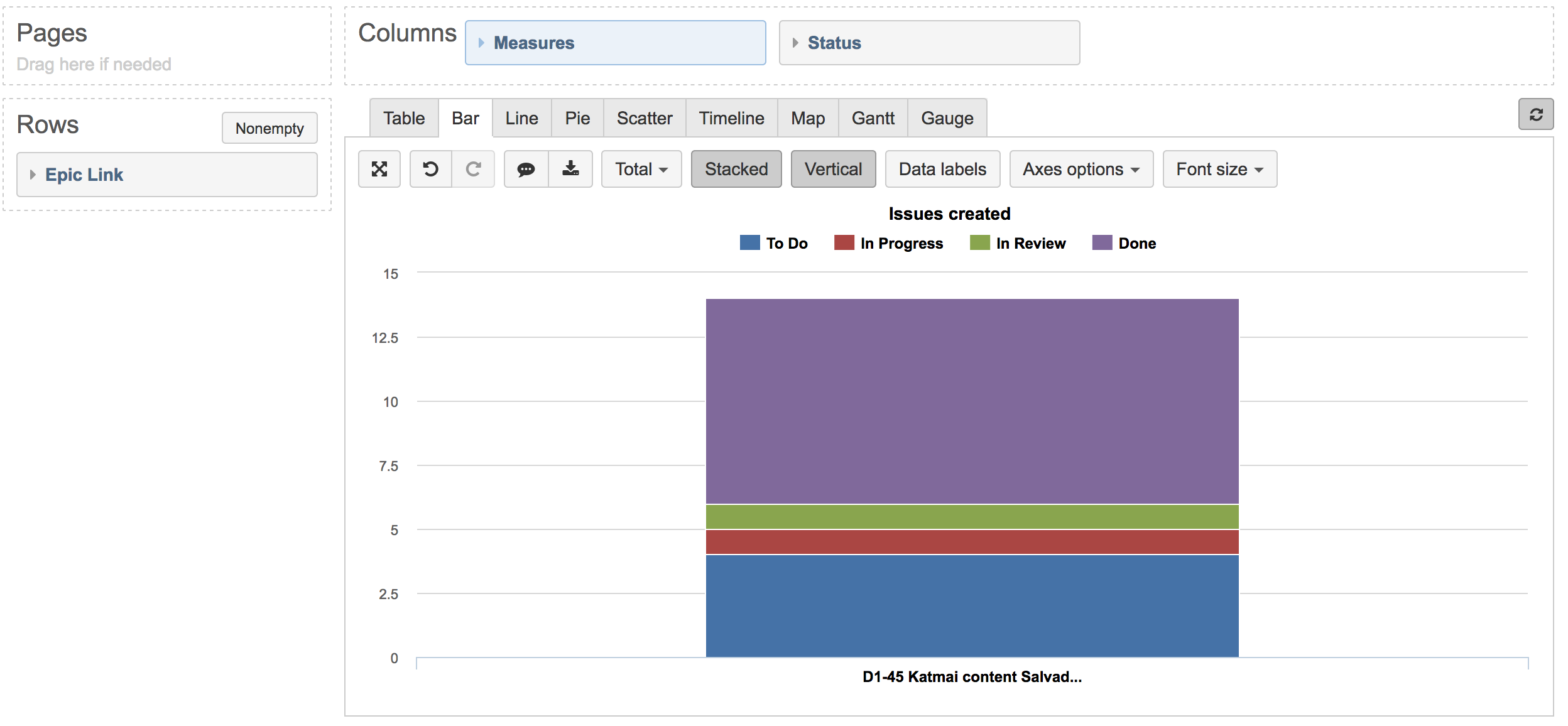
Gauge charts in eazyBI don’t have an option to color code the chart by statuses. I would recommend using a stacked bar chart or a pie chart instead. For example, if you put the Status dimension in columns, you can create a bar chart similar to the one in the picture below:
There you can select appropriate colors for each status. Please have a look at our documentation page for more information on this -
https://docs.eazybi.com/eazybijira/analyze-and-visualize/create-charts#Createcharts-Customizechart.
Also, the formula seems to be missing the [Status] dimension in front of most of the members.
Kind regards,
Roberts // eazyBI support
Thanks @roberts.cacus, appreciate the information - unfortunate that gauge doesn’t have this capability, but I can likely tweak my existing dashboards to accomodate.
You could try a different approach to yor measures based on Story Points of Child stories to gauge Epic Progress. (ie get to a % of Epic Child Story Points where Story is in a “Done” State.