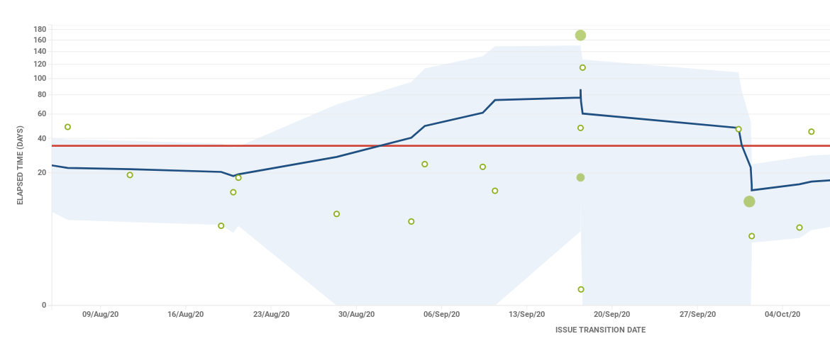
Hi,
I’m looking for a way to create something similar to the attached Jira control chart to show outliers for ticket cycle times
Has anyone got any experience of implementing something similar using EazyBi?
Thanks
Hi,
I’m looking for a way to create something similar to the attached Jira control chart to show outliers for ticket cycle times
Has anyone got any experience of implementing something similar using EazyBi?
Thanks
Hi
Try exploring the following report in the eazyBI demo account:
Perhaps it is similar to the one you expect to create.
It is not an issue-level, but it would show the max cycle time in the period.
Martins / eazyBI team
Thank you for the clarification. Is there a way we can build this report at the issue-level to show the cycle time for each individual issue within the period?
Please check this demo report to calculate the average progress days on issue level
https://eazybi.com/accounts/1000/cubes/Issues/reports/2737561-cycle-time-scatter-plot-per-priorities
Martins / eazyBI