Hi Team,
Im trying to create a pie chart to determine the backlog status health for all product owners to calculate (Green,Yellow,Red).
- Determine the average velocity story points for last 3months by sprint
- Determine the current backlog story points
Green = backlog story points > 3 times average velocity story points for last 3months
Yellow = backlog story points > 1-2 times velocity
Red = 1 times velocity < 1 times velocity.
So far i have created formula for
1.average velocity story points for last 3months by sprint = Avg(
Filter(
[Sprint].[Sprint].Members,
[Measures].[Sprint Closed?] = ‘Yes’ AND
DateBetween([Sprint].CurrentMember.get(‘End date’),‘90 days ago’,‘today’)),
[Measures].[Story Points resolved]
)
- Current backlog story points = CASE WHEN [Measures].[backlog] > 0 THEN
CoalesceEmpty(([Measures].[Story Points history] -
[Measures].[Cumulative Story Points resolved]),0)END.
As im new to eazyBi platform, Currently im struck in process to find the status (GREEN,YELLOW,RED) for all PO’s and display in single pie chart
i need to display all product owners with their backlog health status in single pie chart. All Suggestions and Help would be much Appreciated…
Best Regards,
Victor.
Hi Victor,
If you have the Product owners as dimension and there is the value for both of these measures returned for each of them, you can count how many Product owners fall into each status. The formula for, e.g., yellow would be as follows (note the naming as MDX is case sensitive also for dimension and level names)
NonZero(Count(
  Filter(Descendants(
    [Product owner].CurrentMember, [Product owner].[Product owner]
  ),
    [Measures].[backlog story points] >= [Measures].[average velocity story points for last 3months by sprint]
    AND [Measures].[backlog story points] < 2 * [Measures].[average velocity story points for last 3months by sprint]
  )
))
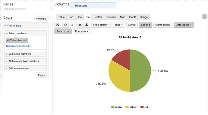
Then you can use these three status health measures together with All Product owners level and see in the pie chart how many are in each (I am using T-shirt size custom dimension in the screenshot).
Lauma / support@eazybi.com
Thanks much lauma, Im looking to create a pie chart with dynamically changing colours., E.g., color is RED for range = 100-500, YELLOW = 600-1000, RED = 1001-1500.
@vignesh_b.s,
I believe my colleague @martins.vanags replied to the question in this thread Data's are not populating when click on Bar or Line or Pie chart ?
Let me know if we missed something and you have further questions!
Lauma / support@eazybi.com
Data’s are now populating in chart. i made changes as suggested @martins.vanags and currently im looking to create a pie chart with dynamically changing colours., E.g., color is RED for range = 100-500, YELLOW = 600-1000, RED = 1001-1500. I have tried in cell formatting and it works too. but in pie-chart i cant create the chart that will change colours dynamically based on values.
@vignesh_b.s, This is so that it is not possible to specify pie slice color dynamically - you can only click on each label color box and specify what the color should be.
If I did not understand you correctly, please attach a screenshot of what your report looks like highlighting what changes you are looking to introduce.
Lauma / support@eazybi.com
