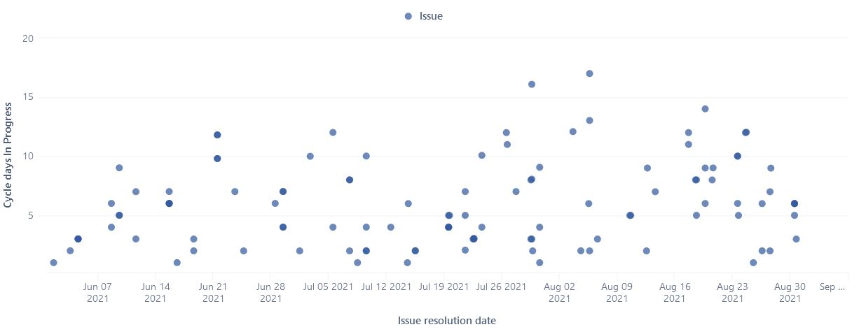
I found the below scatter plot which displays the cycle time for issues.
https://eazybi.com/accounts/1000/cubes/Issues/reports/615508-cycle-time-scatter-plot
Just I would like to show lead time (Red circles)and cycle time (Blue circles) in two different plots. My Jira board DOD is as below:
The time from “To Do” to “Ready to Release” will be definitely the Cycle time and from time the Issue is created in Backlog to time which is in “Released/Done!” will be lead time. Can any body help to modify this scatter plot?
Thanks
Hi @Behzad_Nazarbakhsh
In eazyBI, you can define different issues cycles in import options for your Cycle time from “To do” to “Ready to Release”. During the import, a set of issue cycle measures will be created that you can use for your report: Issue cycles
For Lead time calculation, you can use either “Average resolution days” that count time from issues creation date till resolution. Or you can create your custom measure using DateDiffDays() function. Here is a formula that counts the time from the first transition to backlog status till the last time to release status:
AVG(
  Filter(
    Descendants([Issue].CurrentMember, [Issue].[Issue]),
    DateInPeriod(
      ([Measures].[Transition to status last date],
      [Transition Status].[Released],
      [Time].CurrentHierarchy.DefaultMember),
      [Time].CurrentHierarchyMember)
  ),
  DateDiffDays(
    ([Measures].[Transition to status first date],
    [Transition Status].[Backlog],
    [Time].CurrentHierarchy.DefaultMember),
    ([Measures].[Transition to status last date],
    [Transition Status].[Released],
    [Time].CurrentHierarchy.DefaultMember)
  )
)
Also, check this training video on how to build a scatter chart: Training videos
best,
Gerda // support@eazyBI.com