Hi all. I need a little help if possible please.
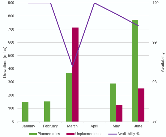
I’m trying to build a report which shows the following:
- Minutes of planned downtime - this is captured in issue type: Incident
- Minutes of unplanned downtime - this is captured in issue type: Sub-Task
- Uptime % - this is captured in issue type: Sub-Task
I’ve got the measures set up so the values are populated in a table in EazyBI, but because I am getting the information from different issue types, the table also contains information that I don’t want to appear in the chart. I hope that makes sense. I’ve included 3 images below to hopefully make this a little clearer.
- The first is of the chart in PPT to show something similar to what I am trying to achieve.
- The second is the table of data that contains the information I need, plus the info I don’t need
- The third is of the combi bar and line chart that the table above generates. I have circled the three elements I want to remove from the chart
I suppose put simply, I want the combi bar and line chart, but so that it only shows:
- Inc-Impact Downtime in Minutes Unplanned Downtime
- Downtime in Minutes Planned Downtime
- Inc-Impact Dynamic Uptime % Unplanned Downtime


Thanks in advance!
David
