Drawing Average & Limit Straight lines based on Issues created over time

Hello everyone,

Can someone support me with the following?

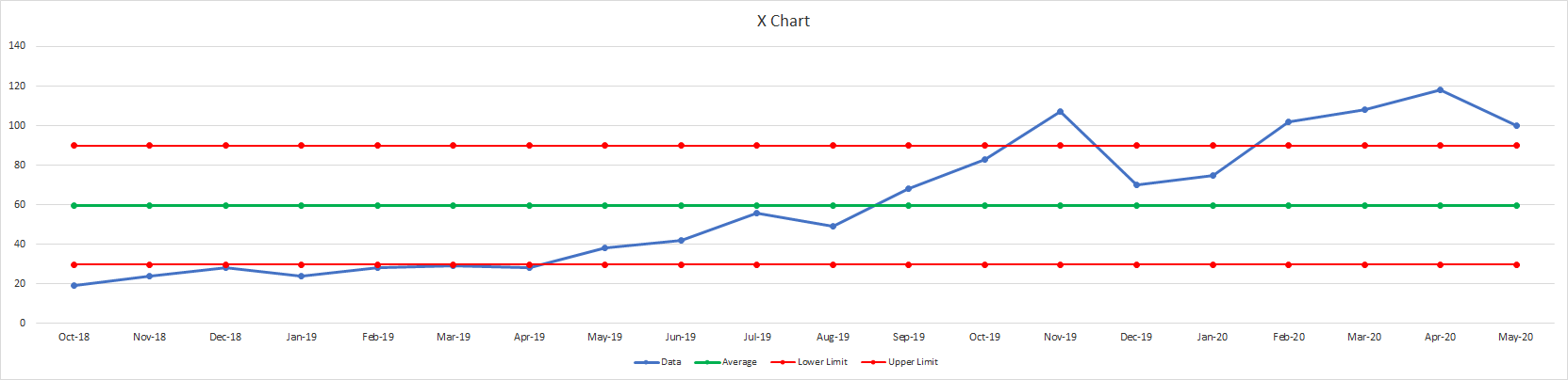
I would like to draw the following chart (see image) for my organisation.
Although it is a simple one it causes me some headaches because as i said i’m new to eazyBI.

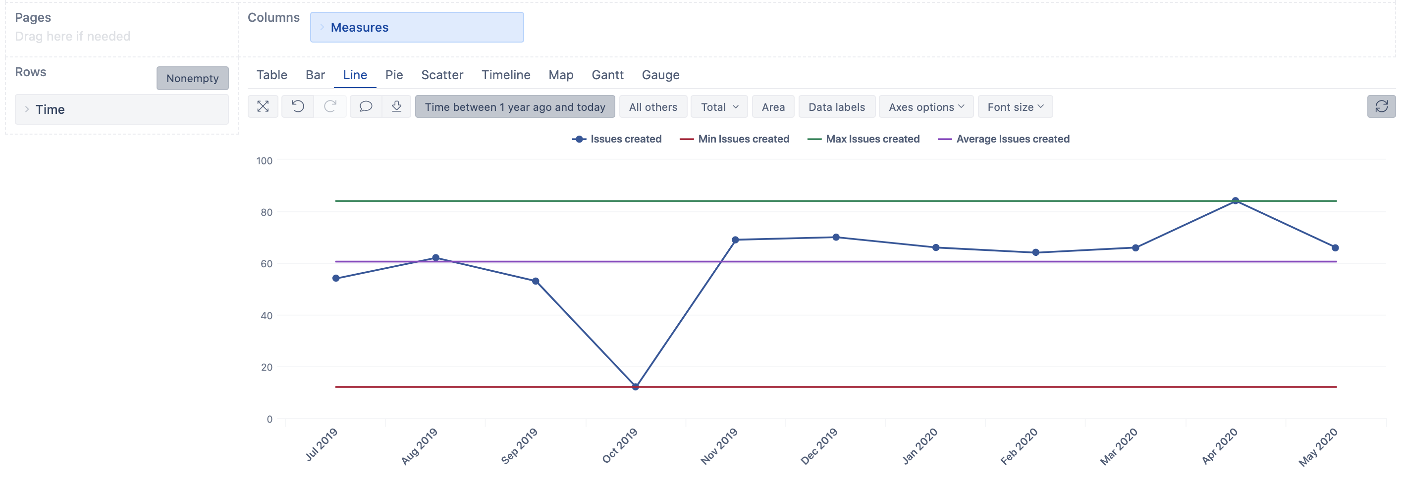
My basic input is Issues created over time.
This is a quite simple chart that i get in eazyBI in seconds.

What i miss though is the How to draw my limits and the average line that comes with it.
All straight lines are calculated from the number of issues created using a simple formula
For example:
i) Average is always the average of the first 20 data point (i.e. first 20 weeks or first 20 months etc.).
ii) And my limits are based on a formula that is also fed by the issues created over time.

Any kind of support will be very much appreciated.
Thank you in advance,
George

1 Like

With the version 5.3 we added a support for some default calculations you can use here. We did some improvements with the version 6.0 there as well.

You can start by adding Time dimension on Rows and select level (Month, Weeks, etc). You can either put in on Pages as well or add Time filter to select the period for your report.

Then you would like to add(use) measure Issues created to the report. Click on table header for this measure and select an option Add calculated>Statistical and there you can select options - Average, Min, Max … and some other. Add one at a time.

eazyBI will show Min value, Max value, or Average according to your selections for Issues created based on periods represented on rows.

Daina / support@eazybi.com