Hi
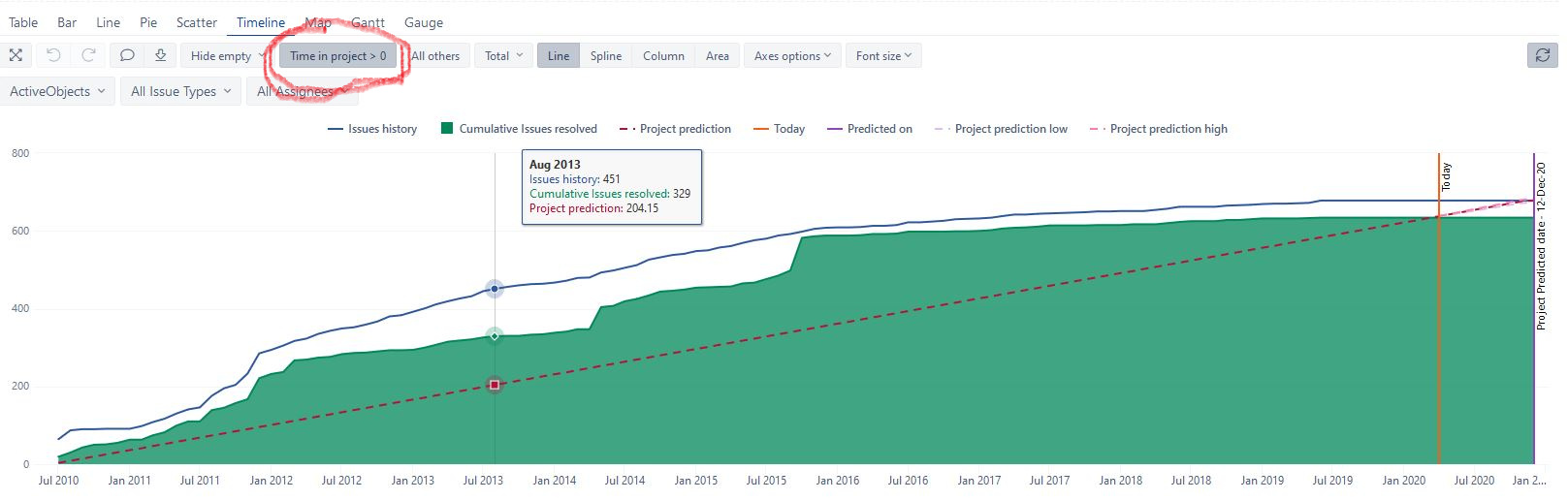
i found on eazyBi demo account this report "Project Prediction report ".
This report is exactly what I’m trying to achieve, but I can’t understand what “Time in project> 0” means.
Look at img below:
please let me know , Thanks
Hi
i found on eazyBi demo account this report "Project Prediction report ".
This report is exactly what I’m trying to achieve, but I can’t understand what “Time in project> 0” means.
Look at img below:
please let me know , Thanks
Hi,
“Time in project” is a measure that marks all time members with “1” whithin the project time (in other words, all dates between project start and predicted end date). It is needed to show on x axis only time when the project is (was) active.
Start date is calculated in “Project start date” measure (it is also included in the report definition): in our case, it is the first date when the first issue is resolved.
Projected end date is calculated in “Project projected date” , and this is projection on when all currently open issues would be resolved based in the resolution pace.
All those measures you should find in Measures after importing the report in your account, in User defined measures, subsection Predicted by issues
If you want to show another time period in the report, you may remove this “Time in project” filter altogether and, instead, set a filter on Time dimension to filter by a particular time period using Filter rows option:https://docs.eazybi.com/eazybi/analyze-and-visualize/date-filters
Best,
Ilze, support@eazybi.com
Hi Illze
thanks for your help, project prediction report is exactly the type of report that I have been trying to recreate for some time.
My difficulty was figuring out how to represent time beyond the measure “project predicted date” on the columns, as on the demo account.
I solved it by adding a larger member data range.
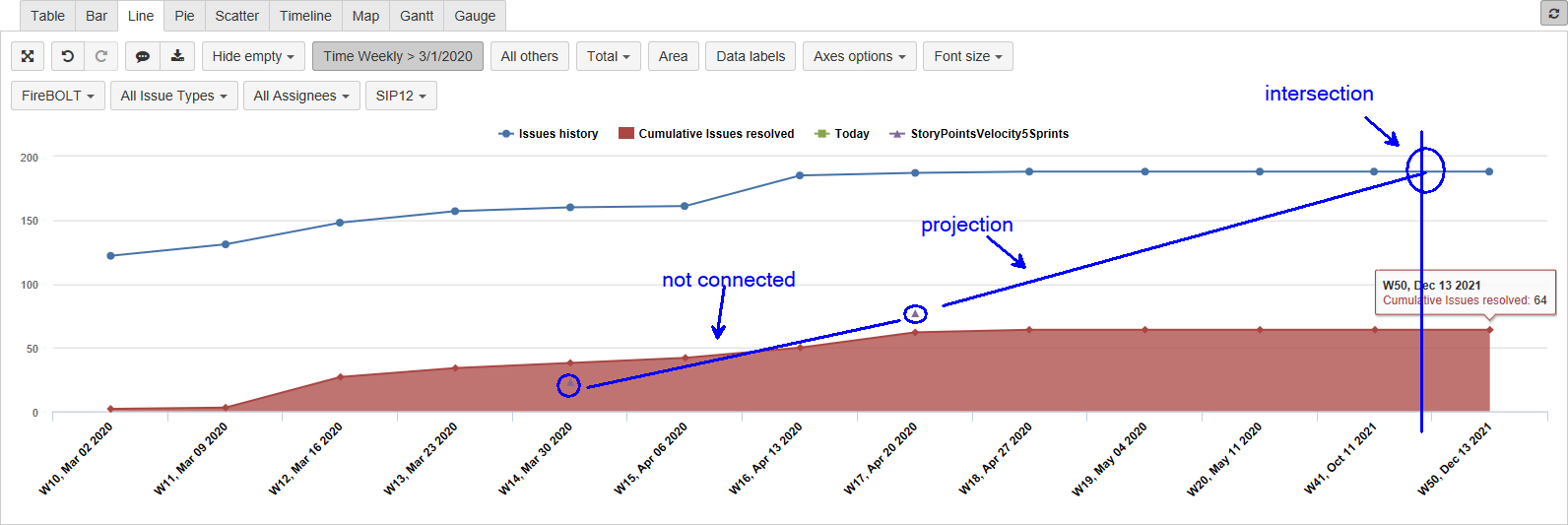
@ilze.leite thank you for your reply here. I am attempting to create a similar graph to the “Project Prediction Report” with my own project and I’m having two issues.
First question: when plotting the custom measure of “Story Points Velocity 5 Sprints” (from another forum post from eazy BI staff), there are two points plotted, but not connected by a line. How do I get them connected with a line AND get that line to project to the intersection with “Issues History”?
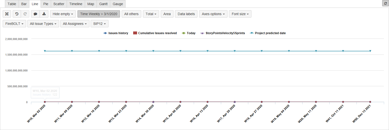
Second question: when I use the measure “Project Predicted Date”, my Y-axis upper limit goes to over a trillion and the line shown is across the rows. How do I get that to be a single vertical line at the precited date?
Can you please advise?
You are using a Line chart. The line chart connects dots with a line, only if there are no empty (missing) values for some periods. Our example formula from demo account Story Points velocity 5 Sprints might show story points for some periods only (sprint completion period). I would suggest using another measure Cumulative story points resolved till today. It will represent the current (cumulative) progress in the project.
You would like to check out example measure from our demo account Predicted line from 5 sprints velocity for Project prediction line based on Story Points velocity in sprints. The measure works based on open story points (Story Points due), and measure Story Points velocity 5 Sprints (also available in our demo account).
You are using a Project prediction date in the report directly. The project prediction date calculates the date value. When used in the report it is treated as the timestamp. Any timestamp value is extremely higher than any Story Points. Please remove the date from the report.
You would like to use some specific measures to show the date as an intersection line (vertical line). Please check the measure Predicted on. It checks if the date should displayed on the period and shows the date as string sing Format function. You can address any date ion the same pattern.
Daina / support@eazybi.com
Hi Daina and Ilze,
I am new to EazyBI and I need to create and demo the Project Prediction Report. This chart is exactly what I am looking for and what we were gonig to have to penibly do in Excel. It’s all relatively urgent, of coruse - demo on Thursday morning CET.
So the question is, how do I proceed? I see on your website that it seems to be available as a template within the Forecast and Management Reports, but I dont see these in my version (free trial). How can I access the chart template? I would really appreciate if we could have a call on this, since I fear the writing side of it will take longer and per phone / screen sharing we can flow more info and more precise in less time…
My number is +4915205768581
Hi,
How can i extend time legend in the graph,
Thanks/Ram