I would like to be able to use ranges on timeline charts, just like we can on line and bar charts.
I would just use a line chart instead anytime I want to use a range, but sometimes a line chart is not a suitable replacement for a timeline chart for various reasons - lack of autospacing of time members is usually a big one. Furthermore, the ranges on the line and bar charts have spaces between them, which in my opinion doesn’t really match up with how people think about time series data.
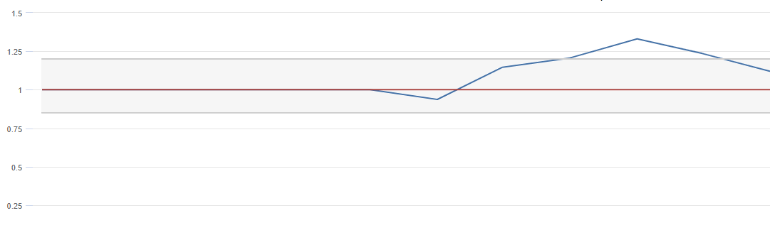
This is an example of what I am suggesting:
You can get sort of halfway there by using stacked areas with the bottom area colored white, but it’s pretty ugly. It blocks the light grey horizontal lines, shows up in the tooltip and legend, and wouldn’t work if the background of the chart changed color for some reason. Not a real solution in my opinion.