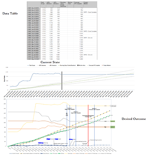
I am trying to create a burnup chart in EazyBi and as part of this we need a way to viasualise key dates (e.g. code complete/go live). I have a table (see screenshot) which has at particular date periods a column which specifies the key marker. How would I get these to show up as either a vertical line or a floating annotation on the relevant date.
This is what the data table looks like, what the chart looks like and then the kind of thing I’d like the chart to look like (Either the floating annotations like at the bottom or the big vertical bars).
Things I have tried:
- Putting the marker on a seperate axis (doesn’t work… I think becase it has no numeric value)
- Changing the markers icon/type (no combiantion seems to work)
Any thoughts on how i can acheive the desired look would be really appreciated!
Cheers,
Jake
Anyone have any ideas… I’m still stumped on this.
There is an option to use Vertical line.
eazyBI Cloud version this option is available in Timeline, Line, and Bar charts.
Here this option is used in Line chart where we added Version releases on Sprint velocity chart:
eazyBI for Jira server supports vertical lin for Timeline charts. You can switch to Timeline and set type for Project Marker as vertical line. Add data labels there to text on this vertical line.
Here is an example Version report where we used this option.
We will add the option to use Vertical lines in Line, and Bar charts with eazyBI version 5.2.
Daina / support@eazybi.com
Thanks Daina! Thats just what i was looking for!
Looking forward to having the vertical line option in more charts 
@daina.tupule I am using this:
'Version release - ’ || + Format([Fix Version].CurrentHierarchymember.Get(‘Release date’), ‘Medium Date’)
and i am getting an error on the bolded “release” above, the error says the formula is not valid using the word “Release”
The formula seems valid. It worked for me. However, I did a small change - I retyped any apostrophe. Copy/paste formula might not work in some cases. During copy/paste some characters might transform if the formula is not shared as a code block formatting or plain text. For example, in community posts added directly in the text without code block formatting, it might transfer apostrophes.
Daina / support@eazybi.com

