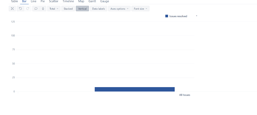
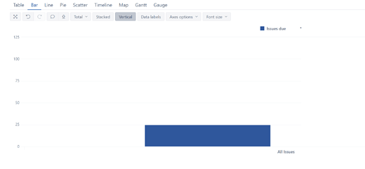
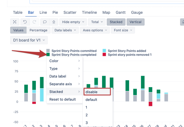
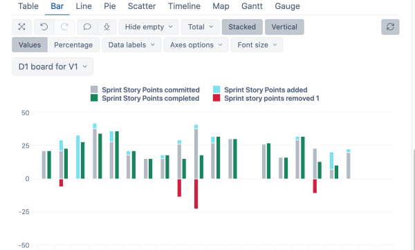
• I have a column chart with two separate Y axes, so that I can control how measures are stacked.
• A viewer of the chart can select a filter representing the scrum team (i.e., that custom field is configured as one of the chart Page dimensions).
• I can in the chart definition set each of the two Y axes to have the same hardcoded Min and Max values, so that they both use the same scale for displaying the data.
When the chart viewer filters to a specific scrum team, the scale for the chart may need to be reset to best fit the data. As soon as the viewer does that, the two Y axes may no longer be set to use the same Min and Max values, so the data might be displayed in a misleading way (because the viewer no longer realizes that the axes are no longer aligned with each other).
Is there any way to set the two Y axes to always share the same Min and Max values as each other, so that even if the data is filtered and the scale for the chart re-set by the viewer, the scales for the two Y axes are always kept “in sync” with each other?
Thanks,
/Jason
