Hello,
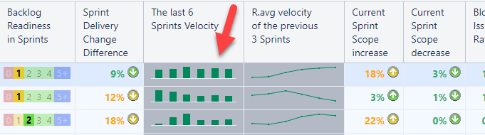
I use SparklineData() in many places in my table-based reports, as shown below. Formats are used, such as columns, lines and areas.
SparklineData(
  LastPeriods( 6, [Time.2 Weeks].[2 Weeks].CurrentDateMember.Lag(1) )
  ,
  (
    [Measures].[Sprint Story Points completed w/ grace period]
    ,
    [Sprint].[Sprints of the last 6 periods]
  )
)
I have two questions:
How can I alter the X-axis labels generated by the [Time.2 Weeks], which has the form, e.g. 2W17, Aug 07 2024 → Aug 07-20 2024 or even Sprint 17 / 2024 with some additional custom logic ?
How can I change the colour of each column in a column chart based on a condition?
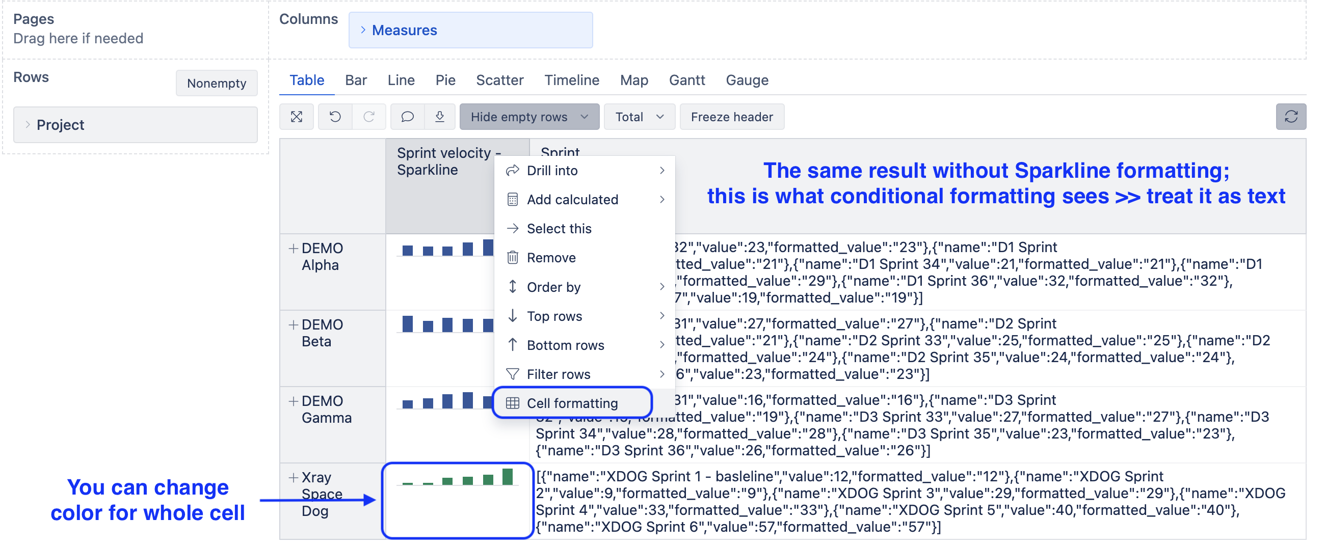
Per #1, I am aware of the JSON format, and modifying the textual content of the "name:" would solve this issue. However, I have not yet figured out how to alter the generated JSON before passing it to the rendering engine, if it is possible at all.
Per #2, As I experienced, the cell formatting option is not applied to the data points rendered in the SparklineData(). Is there a way to alter it each column’s colour in a column chart?
The best way to think of sparklines would be as every simple bar chart with limited options.
Regarding your first question about columns representing the periods and labels on mouseover, eazyBI can show the names as they are in eazyBI (in your case, “2 Weeks”).
If those are actually sprints you are interested in, consider providing a set of Sprints for calcaution instead of “2 Weeks” periods.
SparklineData(
  --set of members to show in sparkline graph, example with last 6 Sprints
  Tail(
    Filter(
      Descendants([Sprint].CurrentMember,[Sprint].[Sprint]),
      [Sprint].CurrentMember.GetBoolean("Closed") AND
      [Measures].[Sprint issues at closing] > 0),
      -- get only the last 6 closed sprints
    6),
  --numeric expression for graph
  (
    [Measures].[Sprint Story Points completed w/ grace period],
    [Sprint].[Sprints of the last 6 periods]
  )
)
The sparklines are a simplified bar chart without options to customize colors or labels for each bar/column. I added your suggestion for color-specific bars to the eazyBI backlog and will update this Community post if a solution is developed.
The most you can do is to change the color for the whole cell based on a text (you should treat the SparklineData() results as formatted text) or some measure value related to the report row.
More details on conditional cell formatting are here: Conditional cell formatting. Consider options with regular expressions (good for texts) or use a custom formula to consider other sprint metrics or more complicated logic.
Due to the grace period, I must use the [Time] dimension in my calculation. Besides that, multiple sprints are going on in parallel every two weeks. Therefore, I would need to show an aggregated Sprint name, e.g. S15, S16 and so on, instead of the actual Sprint names.
Back to my first question. Can I somehow pass a JSON to the Sparkline() function to use that for generating the mini diagram? This way, I could label my columns as I want.
Thanks for the colouring option and for adding this to your backlog.
I am aware of the JSON format and the conditional cell formatting. My primary goal is to alter each bar’s colour based on its value.
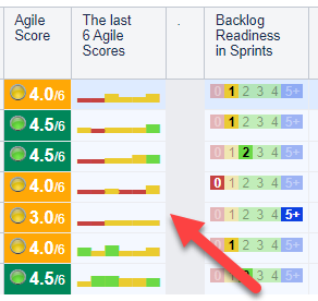
As a workaround for my other calculation called Agile Score, I am using HTML, CSS and Unicode characters to mimic the diagram and the colours.