Good morning,
I again have a question. I´m still new creating reports and I have a questions where I´m stuck…
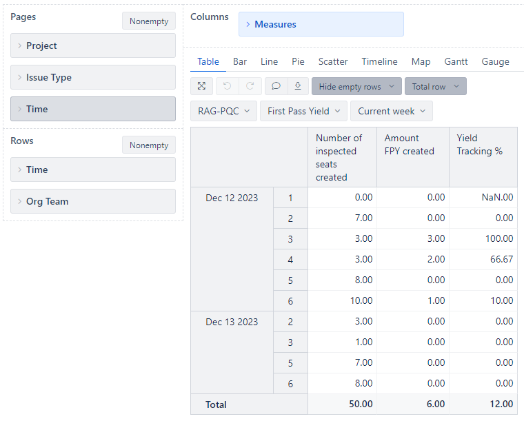
Daily there will be created 6 issues in jira which I like to report. They are always realated to a team (1-6) and have 2 values which should be displayed: Number of inspected seats and amount fpy. A third, which I created is the yield %. This works fine so far.
What I need now is to show per day the overview for the 6 teams with a total PER DAY. Means a total of both values and the yield % from Monday to Friday.
Then the values accumulated to a week - then to a month and a year.
How can I there use just the total values which were generated in the reports?
I don´t know how to set this up properly.
This is what I already have. But the total I can insert always shows a total of every entry.