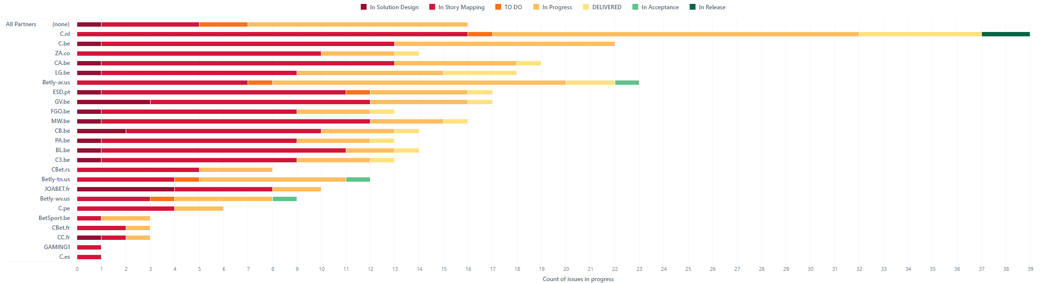
For each partner, I must display a “max limit”, ie. a maximum number of tickets allowed per partner.
The max-limit is not in JIRA, so I wish to “hardcode” it somewhere in the graph.
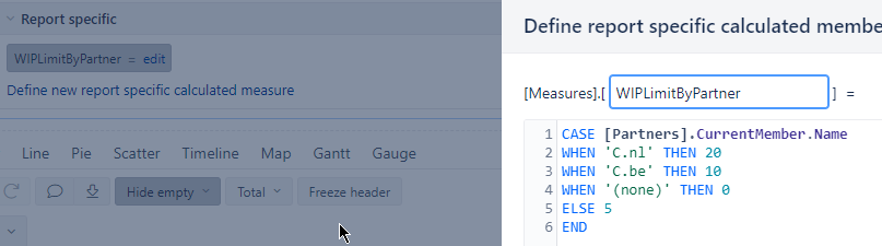
By example, for the first partner “C.nl” I wish to have a limit of 20, for “C.be” a limit of 10, etc.
It will looks like a table like this:
{“C.nl”, 20}, {“C.be”, 10}, …
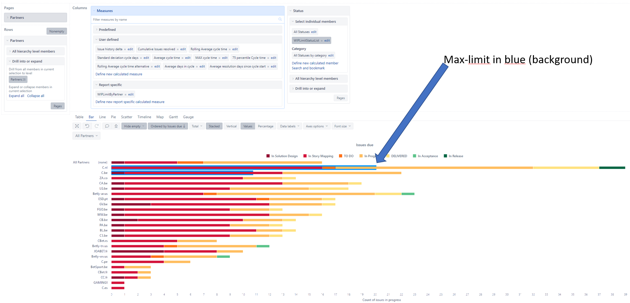
And I wish to display the limit as a background bar (but larger and with a specific color) to show the max limit. Like this:
You did a great job in defining the hard-coded limits based on partner name.
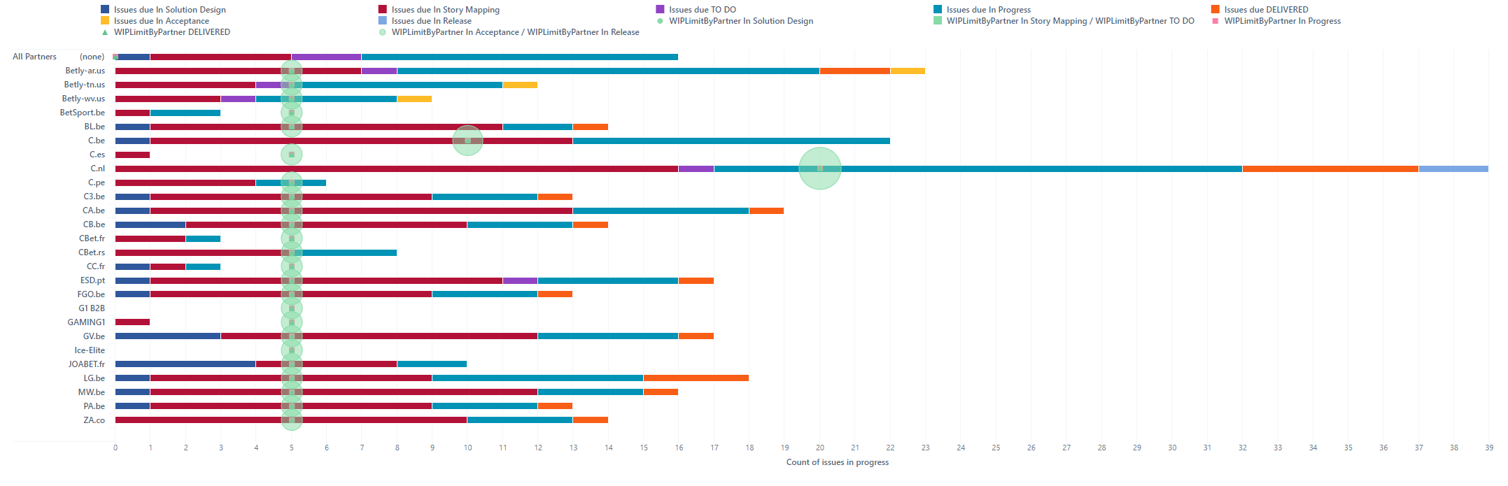
Since you only use two measures in the report - Issues due split by status and Partner limit that should not split, you might drill only the “Issues due” by the Status dimension.
You might read more about that here - Drill into measure by another dimension level.
You might switch to the table view, then remove the status dimension from the report columns.
After that, select only the “Issues due” measure caption on the table top row and drill into the Status dimension. That will split the Issues due into Statuses and retain the “WIPLimitByPartner” once. Then you might switch back to the bar chart and apply stack settings as required.