is there a way to for example double the height of Diagrams in Dashboards?
The width can be changed with the 25%, 33%, 50% etc. buttons.
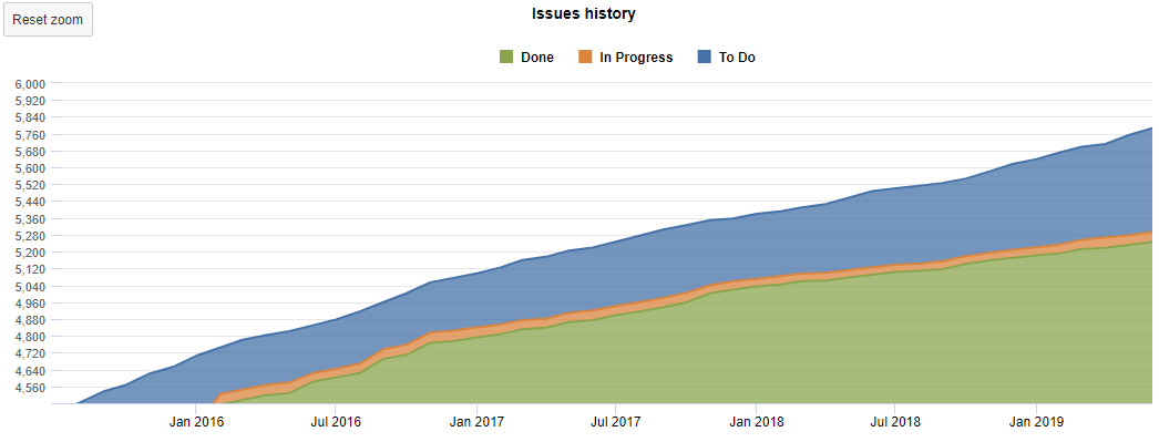
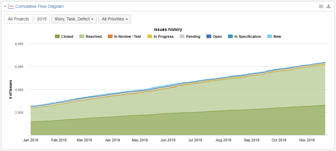
There is the problem that in a CFD with a lot of closed issues you cannot really use it anymore.
Maybe it is possible with eazyBi 5? (as we are on 4 at the moment).
In the analysis mode you can enter a min value, which kind of helps but this is not changeable in the Dashboard view.
Thank you for the idea! That would definitely be a helpful improvement and we already have heard a need for the custom report hight on the dashboard. I added it to our backlog for further considering as we plan to improve dashboard options.
Min value is the solution I would recommend. Another, a bit different approach, would be setting Closed/ Done issues on a separate axis and represent them not as area but, for instance, only values.
thank you very much for your reply that is very helpful and good to know.
One small additional question, as this also sounds good:
How can I achieve that?: