Hello, I’ve been having a huge problem for quite some time and have never found a solution. I’m trying to create a cumulative flow diagram in Eazybi, where I can see the bottlenecks by status, WIP, cycle time, etc., but even with Eazybi’s AI assistant, I can’t get close to reproducing a functional cumulative flow diagram.
measure cumulative flow:
– annotations.disable_drill_through=true
CASE WHEN
DateCompare(
Now(),
[Time].CurrentHierarchyMember.StartDate
) > 0
THEN
CASE WHEN
[Transition Status].CurrentHierarchyMember.Name MATCHES “Concluído.*”
THEN
CoalesceEmpty(
[Measures].[Issues history] -
(
[Measures].[Issues history],
[Time].CurrentHierarchy.Levels(“Day”).DateMember(
[Measures].[First date in report]
)
),
0
)
ELSE
[Measures].[Issues history]
END
END
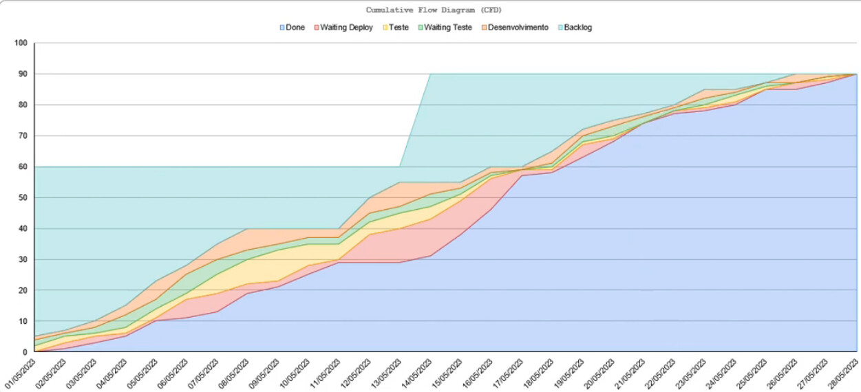
Example of the cumulative flow diagram I want to create.
Hi @Jrabellus
Welcome to eazyBI Community! Thanks for posting your question!
We have a ready-to-use Cumulative Flow Diagram sample that you can use as a starting point. You can find it here: https://eazybi.com/accounts/1000/cubes/Issues/reports/187032-cumulative-flow-diagram
This report uses the Issue history measure, that counts how many issues are in each status at the end of each time period.
You don’t need to rebuild it manually. Export the report definition of the sample report and import it into you account. See video instructions on how to do that here - Export and import report definitions
Best,
Elita from support@eazybi.com
Hi Elita, how are you? I’ve seen this demo account example before, but it doesn’t meet the real needs of a CFD. The “bands” for each status are independent and stacked. To see bottlenecks and when issues stop being processed in those statuses, the standard Eazybi CFD overlays each status band, and when one rises while stacked, the others rise as well, unlike the example image I attached. I already created a report like the one in the demo account you linked, but it doesn’t meet my needs for checking the flow metrics.
Hi @Jrabellus
Thanks for the follow up!
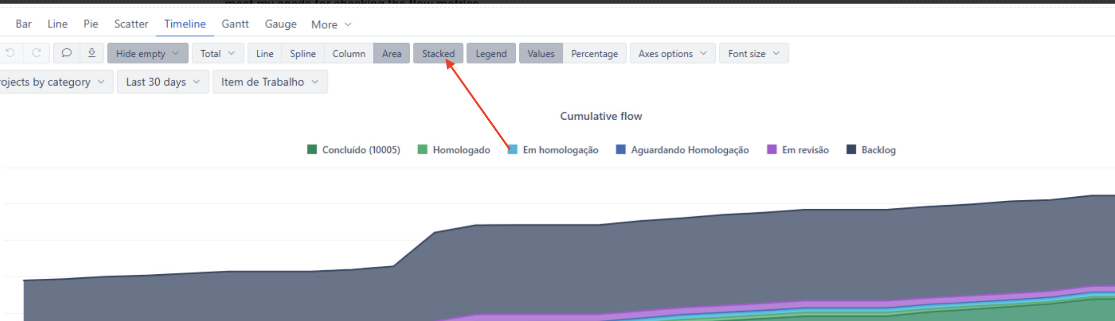
Please try disabling the “stacked” option and see if it returns the expected results for you
Make sure you order the statuses, selecting those that have the highest cumulative count first
Best,
Elita from support@eazybi.com
Hi Elita,
Thanks for your suggestion, but I think there’s a misunderstanding about the goal here.
I’m trying to build a Cumulative Flow Diagram (CFD), which has a few strict characteristics:
-
It must represent the cumulative count of issues over time per status
-
The areas must remain stacked, because that’s what visually represents WIP and flow distribution
-
The total height of the chart should reflect the total scope evolution
-
Each band (status) should show how work is accumulating and flowing through the system
Disabling the stacked option breaks the core concept of a CFD, since it turns the visualization into independent lines instead of a continuous flow.
Hello @Jrabellus
Stacked but with lines that don’t shift" isn’t possible - they’re opposite things. Stacking means each area is placed on top of the one below, so its top edge is the sum of itself plus everything/every status underneath. That’s what makes it a stack. The only way for a areas top edge to stay still while another band changes is if the chart is not stacked. You can’t have both at once - it’s not a limitation of eazyBI, it’s just what “stacked” means.
The top layars of areas are stacked above everything below it, so it moves whenever a lower area changes - even if that particular area itself didn’t change. Your reference chart you shared initially does the exact same thing.
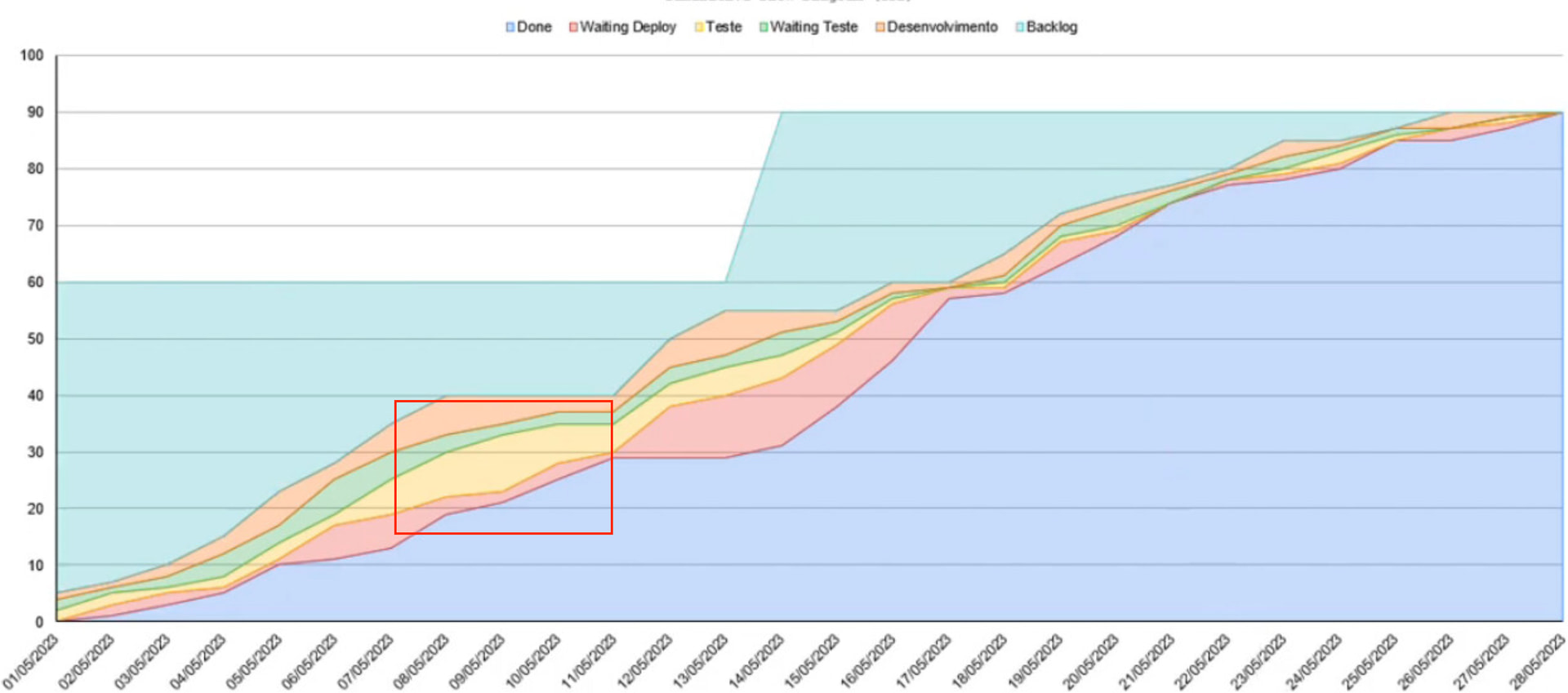
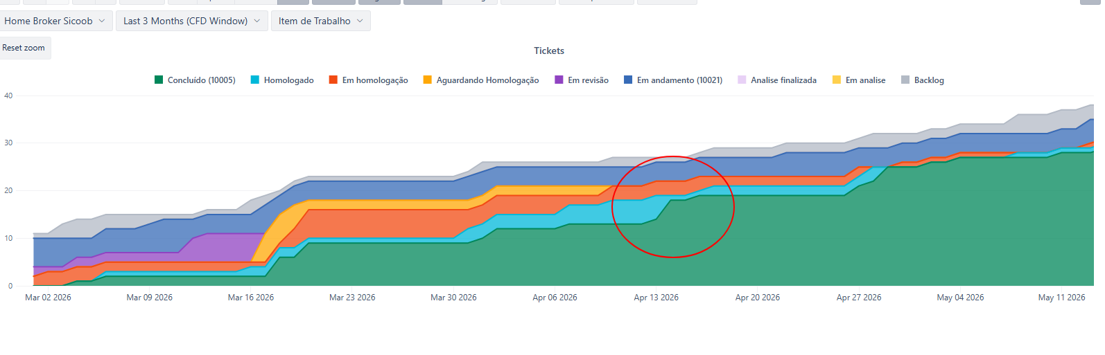
See the marked area. Items in Done status grow and so do the rest of the statuses. Not necessarily because there is an increase of ticket count in those other statuses, but purely because the items in Done status increase. Done grew by about 14 items, and Backlog at the top stayed flat (no new work came in). So those 14 items by which the Done status grew had to come from somewhere in the middle - and looking at the chart, Waiting Deploy is where they came from. Its thickness shrinks to almost nothing across those days, even though the top line of Waiting Deploy actually rises. The top line goes up because Done below it grew by more than Waiting Deploy shrank - but the ticket count in Waiting Deploy itself clearly dropped (while the line for the Waiting for deploy clearly inceases). What matters is the thickness of the layer, not the direction of its top line. The thickness tells you the real count/bottleneck; the top line is just a visual consequence of whatever is stacked below.
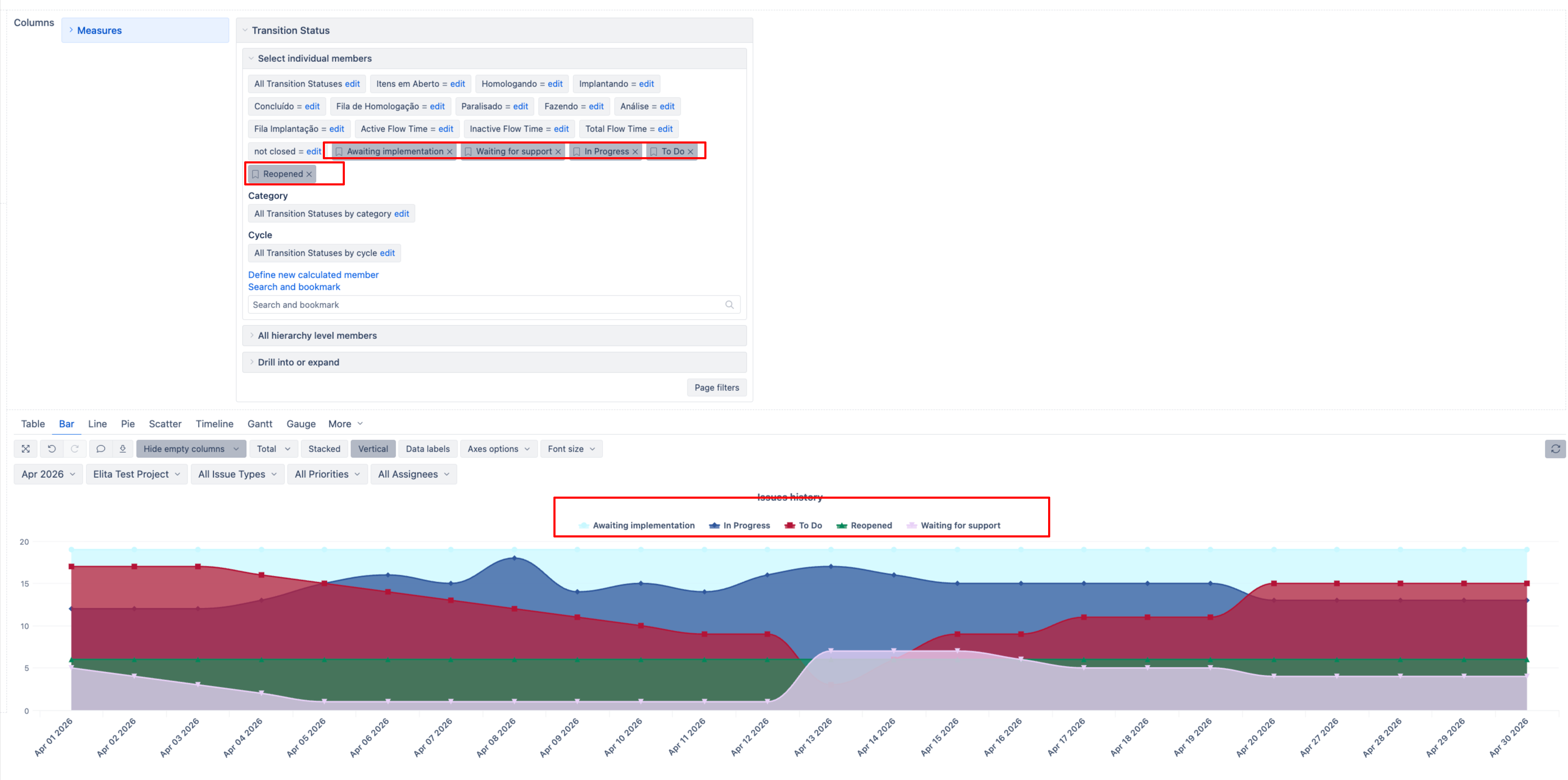
Hence the report with Issues History should show the same chart. But make sure you include all statuses, because if you don’t include all statuses, then issues that transition into a missing status disappear from the chart entirely - as if they no longer exist. That makes the total height shrink over time instead of growing, and causes the layers to behave unpredictably.
Best,
Elita from support@eazybi.com
Hello Elita,
Thank you for the explanation and for taking the time to respond.
I understand the technical behavior of the stacked chart in eazyBI and how the tool calculates the areas based on the accumulation of the lower categories. However, the main point of my discussion was not about how stacking works mathematically, but rather about the terminology and visual interpretation of the chart in relation to the CFD concept described in Kanban literature.
A CFD (Cumulative Flow Diagram), as defined in the Kanban Method, has specific characteristics regarding flow visualization and interpretation. Its primary purpose is not simply to “stack areas,” but to represent flow stability, WIP, bottlenecks, and delivery rate over time in a way that is consistent with the system states. When the chart behavior allows visual distortions caused by disappearing statuses, implicit movements, or changes that do not directly reflect the actual flow between states, it moves away from the classical CFD concept commonly described in Lean/Kanban literature.
My criticism was not about how eazyBI works itself, but rather that this chart model does not accurately represent the expected behavior of a CFD according to widely accepted Kanban literature.
In any case, I managed to build my own version that behaves the way I needed for real flow analysis and process metrics.
So I will close the community thread here.
Thank you again for your attention.
measures:
CASE WHEN
[Transition Status].CurrentHierarchyMember IN {
[Transition Status].[Concluído (10113)],
[Transition Status].[Concluído (10005)]
}
THEN
Cache(
IIf(
Sum(
{PreviousPeriods([Time].CurrentHierarchyMember), [Time].CurrentHierarchyMember},
[Measures].[Transitions to status] - [Measures].[Transitions from status]
)
- CoalesceEmpty(
(
[Measures].[Issues history],
[Time].[Day].DateMember(
DateAddDays([Time].[Last 3 Months (CFD Window)].StartDate, -1)
)
),
0
) < 0,
0,
Sum(
{PreviousPeriods([Time].CurrentHierarchyMember), [Time].CurrentHierarchyMember},
[Measures].[Transitions to status] - [Measures].[Transitions from status]
)
- CoalesceEmpty(
(
[Measures].[Issues history],
[Time].[Day].DateMember(
DateAddDays([Time].[Last 3 Months (CFD Window)].StartDate, -1)
)
),
0
)
)
)
ELSE
NonZero([Measures].[Issues history])
END
measure dimesion time:
Aggregate({[Time].[Month].CurrentDateMember.Lag(2):[Time].[Month].CurrentDateMember})