Hello Community,
I’d like to display a horizontal line into a time line / column diagramm. Does anybody have a suggestion how this would be possible?
Thanks in advance.
Best regards,
Mark from Germany 
Hello Community,
I’d like to display a horizontal line into a time line / column diagramm. Does anybody have a suggestion how this would be possible?
Thanks in advance.
Best regards,
Mark from Germany
Hi,
Hi,
In this case, you could try defining a new user-defined calculated member in “Measures” dimension which would be a fixed line - the same for all periods or members (depending what is on x axis).
Then you could enable this measure in your chart.
Martins / eazyBI support,
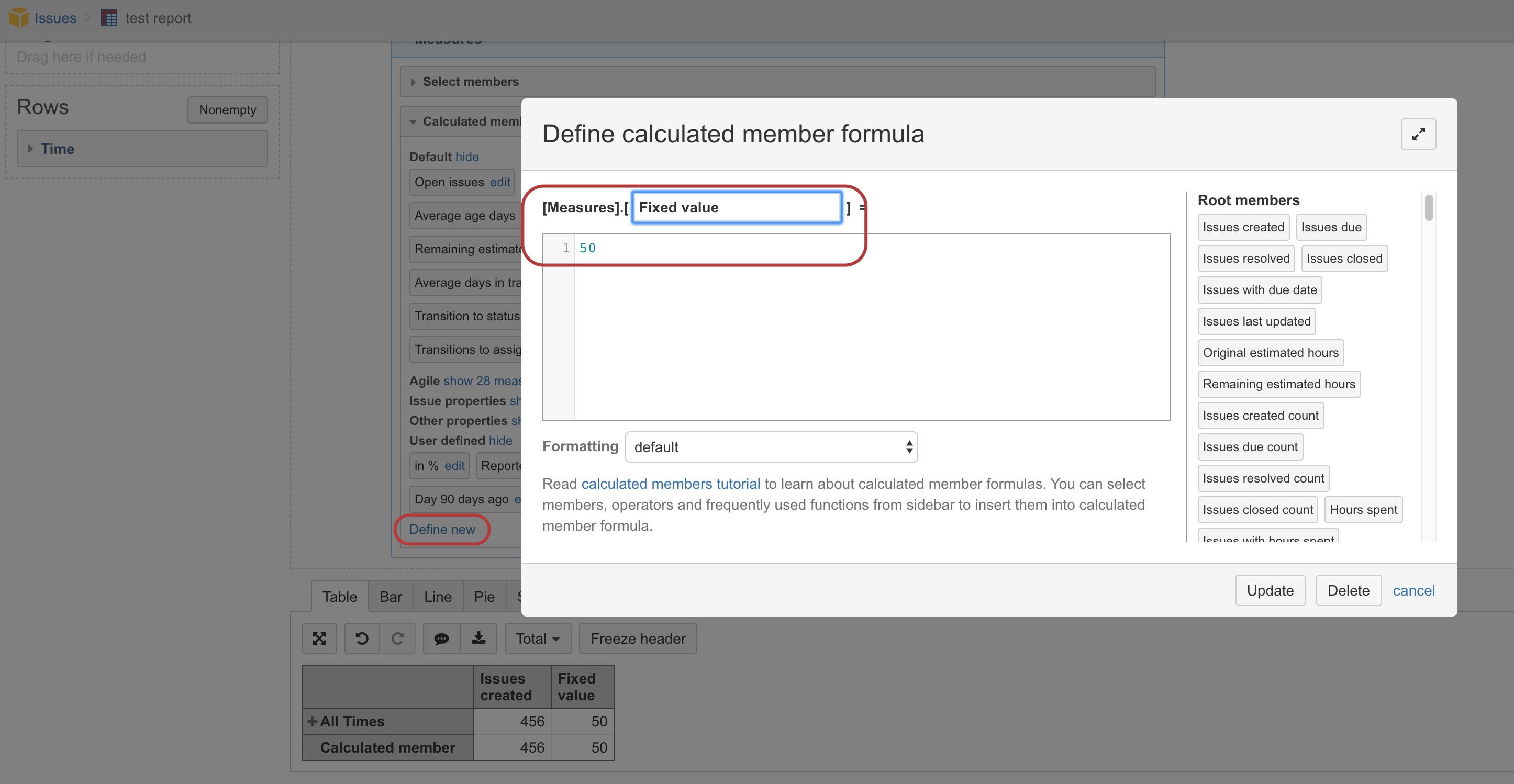
Hello Martins,
thank you for your feedback. Can you send me a screenshot of how you defined the measure “fixed value”?
Thanks in advance.
Mark Bühler
Hi,
I defined a new user-defined calculated member for “Measures” dimension where I typed manually the value 50
Martins / eazyBI support
will this work if i want the horizontal defined measure a line but everything else is bars? im having a heck of a time with this
Hi,
Yes, it would be possible to change the data type for just one marker in the chart.
Please see the chart customization page:
https://docs.eazybi.com/eazybi/analyze-and-visualize/create-charts#Createcharts-Customizechart
Martins / eazyBI support
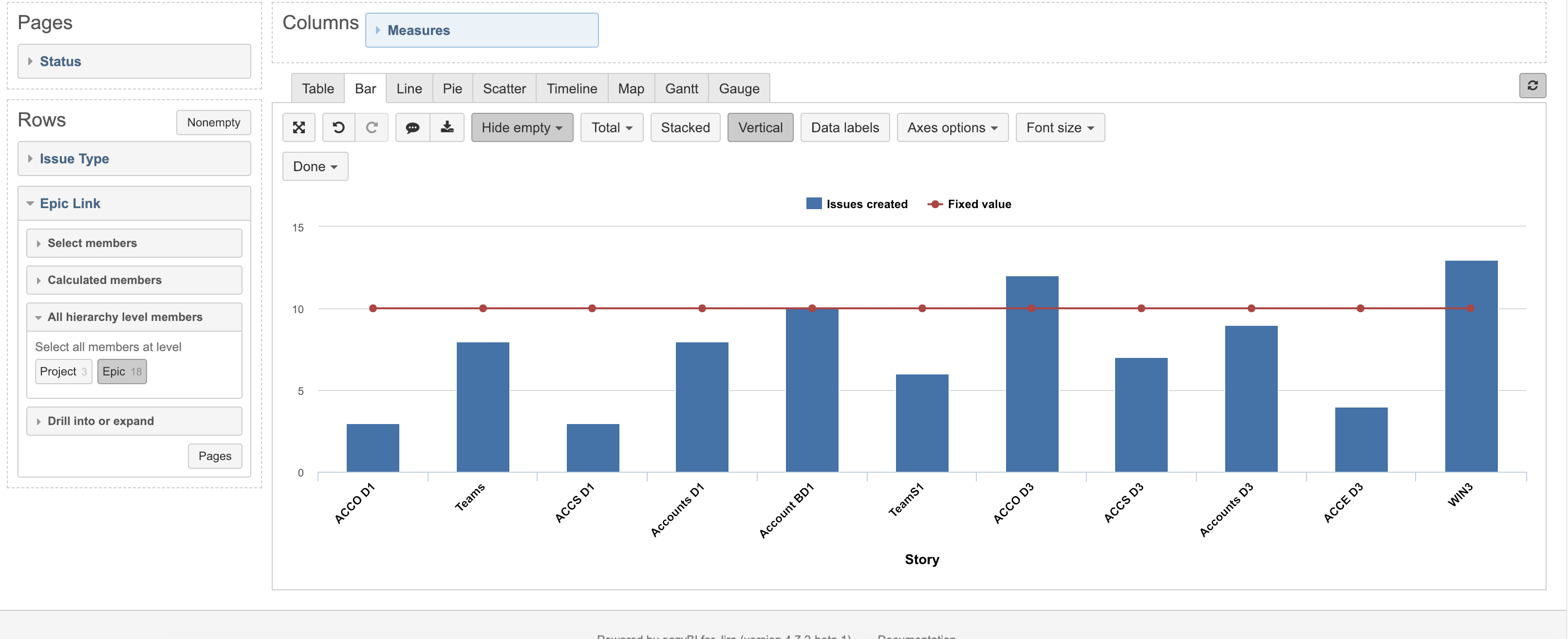
thanks. this helps. i think my problem is i have the data backwards. Any advice? I have 20 some epics with the same 3 stories each. i am trying to graphically show progress of each epic with the ‘finish line’ 3 issues completed in the epic as the horizontal line. the calculated field is showing as duplicated data?
Hi,
Perhaps, you could change the layout for a bit in your report.
See one example here:
We usually recommend changing the data type for marker if that is a measure.
Martins / eazyBI support
this worked. thanks so much!
Hello,
Thank you for everything.
I would like to do the same on a horizontal histogram but in my case I have 3 columns (Measure + 2 other columns) and I want to have 2 vertical lines (the first at 6 and the second at 11).
Can you help me please ?
Hi,
In this case, move the “secondary” dimension from columns to user-defined measures.
For example, instead of measure “issues created” use a user-defined measure with the following formula:
(
[Measures].[Issues created],
[Status].[To Do]
)
That would calculate the result for Issues created in status To do without using the “Status” dimension in columns.
Then you can use the new user-defined measure as a vertical line in your chart.
And turn off the “Vertical” feature in the report toolbar.
Martins / eazyBI
Thanks a lot. Right answer