Hello @Timi
Thanks for posting your question!
Could you let me know what specific aspects you’d like to improve?
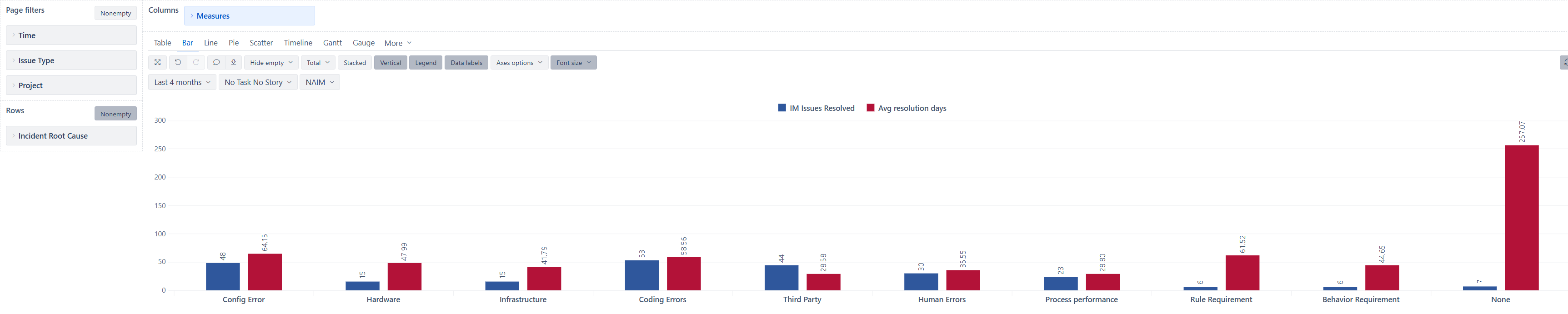
What I may suggest by looking at your chart is to consider bringing the Avg resolution days to a separate axis (check out the documentation here - Customize chart to see how to do that). Since the ticket count and resolution days are different units of measure, it would make more sense to have both measures on separate axes. This will make both measures easier to read and compare.
If you want to highlight some values in different colors based on some values, you may also consider applying conditional formatting - Charts conditional formatting
Best wishes,
Elita from support@eazybi.com
Hello Elita,
Thanks for the recommendation on separate axis that really helps.
I don’t have any specific aspects I’m trying to improve just make it look more visually appealing.
Hello @Timi
You may try checking out our demo account dashboards (note there are multiple tabs) - Customized Charts - Jira Demo - eazyBI . There are many example reports built that you may find interesting. This is a similar report you are building but visuzalized differently - Issue resolution days over time with trend - Issues - Jira Demo - eazyBI
If you like any of the reports and want to replicate them into you eazyBI account, you can export and import the report definition into your account (see how to do that here Export and import report definitions )
Best wishes,
Elita from support@eazybi.com