Hi all
Sorry if the title sounds confusing.
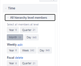
I want to create a dashboard having Time as a common dimension. When using a member like “current year”, I want some of the graphics to show the data grouped like this
But for other graphics, like a bar chart, I want Time to be drilled into months by default.
As you can see in the images, I could do this when Time is not a common dimension.
Any ideas?
Thanks
W.


