How to display graph by combining JIRA data and Excel data having a common field

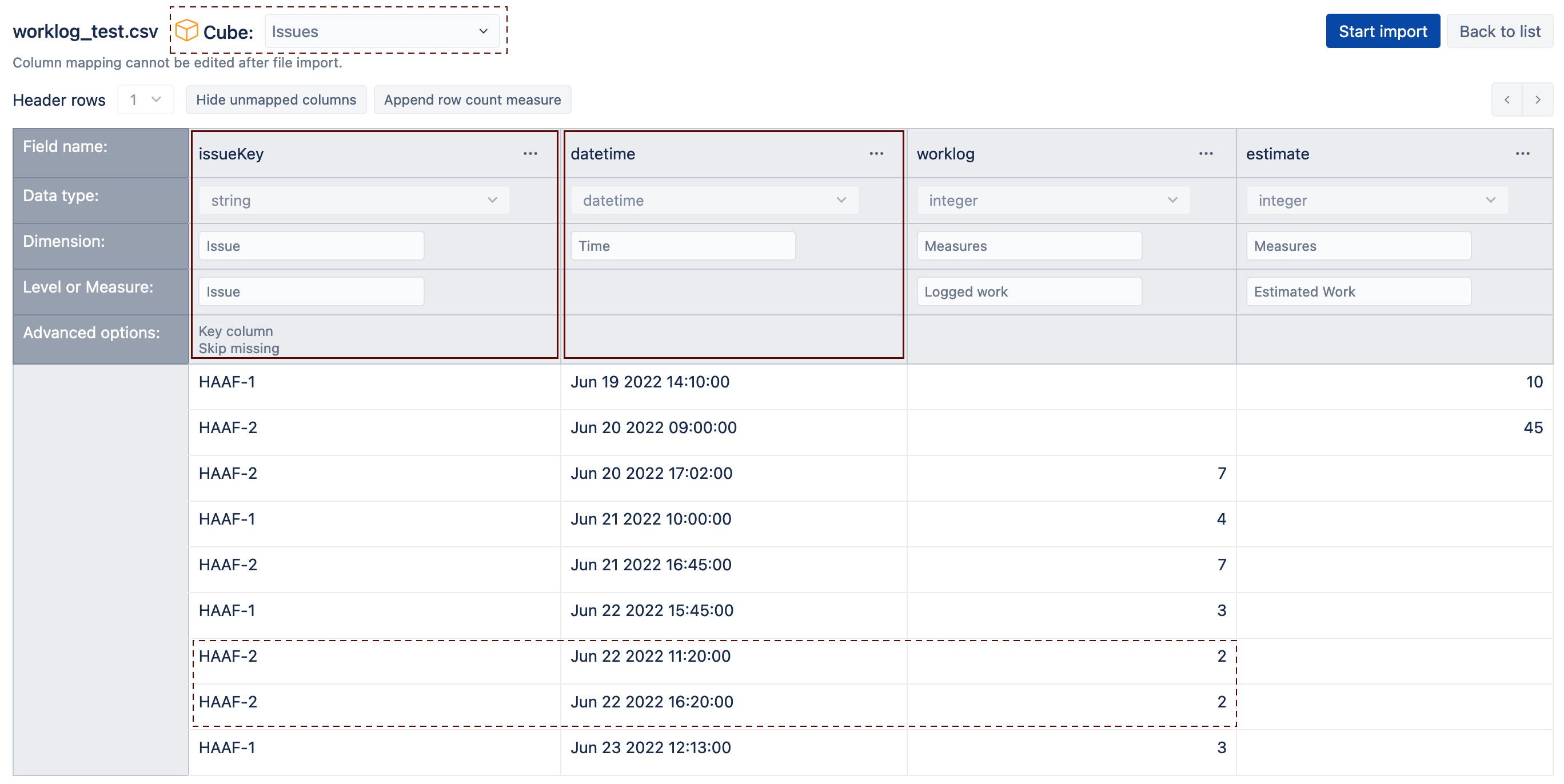
1.We have all our Change requests and Enhancement items logged in JIRA , with estimation as a custom field.
2.Now technicians working on those issues log time spent against those JIRA issues in organization time sheet. The time sheet can be exported in Excel format and would have the JIRA ID and the time spent against respective JIRA issues.

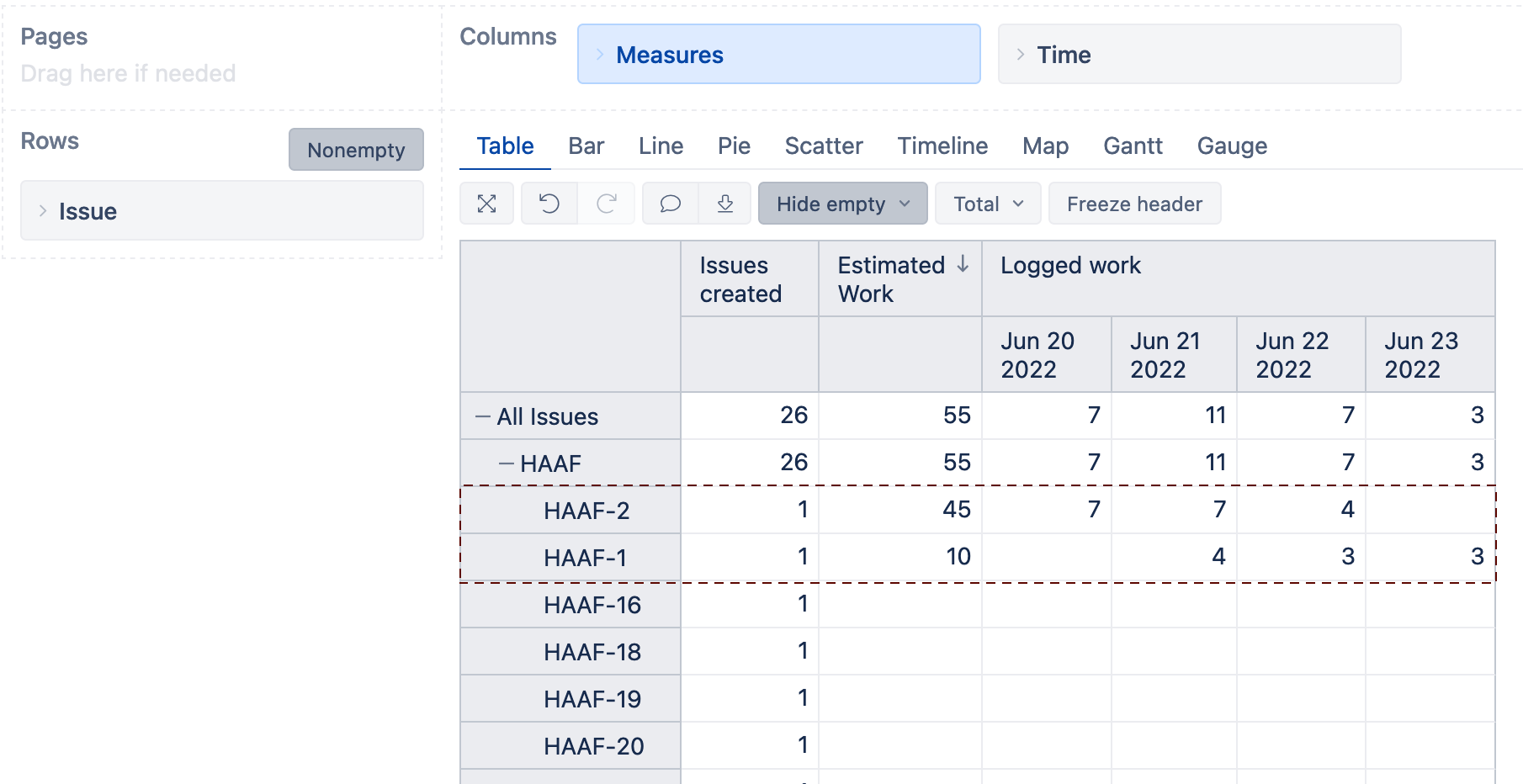
Thus the data from 1 and 2 as above can be combined at any time using the common field of the JIRA id to get the estimation as well as the time spent.

We require our data source to be both the JIRA and the Excel(extracted from the organization timesheet).Is this achievable? Kindly suggest for an approach.

Hi @Joy_Nandi ,

My general recommendations are to map the data to the Issue dimension using Jira issue Key. Use the date the work is logged and map it to the eazyBI Time dimension. Suppose an issue can have multiple worklogs on one date. In that case, I recommend including the timestamp so the entries are not overwritten. A simplified data mapping screen could look similar to the one below:


After the data import, the report could look similar to the one below:

Please follow the recommendations from the eazyBI documentation pages Additional data import into Jira Issues cube and here Excel and CSV file upload.

Best,
Roberts // support@eazybi.com