Hi,
Typically management are more interested to drill though the issue that still not resolved in Gauge chart.
Could you share on how to configure that?
Hi @Alfred.Tan,
In the gauge chart, you can drill through the measure that is the main metric (you can see it above the gauge), not the metric used as a limit. In your case, you can drill through “Issues resolved”.
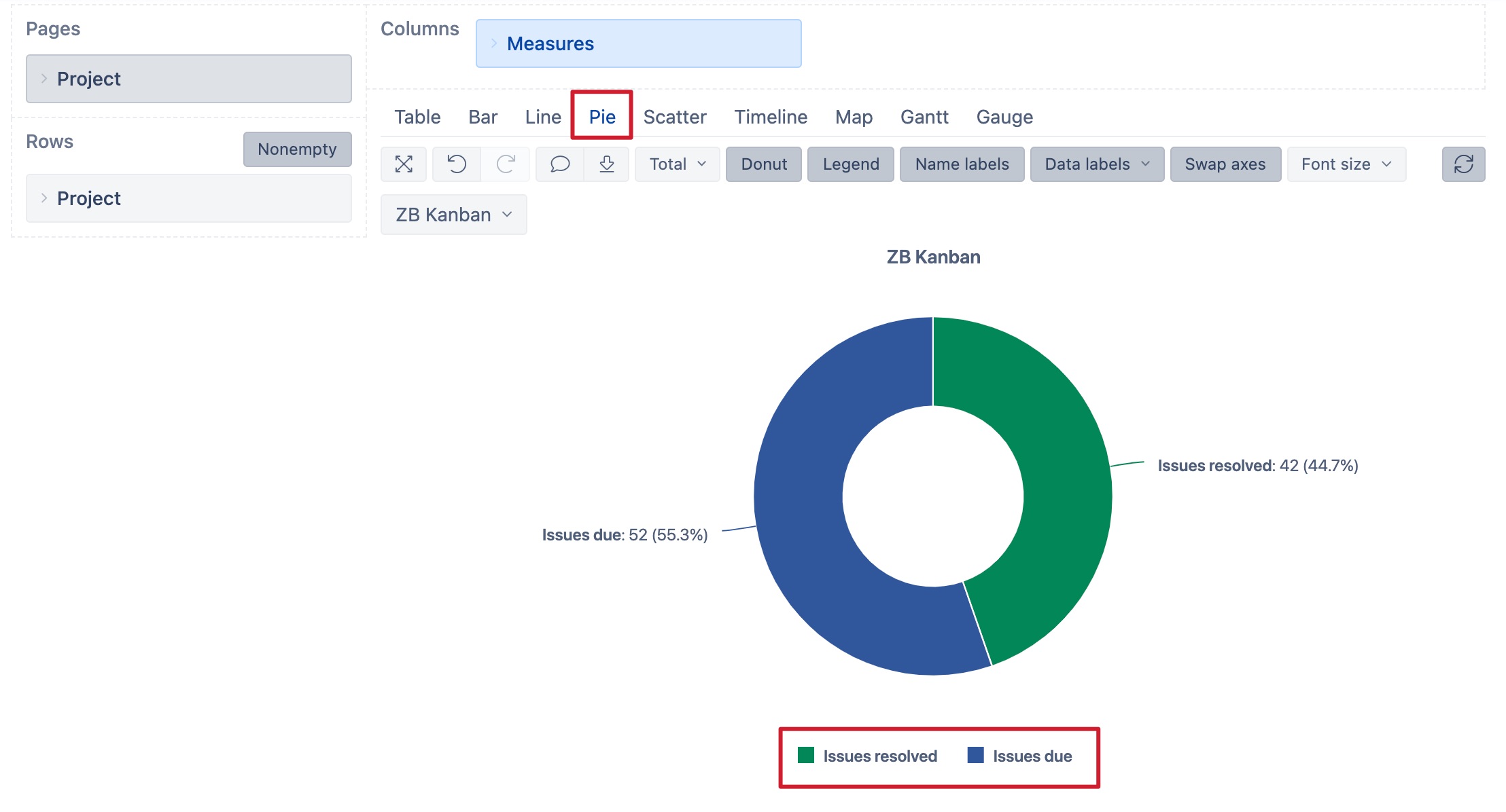
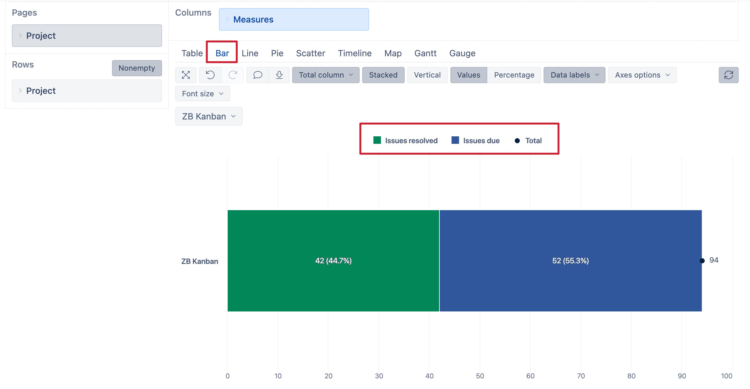
I would recommend using a Pie chart or stacked Bar chart chart of measures Issues resolved and Issues due to see the proportion of resolved and unresolved issues. Then management will be able to drill through each metric separately.
The report layout for the Pie chart might look like in the pictures below.
And the report layout for the Bar chart might look like this.
More details on the mentioned measures Issues resolved and Issues due are described here: https://docs.eazybi.com/eazybijira/data-import/jira-issues-import/jira-core-measures-and-dimensions.
And how to build and modify the charts is described here: https://docs.eazybi.com/eazybijira/analyze-and-visualize/create-charts.
Best,
Zane / support@eazyBI.com
Hi @Alfred.Tan,
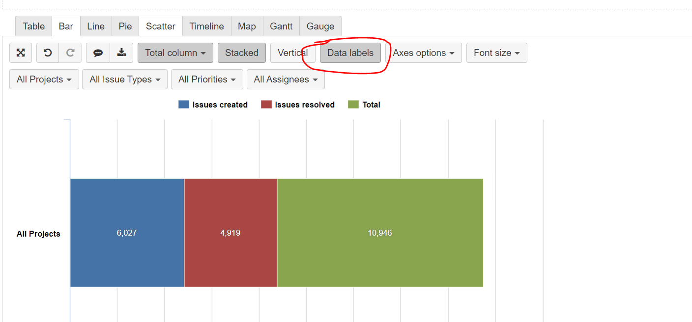
From the screenshot, it looks like you have an older eazyBI version. Option to represent relative percentage in the bar chart is available since version 5.3. For more details on what new improvements and functionality is added to eazyBI you can check the changelog or read the blog on improvements in each version:
For the older eazyBI version, the Pie chart is an option to represent the relative proportion of resolved and unresolved (due) issues.