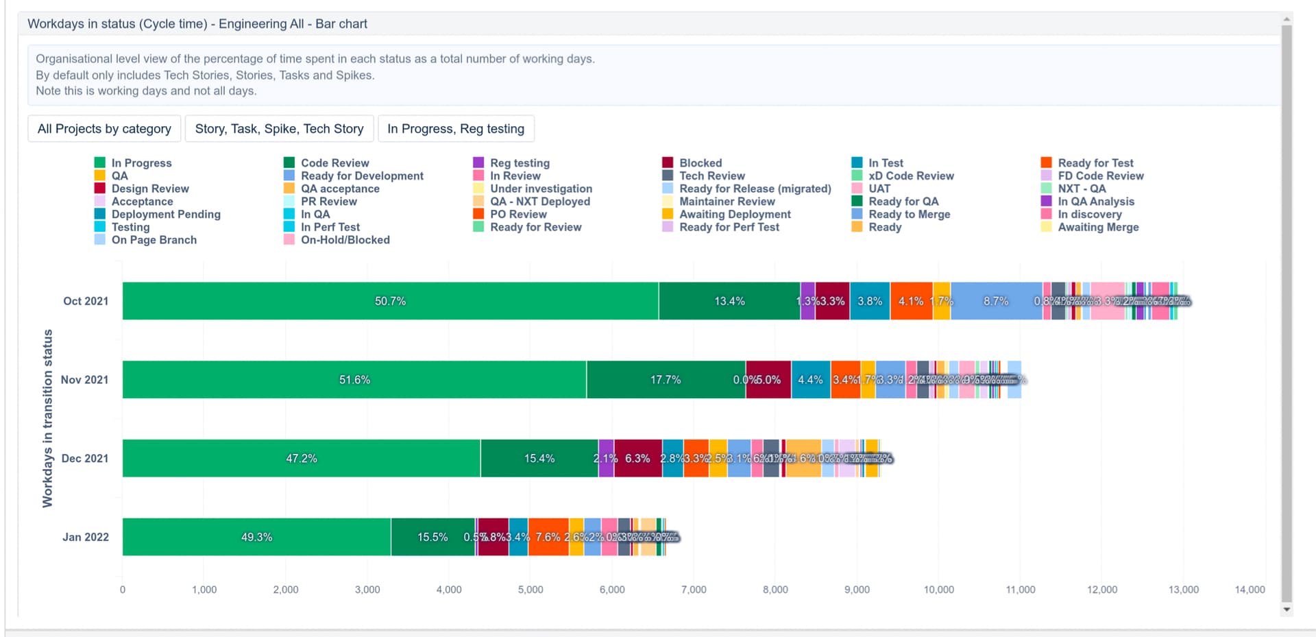
How would I get all the statuses into one row (the attached image shows it by month)? This is the chart I’m trying to create…
Hi @neilarm,
In the bar chart, you can swap axes (Axes options → Swap axes) to change rows (Time) and columns (Transition Status) placement in the Bar chart.
If you woudl like to get only one bar representing all four months, then move the “Time” dimension on report pages to filter the reporting period, the “Transition Status” dimension on report rows, and measure “Workdays in transition status” on columns.
Please see those two short training videos on how to create and modify charts:
Best,
Zane / support@eazyBI.com
Thank you! I’m really close but for some reason I can’t breakout the months- I feel like it should be something simple that I’m not doing. In the table view it is broken out by months- included the screenshot of the table below. Any help would be appreciated!

Hi @neilarm,
Probably I didn’t read correctly what you would like to achieve by “get all the statuses into one row”, sorry.
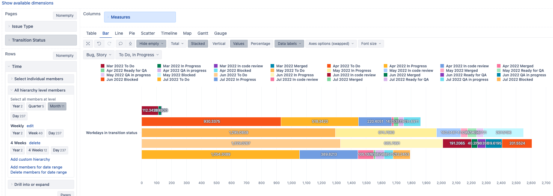
Anyhow, you might want to keep dimensions “Transition Statuses” and “Time” separated, one on rows and another on columns, so the bar chart legend is more readable.
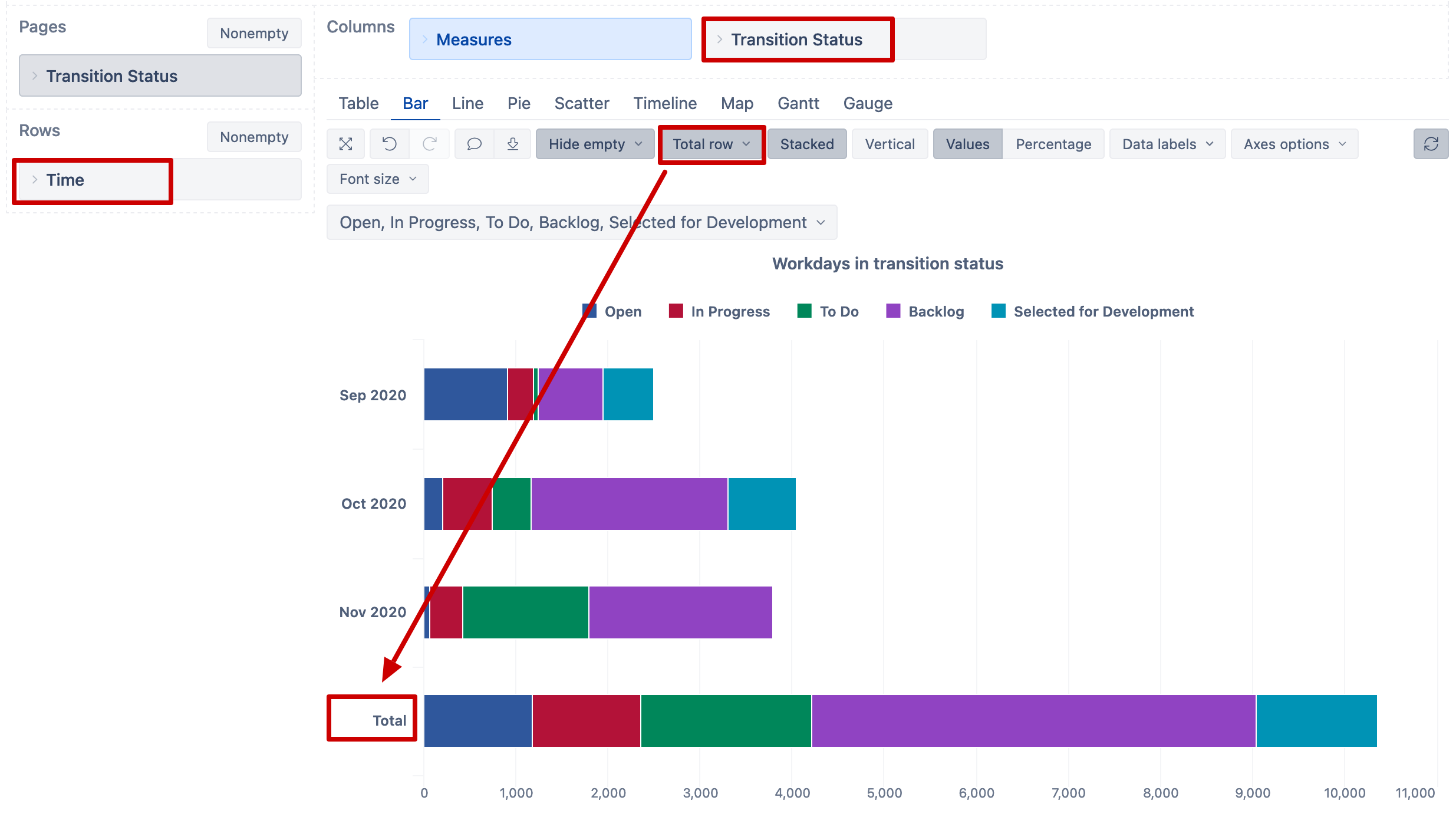
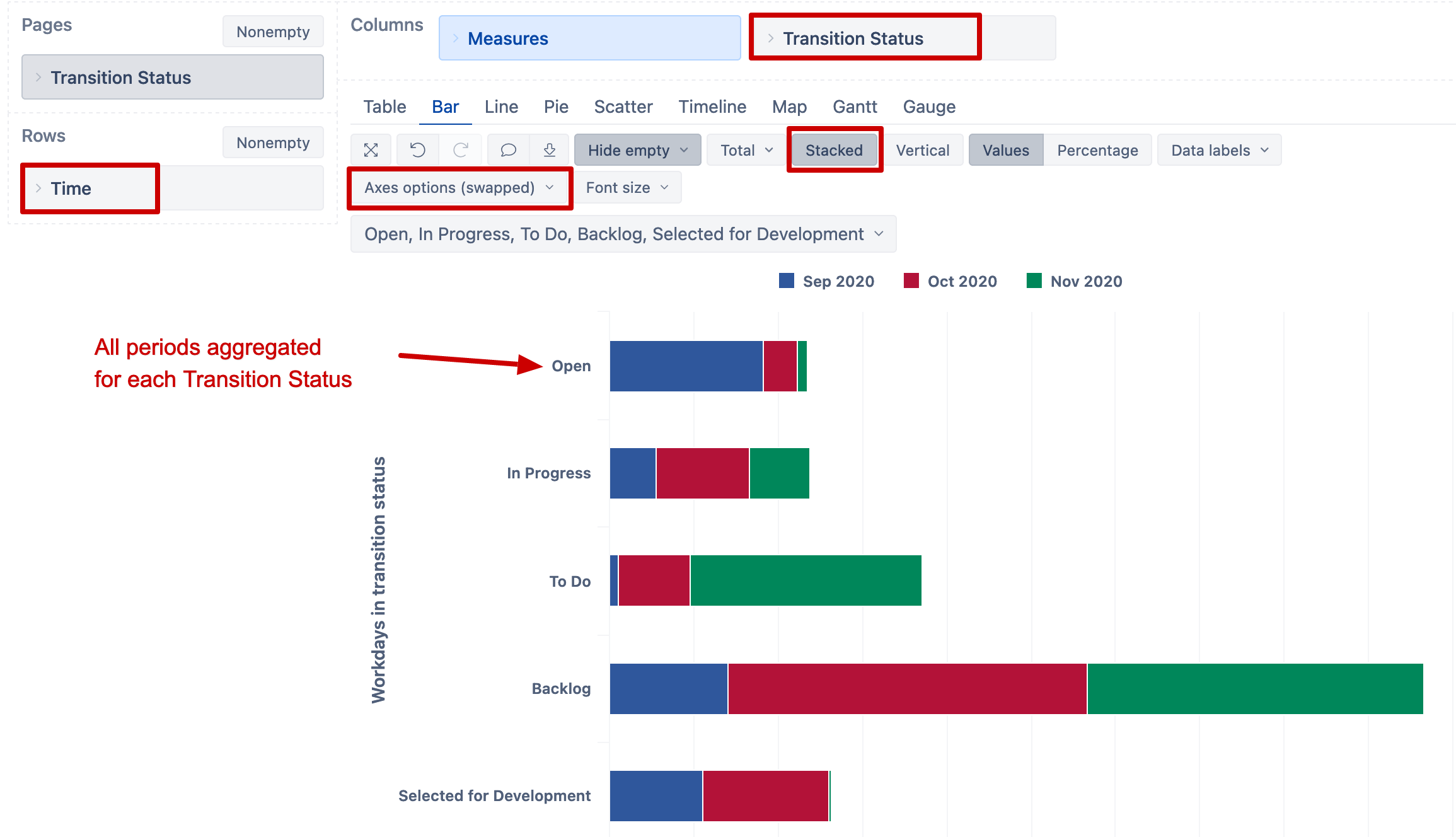
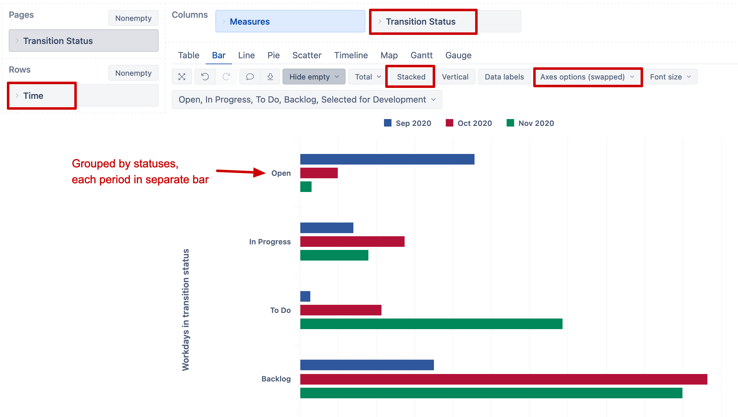
Please see three different report layout options and what Bar chart settings are for each. Is one of those close to what you are looking for?
-
Total over selected periods
-
Time in transition ststuas grouped by statuses, periods stacked in bars.
-
Time in transition statuse grouped by statuses, each period separate bar