How to set a 'goal' line in a chart

Hello,

I have a chart that shows the average days for some issues, over a period of time, by a field called ‘Severity’.

This is what it looks like:

So currently I have “Time” on rows, “Severity” on columns, and two other fields on pages.

What I would also like to add is a line for each severity, showing the ideal, or the goal for each one:

I hope this image is clear enough to show what I would like to achieve.

PS - the goal does not change, it is already known, for example, Severity ‘S’ will always be 2.

Thank you!

I figured out a way to do this:

I created a calculated member on measures that gives a value based on Severity. For example, all issues with S severity will get 2.

Then I simply added this to the report and made sure to choose it as a line type instead of bar.

2 Likes

Hi Arama,

I am exactly looking to do that. Could you please help me defining the formula?
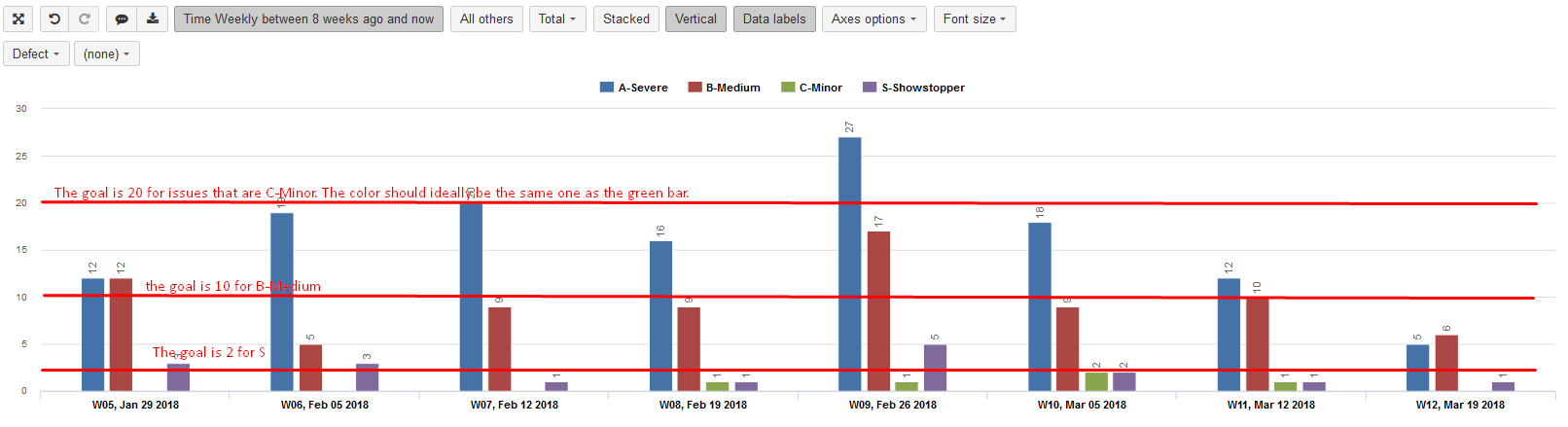
In my case my team has the goal resolve issues in less than 4 days. I wrote:

[Measures].[Average resolution days]=4
But it gives me as a result “false”.
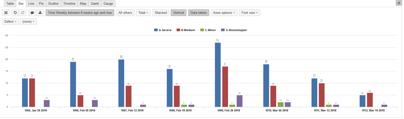
How did you define yours?

Hello @Nuria

My formula looks like this:

CASE
WHEN [Priority].CurrentMember.Name = ‘Blocker’
THEN 2
WHEN [Priority].CurrentMember.Name = ‘Critical’
THEN 5
WHEN [Priority].CurrentMember.Name = ‘Major’
Then 10
When [Priority].CurrentMember.Name = ‘Minor’
Then 20
ELSE 30
END

Hope this helps.

For your case, it could be something similar to:

CASE
WHEN [Measures].[Average resolution days].CurrentMember.Name < ‘4’
THEN 2
END

This is not tested.