Hallo,
I would like to show the issue count on each plotted point to avoid overlapping plots. An example would be to use all issues in the row and two custom fields in the measures (single-select 1…4). I can display a normal plot by CF values, but these tend to overlap due to shared values. (use-case is a risk/impact plot of issues)
I would be grateful for any help or better suggestions
I am not sure the scatter chart would be that flexible.
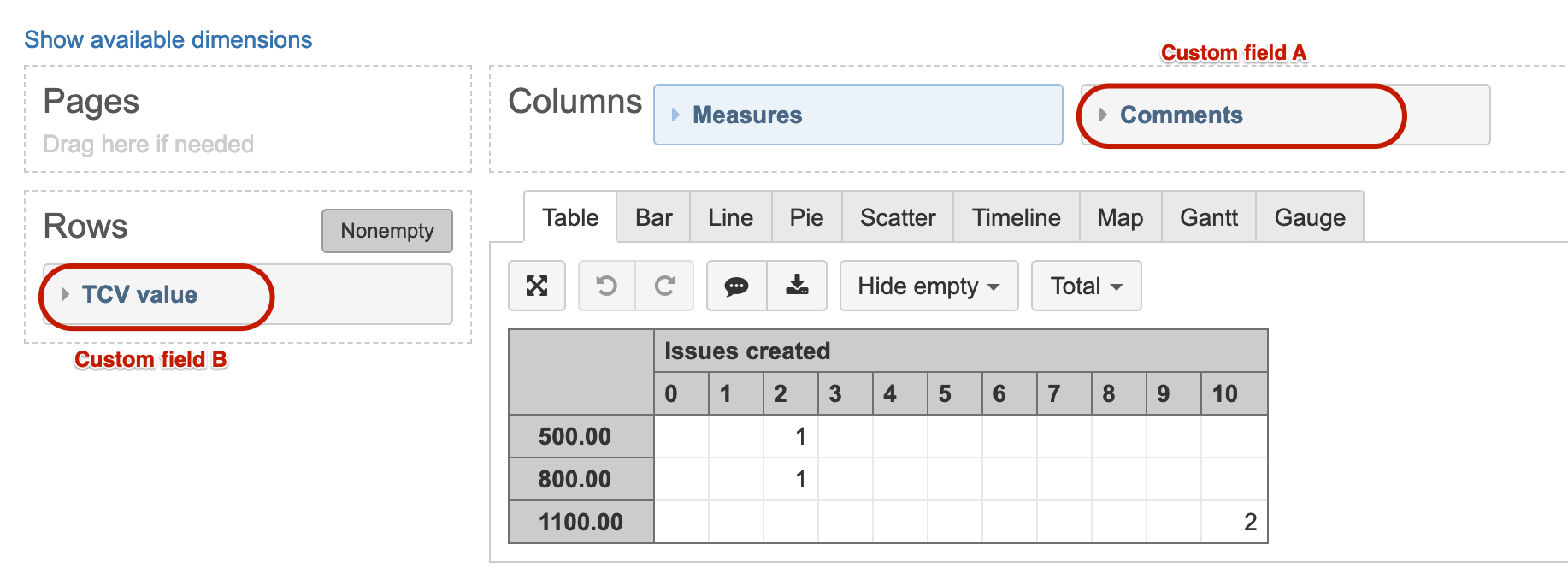
The closest workaround I found is a table report view after you define your custom fields via eazyBI advanced settings to import both of them as dimensions and then use in separate axis
Otherwise, the behavior in scatterchart is as you describe - issues would overlap in case of identical values in both custom fields.
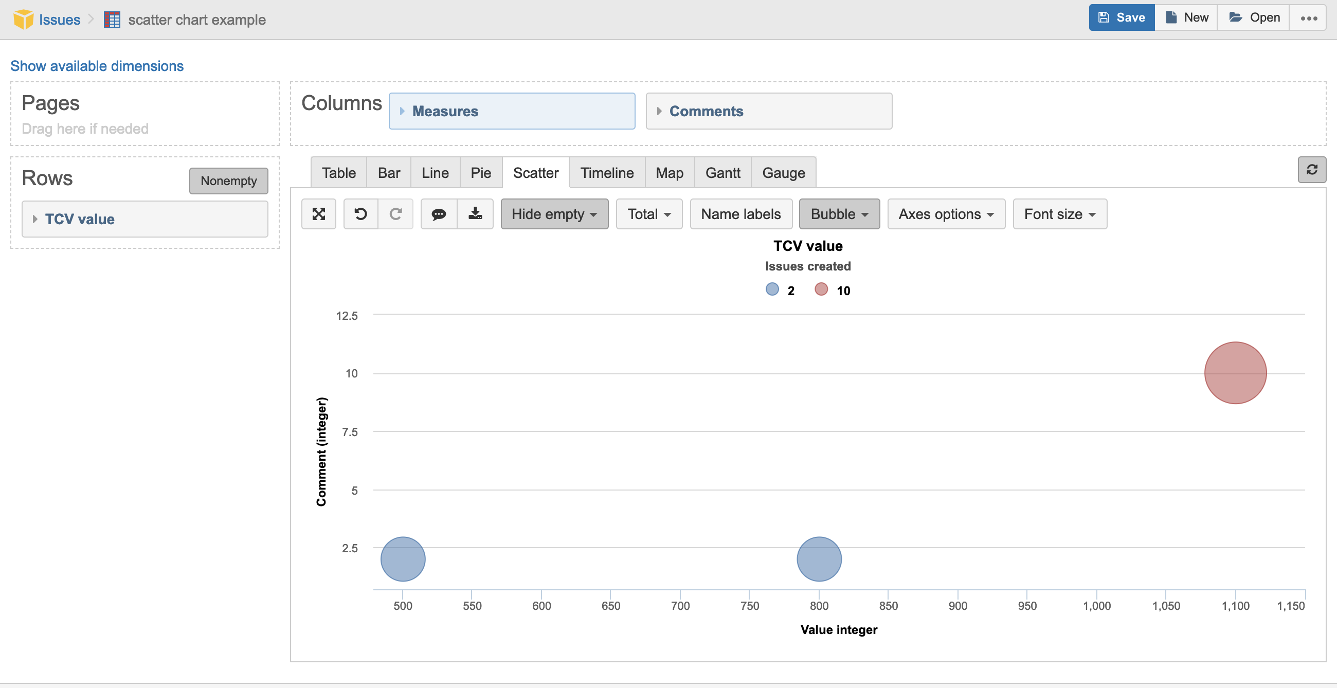
We just figured out a workaround to make scatter chart sum issues created and still show them on two separate axes where each of them shows values from a different custom field (see below) imported as a dimension.
You could reach out to eazyBI support for more details on this workaround.
Hallo Martins,
Thank you for the response. Could you please expand the definitions of the two user defined measures. I am still defining these false in my case as I only get empty values.
Bets regards,
Mark
PS. What is meant with “You could reach out to eazyBI for more details” … is it desired that in such a request I open an issue with support?
Yes, I recommended to reach out to eazyBI support by sending a question directly to us as this use-case may require additional communication in case you need more detailed steps to import both of your custom fields as dimensions and then create new calculated measures for this specific use-case.
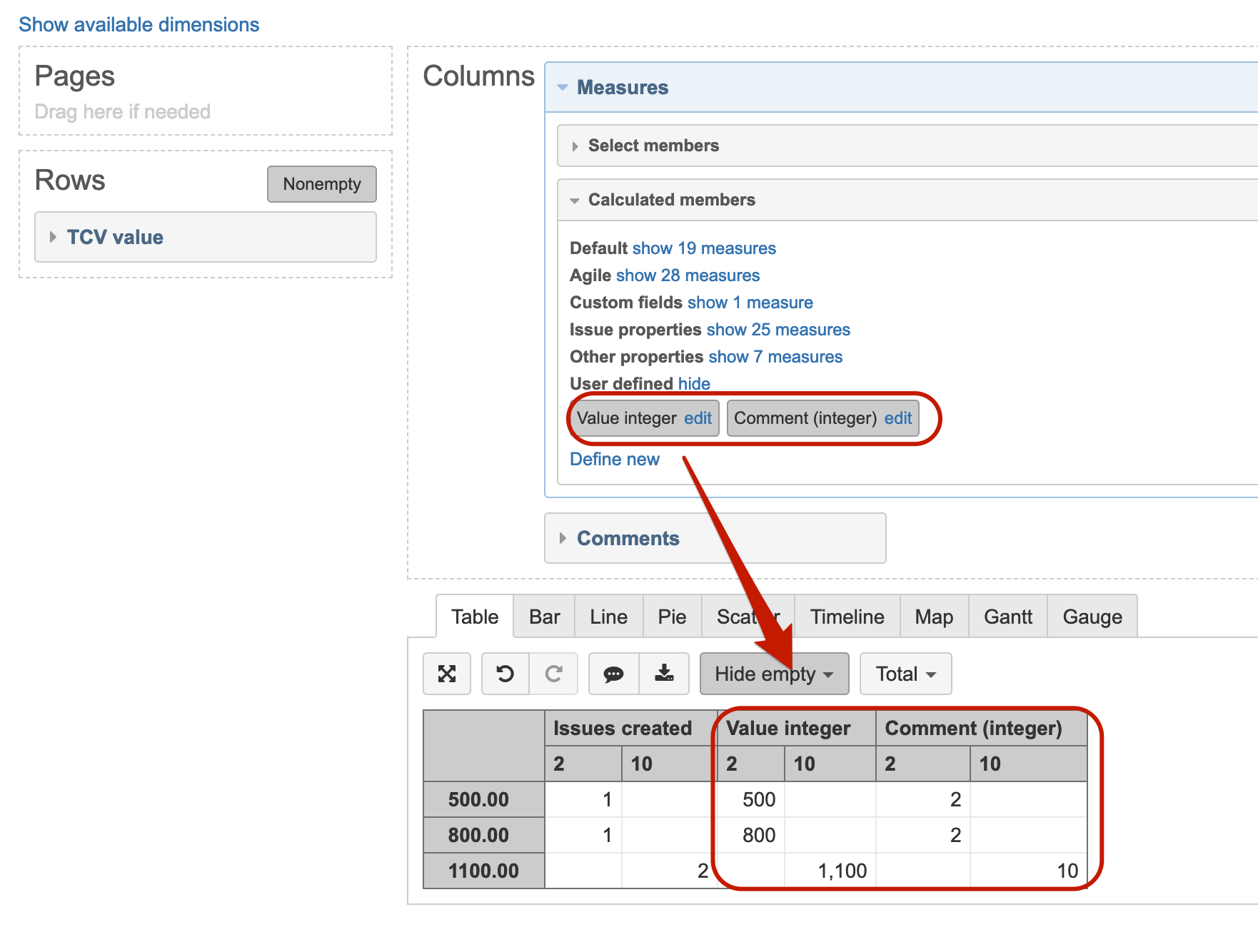
Anyway, after you have imported your two custom fields as separate dimensions, you could create new calculated measures that would return the dimension member names in separate columns.
This is the code I used for my calculated measure: “Value integer”
CASE WHEN
[Measures].[Issues created]>0
THEN
Val([TCV value].CurrentMember.Name) --member from new dimension
END
A similar code I used for “Comment (integer)” measure.
CASE WHEN
[Measures].[Issues created]>0
THEN
Val([Comments].CurrentMember.Name) --member from new dimension
END
Hallo Martins,
Thank you very much for your assistance. The information you have provided should suffice. I will contact support for further help if needed.
Best regards,
Mark
PS. It is a pleasure to see the commitment made by EazyBi to the Community. Thanks!
With version 6.2.0. we redesigned Cell formatting options for Table and Gantt charts with various configurations options.
You can use a custom formula to specify rules for coloring cells per a combination of two dimension member names. Here is a risk chart in our demo account you can use as an example.